D1.3 Display sets of data, using one-to-one correspondence, in concrete graphs, pictographs, line plots, and bar graphs, with proper sources, titles, and labels.
Skill: Representing Sets of Data
Once the data from a survey has been grouped into categories in a frequency table or the like, it is often very useful to represent it using a graph because of its visual impact. In effect, a graph:
- presents information in an organized manner;
- is generally easier to read and interpret than a data representation using text or a table;
- allows you to see all the data at a glance and to get a first impression (for example whether the data is evenly or unevenly distributed between the categories);
- facilitates the next step in the inquiry process, which is the analysis of the data and interpretation of the results.
Source: translated from Guide d’enseignement efficace des mathématiques, de la maternelle à la 3e année, Traitement des données et probabilité, p. 86.
For example, students can represent a set of statistical data much more succinctly and effectively with a table or graph than with an oral description. However, they must learn to use the various conventional representations of data (for example, frequency table, pictograph, bar graph) correctly to ensure that the message being conveyed is accurate and that it is understood by others. Students can then use these representations to justify a conclusion or support an argument during a mathematical discussion with the class.
Source: translated from Guide d’enseignement efficace des mathématiques, de la maternelle à la 3e année, Traitement des données et probabilité, p. 30.
Once the data have been collected and recorded, students must group them within a limited number of categories. There is no rule that dictates how to group the data; the choice of grouping depends largely on the type of data collected.
Source: translated from Guide d’enseignement efficace des mathématiques, de la maternelle à la 3e année, Traitement des données et probabilité, p. 81.
The source, title, and labels provide important information about data in a graph or table:
- The source indicates where the data was collected.
- The title introduces the data contained in the graph or table.
- Labels provide additional information, such as the category represented by each bar in a bar graph, or each “X” in a line plot. On a pictograph, a key tells how many each picture represents.
Source: The Ontario Curriculum. Mathematics, Grades 1-8 Ontario Ministry of Education, 2020.
The order of the categories is important in graphs with quantitative data. Numbers are placed in ascending order on the axis. In contrast, the order of the categories is not important in graphs with qualitative data (for example, the colours can be placed in any order).
Knowledge: One-to-One Correspondence
With one-to-one correspondence, there is one object for each piece of data in a concrete graph or one picture for each piece of data in a pictograph.
Source: The Ontario Curriculum. Mathematics, Grades 1-8 Ontario Ministry of Education, 2020.
Knowledge: Concrete Graph
In a concrete graph, data are represented, usually with one-to-one correspondence, in a concrete way by people or objects. The graph can be created on the floor, on a large tarpaulin, or on a grid carpet. Using a grid, columns of same-sized rectangles or squares are formed in which a person or object can be placed. It is then easy to compare the number of data in each column since all that is needed is to compare the length of the columns.
The concrete graph usually includes:
- a title;
- several columns or rows designated by categories;
- a representation of the data using people or objects arranged from the bottom of the column or from the left of the row and equally spaced.
Graph with Representative Material
In a graph with representative material, the data are represented, usually with one-to-one correspondence, in a concrete way by the same objects arranged in columns or rows. These objects may or may not be related to the data they represent. One may also choose to change objects from one category to another, but it is important to use objects of the same dimensions or to place the objects in a grid.
The graph with representative material usually includes:
- a title;
- several columns or rows designated by categories;
- a representation of the data using the same objects arranged from the bottom of the column or from the left of the row and equally spaced.
Picture Graph
In a graph with photos or illustrations, the data are not represented by concrete objects, but rather by images, usually with one-to-one correspondence, by photos or illustrations that are placed inside a grid.
The graph with photos or illustrations usually includes:
- a title;
- several columns or rows designated by categories;
- a representation of the data using photos or illustrations arranged from the bottom of the column or from the left of the row and spaced equally.
Source: translated from Guide d’enseignement efficace des mathématiques, de la maternelle à la 3e année, Traitement des données et probabilité, p. 91-94.
Knowledge: Pictograph
In a pictograph, data is represented by a picture or a symbol. Pictures are placed in columns or rows in a one-to-one or one-to-many correspondence.
The pictograph usually includes:
- a title;
- several columns or rows designated by categories;
- a representation of the data using pictures arranged from the bottom of the column or from the left of the row and equally spaced;
- a key indicating what each picture represents.
Example
Question of Interest: When rolling two dice, which sum represents the most likely outcome?
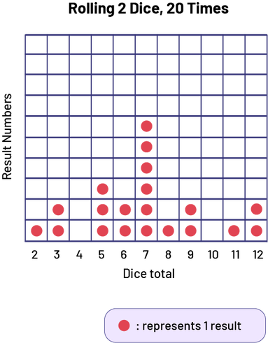 Image Diagram with illustrations, titled Rolling two dice, formed by a grid of 110 cells. Title of
the vertical axis: Result Numbers. Title of the horizontal axis: Dice total Horizontal axis numbered from 2 to 12.
Column 2: one red chip Column 3: two red chips Column 4: zero red chips Column 5: three red chips Column 6: two red
chips Column 7: six red chips Column 8: one red chip Column 9: two red chips Column 10: no red chips Column 11: one
red chip Column 12: two red chips Legend: each red chip represents one result
Image Diagram with illustrations, titled Rolling two dice, formed by a grid of 110 cells. Title of
the vertical axis: Result Numbers. Title of the horizontal axis: Dice total Horizontal axis numbered from 2 to 12.
Column 2: one red chip Column 3: two red chips Column 4: zero red chips Column 5: three red chips Column 6: two red
chips Column 7: six red chips Column 8: one red chip Column 9: two red chips Column 10: no red chips Column 11: one
red chip Column 12: two red chips Legend: each red chip represents one result
Source: translated from Guide d’enseignement efficace des mathématiques, de la maternelle à la 3e année, Traitement des données et probabilité, p. 94-95.
Knowledge: Line Plot
The line plot allows you to quickly record the data from a survey within pre-designated categories by placing the same symbol for every item in the appropriate column. These symbols are usually placed in an orderly fashion to facilitate counting.
The line plot usually includes:
- a title;
- a graduated horizontal axis with a label;
- x's that represent each data item.
Example
A team conducts a survey to determine the number of servings of fruit that students eat daily. Team members simultaneously collect and record data by placing an 'X' in the appropriate location on a line plot.
 Image Number line, titled Fruit eaten by students, and the horizontal axis, Number of fruits. The
horizontal axis is
numbered from 1 to 9. 1: one X 2: three Xs 3: one X 4: two Xs 5 : four Xs 6 : four Xs 7 : no Xs 8 : no Xs 9 : one X
Legend: one X represents one result.
Image Number line, titled Fruit eaten by students, and the horizontal axis, Number of fruits. The
horizontal axis is
numbered from 1 to 9. 1: one X 2: three Xs 3: one X 4: two Xs 5 : four Xs 6 : four Xs 7 : no Xs 8 : no Xs 9 : one X
Legend: one X represents one result.
Source: translated from Guide d’enseignement efficace des mathématiques, de la maternelle à la 3e année, Traitement des données et probabilité, p. 78-79.
Knowledge: Bar Graph
In a bar graph, data are represented symbolically by horizontal or vertical bars with lengths corresponding to the frequency. This more abstract representation allows the difference between the frequencies of each category to be highlighted.
The bar graph usually includes:
- a title;
- the designation of categories along the horizontal or vertical axis;
- a scale with appropriate intervals along the other axis to represent frequencies;
- labels on the axes;
- a representation of the data using bars of equal width and whose length corresponds to the frequency;
- the same space between each of the bars.
Source: translated from Guide d’enseignement efficace des mathématiques, de la maternelle à la 3e année, Traitement des données et probabilité, p. 96.
Example
 Image Horizontal bar graph titled Snack – shared by students. Vertical axis title: Snacks. The
vertical axis shows four categories: Chocolate, Fruit, Lollipop and Cookie. Horizontal Axis Title: Number of Students.
The horizontal axis is numbered from 0 to 19. The blue bar, for chocolate, corresponds to 6 students. The yellow bar,
related to a fruit, corresponds to 15 students. The red bar, for a lollipop, corresponds to 14 students. The purple
bar, for a cookie, corresponds to 6 students.
Image Horizontal bar graph titled Snack – shared by students. Vertical axis title: Snacks. The
vertical axis shows four categories: Chocolate, Fruit, Lollipop and Cookie. Horizontal Axis Title: Number of Students.
The horizontal axis is numbered from 0 to 19. The blue bar, for chocolate, corresponds to 6 students. The yellow bar,
related to a fruit, corresponds to 15 students. The red bar, for a lollipop, corresponds to 14 students. The purple
bar, for a cookie, corresponds to 6 students.
Source: translated from Guide d’enseignement efficace des mathématiques, de la maternelle à la 3e année, Traitement des données et probabilité, p. 215.