D1.3 Display sets of data, using one-to-one correspondence, in concrete graphs, pictographs, line plots, and bar graphs, with proper sources, titles, and labels.
Activity 1: Pictograph or Bar Graph?
Materials
- Appendix 2.4 (1 copy per pair)
- grid paper
- sheets of paper
- stickers
- bingo markers
- coloured pencils
Summary
In this activity, students will represent the data in a frequency table using a pictograph or bar graph.
Directions
Group students into pairs and distribute a copy of Appendix 2.4 (Frequency Tables) to each pair. Have pairs read the different tables, choose one and represent it with a pictograph or bar graph. Provide them with the necessary materials.
When all teams have finished, invite each team to present their graph and justify their choice. Invite other students to comment on whether the graph is complete and whether it correctly represents the data in the table.
Then encourage students to compare the different graphs by asking questions such as:
- These two teams represented the same frequency table using a different graph. Do both graphs effectively represent the data?
- Is there a frequency table for which one graph is more advantageous than the other? Why? (Because of the higher frequencies in Table 4, it would be time consuming to create a pictograph. In this case, the bar graph is easier to create and also easier to interpret.)
- If you were to present data to kindergarten students, what type of graph would you use? Why? (I would use the pictograph because it is easier for younger children to understand.)
Source: translated from Guide d’enseignement efficace des mathématiques, de la maternelle à la 3e année, Traitement des données et probabilité, p. 209.
Activity 2: Representation Using a Concrete Graph
Propose the following question of interest to students and guide them in collecting and representing data using the sample questions.
| Question of Interest | What is the students’ favourite stuffed animal? |
| Type of Inquiry | Survey |
| Type of Information | Preference |
| Grouping of Data | Nominal categories |
| Data Representation | Stuffed animals, based on a one-to-one correspondence. |
| Concrete Graph | 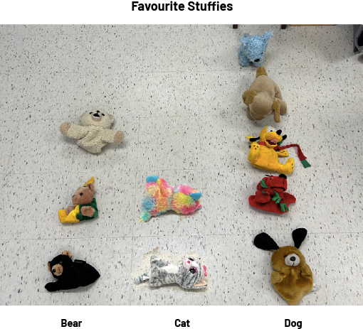 |
Sample questions:
- How can the data be collected? By observation, by survey, by experience?
- Are we looking for general information or a preference among people?
- What is the attribute described by the categories? (qualitative data or quantitative data)
- How can we represent the data? By real objects (concrete graph), objects that represent the data (graph with representative material), images of the objects (picture graph) or the same image for all the objects (pictograph)?
Source: translated from Guide d’enseignement efficace des mathématiques, de la maternelle à la 3e année, Traitement des données et probabilité, p. 92.
Activity 3: Representation Using a Graph With Representative Material
Propose the following question of interest to students and guide them in collecting and representing data using the sample questions.
| Question of Interest | What materiel are the students’ pencil cases made of? |
| Type of Inquiry | Observations |
| Type of Information | General information |
| Grouping of Data | Nominal categories |
| Data Representation | Connecting cubes, in a one-to-one correspondence. |
| Graph with Representative Material | 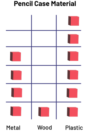 Image Diagram with representative material, titled The Pencil Case Material, formed by three
columns: the Metal column, which has four red blocks, the Wood column, which has one red block, and the
Plastic column, which has six red blocks. Image Diagram with representative material, titled The Pencil Case Material, formed by three
columns: the Metal column, which has four red blocks, the Wood column, which has one red block, and the
Plastic column, which has six red blocks. |
Sample questions:
- How can the data be collected? By observation, by survey, by experience?
- Are we looking for general information or a preference among people?
- What is the attribute described by the categories? (qualitative data or quantitative data)
- How can we represent the data? By real objects (concrete graph), objects that represent the data (graph with
representative material), images of the objects (picture graph) or the same image for all the objects
(pictograph)?
Source: translated from Guide d’enseignement efficace des mathématiques, de la maternelle à la 3e année, Traitement des données et probabilité, p. 93.
Activity 4: Representation Using an Picture Graph
Propose the following question of interest to students and guide them in collecting and representing data using the sample questions.
| Question of Interest | What types of shoes do teachers at the school wear? |
| Type of Inquiry | Observations |
| Type of Information | General information |
| Grouping of Data | Nominal categories |
| Data Representation | Shoe pictures, one-to-one correspondence |
| Picture Graph |  Image Chart with illustrations, titled Shoes Worn by the Teaching Staff, formed with three
columns: the Shoes column, which has seven pumps, the Running Shoes column, which has eight sneakers, and
the Sandals column, which has five sandals. Image Chart with illustrations, titled Shoes Worn by the Teaching Staff, formed with three
columns: the Shoes column, which has seven pumps, the Running Shoes column, which has eight sneakers, and
the Sandals column, which has five sandals. |
Sample questions:
- How can the data be collected? By observation, by survey, by experience?
- Are we looking for general information or a preference among people?
- What is the attribute described by the categories? (qualitative data or quantitative data)
- How can we represent the data? By real objects (concrete graph), objects that represent the data (graph with representative material), images of the objects (picture graph) or the same image for all the objects (pictograph)?
Source: translated from Guide d’enseignement efficace des mathématiques, de la maternelle à la 3e année, Traitement des données et probabilité, p. 94.
Activity 5: Representation Using a Pictograph
Propose the following question of interest to students and guide them in collecting and representing data using the sample questions.
| Question of Interest | When two dice are rolled, what is the most likely result? |
| Type of Inquiry | Probability experiment |
| Type of Information | Quantity |
| Grouping of Data | Numerical categories |
| Data Representation | Pictograms, one-to-one correspondence |
| Pictograph | 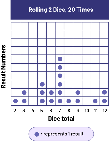 Image Diagram with illustrations, titled Rolling two dice, formed by a grid of 110
cells. Title of the vertical axis: Result Numbers. Title of the horizontal axis: Dice total Horizontal axis
numbered from 2 to 12. Column 2: one blue chip Column 3: two blue chips Column 4: zero blue chips Column 5:
three blue chips Column 6: two blue chips Column 7: six blue chips Column 8: one blue chip Column 9: two
blue chips Column 10: no blue chips Column 11: one blue chip Column 12: two blue chips Legend: each blue
chip represents one result
Image Diagram with illustrations, titled Rolling two dice, formed by a grid of 110
cells. Title of the vertical axis: Result Numbers. Title of the horizontal axis: Dice total Horizontal axis
numbered from 2 to 12. Column 2: one blue chip Column 3: two blue chips Column 4: zero blue chips Column 5:
three blue chips Column 6: two blue chips Column 7: six blue chips Column 8: one blue chip Column 9: two
blue chips Column 10: no blue chips Column 11: one blue chip Column 12: two blue chips Legend: each blue
chip represents one result
|
Sample questions:
- How can the data be collected? By observation, by survey, by experience?
- Are we looking for general information or a preference among people?
- What is the attribute described by the categories? (qualitative data or quantitative data)
- How can we represent the data? By real objects (concrete graph), objects that represent the data (graph with representative material), images of the objects (picture graph) or the same image for all the objects (pictograph)?
Source: translated from Guide d’enseignement efficace des mathématiques, de la maternelle à la 3e année, Traitement des données et probabilité, p. 95.