D1.5 Analyse different sets of data presented in various ways, including in logic diagrams, line plots, and bar graphs, by asking and answering questions about the data and drawing conclusions, then make convincing arguments and informed decisions.
Activity 1: Analysis of Data Represented by a Pictograph
After reading a story about a dog, a cat and a fish, the teacher says to the students, 'I wonder how many of you have one of these pets at home.' She then suggests that they conduct a survey. After discussion, the students come up with the following multiple choice survey question:
What pet do you have?
- A dog
- A cat
- A fish
- No animals
- Another animal
To complete the survey, it is agreed that each student will place a star in the appropriate category in a pictograph. If the student has more than one pet, he or she will have to choose which category to place the star in.
The graph below represents the results of the survey.
 Image Chart, with the title Which Pet Do You Have, consisting of five categories: Dog, counting six stars; Cat, counting three stars; Fish, counting seven stars; None, counting four stars; and Other, counting two stars. Legend: One star represents one student.
Reading the Data
The teacher asks questions such as:
- How many students have a dog as a pet? (There are six students who have a dog because there are six stars in the 'dog' category.)
- How many categories are there? (There are five categories. They correspond to the answer choices.)
- What does the key tell us about the graph? (Each star represents a student's response to the survey.)
- What does the horizontal axis represent in this pictograph? (The horizontal axis represents all possible answers.)
- How many students have a pet that is not a cat, dog, or fish? How do you know? (Two students have a pet that is not a cat, dog, or fish because there are two stars in the 'other' category.)
- Does the graph effectively represent the survey responses? Why? (Yes, the graph effectively represents the data because it is easy to see the distribution of responses in each category.)
Reading Between the Data
The teacher notes that students pay particular attention to their 'personal data' (for example, 'This star represents my dog.', 'I put a star here because I have fish at home.') In order to encourage students to see the graph not as a series of personal data, but rather as a collective set of data forming a whole, the teacher asks questions such as:
- What pet is most common in the homes of the students in the class? How do you know? (It's fish since that's the category with the most stars.)
- Are there more cats or more dogs in the homes of the students in the class? How do you know? (There are more dogs than cats. In the 'dog' category there are six stars and in the 'cat' category there are only three stars.)
- Are there more families with fish than families with either a dog or a cat? (No, since there are nine families with either a dog or a cat and only seven families with fish.)
- According to research, cats are the most common pet in Canada. How do our survey results resemble or differ from this result? (The survey results are different because fish, not cats, are the most common pets found in the homes of students in the class.)
Reading Beyond the Data
The teacher asks questions such as:
- Do you think it's possible that dogs are the most common pet in other Grade 2 classes? Why? (Yes, it's possible that dogs are the most common pet in other classes because they are different families than we are.)
- Other than dogs, cats, and fish, what other pets are found in the homes of students in the class? (We can't tell; all we can say is that two students reported having another pet.)
- What if we wanted to know how many fish were in the homes of the students in the class? (Students could place a star for each fish they have or write on their star the number of fish they have.)
- How many students have two different pets at home? (The graph does not give us this information, since each student could only place one star on the graph.)
- What is the benefit of allowing each student to place a single star on the graph? (It is then easy to verify, by counting the stars, that all students have completed the survey.)
- If the survey response choices were snake, cat, fish, none , and other, do you think it is likely, unlikely, or very likely that fish would still be the pet most often found in the homes of students in the class? Explain your reasoning. (I think it is very likely that fish would still be the pet most often found because I don't think many families have a snake in their home.)
- What conclusion can you draw from the data presented in this graph? Explain why. (It can be concluded that the students in the class like animals since the majority of them have a pet.)
Source: translated from Guide d’enseignement efficace des mathématiques, de la maternelle à la 3e année, Traitement des données et probabilité, p. 102-106.
After students have analyzed the data collected in relation to the survey question 'What pet do you have?' the teacher encourages them to interpret the results by asking questions such as:
- What did we want to know at the beginning of the survey? (We wanted to know how many students have a dog, cat, or fish at home.)
- Did we get the answer to this question? (Yes, we can see that 16 students have a dog, cat, or fish at home.)
- Was anything else learned? (Yes, it was learned that four students do not have a pet and two students have a pet other than a dog, cat, or fish.)
- The school principal invites each class to choose an animal name to represent the class. How can the results of this survey help us choose this name? (Since most students have fish at home, this is the name that should be chosen to represent the class.)
Source: translated from Guide d’enseignement efficace des mathématiques, de la maternelle à la 3e année, Traitement des données et probabilité, p. 109.
Activity 2: Celebrating Spring (Data Analysis Using a Bar Graph)
Materials
Appendix 2.3 (quantity corresponding to half the number of teams)
Summary
In this activity, students are asked to analyze and interpret bar graphs.
Directions
Group students into teams and present the following scenario.
A Grade 2 class was invited to a potluck snack to celebrate the arrival of spring. Students contributed food and treats to the snack. To keep track of what was brought in, two students represented the data about the snack using a bar graph.
Provide each team with one of the two bar graphs in Appendix 2.3. Invite students to read their bar graphs and note as much information as possible about the snack.
Then invite members of one of the teams that received Laura's graph to present it and list the information they noted. Then invite the other teams that received this graph to indicate, if applicable, other information that was not already mentioned. Encourage students to read beyond the data by asking questions like:
- Why do you think there are so many lollipops?
- Can we know how many apples were brought in for snacking? Why?
- Can we conclude that fruit is the preferred type of snack for students in this class?
Repeat the same process with the teams that received David's graph. Then encourage students to compare the two graphs by asking questions such as:
- Did Laura and David represent the same data? How can you demonstrate this?
- How are the two graphs different?
- If you wanted to promote good nutrition, which of the two graphs would you choose?
Source: translated from Guide d’enseignement efficace des mathématiques, de la maternelle à la 3e année, Traitement des données et probabilité, p. 208.
Activity 3: Misleading Graph
Students are presented with the picture graph below, that one team created as part of a survey, representing students' responses to the survey question, 'Which is your favourite animal: cat, dog, or hamster?'.
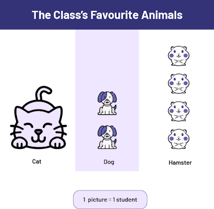 Image Chart with illustrations, titled The Class’s Favourite Animals, made up of three columns: the Cat column, which has one cat, the Dog column, which has two dogs, and the Hamster column, which has four hamsters. Legend: One illustration represents one student.
When analyzing the data, lead students to recognize that the graph may lead to the conclusion that the cat is the students' favourite animal since it is the largest picture. Then ask, 'What should be done to prevent the graph from leading to false conclusions?' (The same size pictures should be used or the pictures should be placed in a grid.)
Source: translated from Guide d’enseignement efficace des mathématiques, de la maternelle à la 3e année, Traitement des données et probabilité, p. 110-111.
Activity 4: Analyze Data Represented by a Line Plot
Let's Breathe Calmly
Present the line plot below, illustrating the number of breaths per minute of students in a Grade 4 classroom.
 Image A number line titled Number of breaths per minute among Grade 4 Students, numbered 14 to 27. 14 breaths: one X 16 breaths: two Xs 14 breaths: two Xs 18 breaths: four Xs 19 breaths: six Xs 20 breaths: five Xs 21 breaths: three Xs 22 breaths: two Xs 26 breaths: one X 27 breaths: one X
To get students to interpret the data, ask the following questions:
- What does each 'X' on this line plot represent? (Each 'X' represents a student whose breaths per minute match the number below it.)
- Why are there no 'X's' in some places? (No student took 15, 23, 24, or 25 breaths in one minute.)
- How many students are in this class? (There are 27 students in this Grade 4 class.)
- In this class, what is the lowest number of breaths per minute recorded by a student? the highest number? (The lowest number of breaths per minute is 14 and the highest number is 27.)
- Where do most students in this class fall in the number of breaths per minute? (The majority of students in this class fall in the range of 16 to 22 breaths per minute)
- If we wanted to represent the number of breaths per minute of this class by a single number, what number would we use? (This number would be 19 breaths per minute because several students in the class took 19 breaths per minute and many other students took a number of breaths per minute that is close to 19, at 17, 18, , 20 and 21.)
- What is the explanation for students in this class taking 14, 26, or 27 breaths per minute? (These students may have miscounted their breaths or may be trying to breathe slowly or quickly.)
Then ask students to count the number of breaths they take in one minute, record their data on a line plot, and compare the class results to the data presented.
Source: translated from Guide d’enseignement efficace des mathématiques, de la 4e à la 6e année, Traitement des données et probabilité, p. 194-195.