D1. Data Literacy
Manage, analyse, and use data to make convincing arguments and informed decisions, in various contexts drawn from real life.
Learning Situation 1: An Olympic Race!
Total time: approximately 4 hours
Summary:
Students conduct a survey to determine the time required for each person to complete the 100-metre race. They record the results and represent them using a pictograph or bar graph. They then analyze and interpret the data.
| Overall Expectation | Specific Expectations |
|---|---|
| D1. Data Literacy
Manage, analyze, and use data to make convincing arguments and informed decisions, in various contexts drawn from real life. |
D1.2 Collect data through observations, experiments, and interviews to answer questions of interest that focus on qualitative and quantitative data, and organize the data using frequency tables. D1.3 Display sets of data, using many-to-one correspondence, in pictographs and bar graphs with proper sources, titles, and labels, and appropriate intervals. D1.5 Analyse different sets of data presented in various ways, including in frequency tables and in graphs with different scales, by asking and answering questions about the data and drawing conclusions, then make convincing arguments and informed decisions. |
Learning Goals
The purpose of this learning situation is to have students practice the four steps of the inquiry process, which are:
- identify the situation;
- collect data;
- organize the data (for example, by grouping them by intervals);
- analyze the data and interpret the results.
| Learning Context | Prerequisites |
|---|---|
|
In Grade 3, students can be supported to develop their understanding of the inquiry process that underlies the Data strand. In this learning situation, they have the opportunity to conduct primary data collection in an authentic setting and use many-to-one correspondence to graph the results. In addition, the scope of the data collected is such that they are encouraged to reduce the number of categories used in their graph by grouping them by class intervals. |
To be able to complete this learning situation, students must be able to:
|
Mathematical Vocabulary
survey, question of interest, data, categories, frequency table, intervals, pictograph, key, one-to-one correspondence, many-to-one correspondence, bar graph, scale, axis, title, stopwatch
Materials
- copy of Appendix 3.1 (List of Winter Activities)
- copy of Appendix 3.2
- tape to measure a 100 metre track in the gym or outdoors
- stopwatches (at least 2)
- large sheets of paper (1 sheet per group of 2)
- markers
- interlocking cubes
Preparatory Activity
Duration: approximately 50 minutes
The purpose of this activity is to make students aware that in some survey situations, it is useful to group data by scales with intervals. Introduce Appendix 3.1 (List of Winter Activities). Explain to students that a few Grade 3 classes were presented with a list of 15 winter activities and asked to indicate how many of these activities they would like to participate in on an outdoor day. Inform them that the table represents the data corresponding to the survey results.
Check students' ability to read data in a table by asking questions such as:
- What is the name of this kind of table? (Frequency table)
- What is the title of the table? (Number of Winter Activities Grade 3 Students Would Like To Participate in During an Outdoor Day)
- What question could students have been asked to obtain this data? (Of the following 15 winter activities, how many would you like to participate in on an outdoor day?)
- How are the responses grouped? (They are grouped into categories based on the number of activities students would like to participate in.)
- What information is contained in the 1st row of the graph? (Six students indicated that they would like to participate in only 1 activity.)
- What information is contained in the 7th row of the graph? (Nine students indicated that they would like to participate in 7 activities.)
- Does this data tell us which activity is the most popular? (No, this data tells us how many students chose 1 activity, 2 activities, etc., but not which ones.)
Distribute interlocking cubes to two students and ask them to represent the data in the frequency table using the cubes.
Then have students look at the cube towers they constructed and point out that it is difficult to draw many conclusions from this representation because of the large number of response categories. Suggest that it might be useful to group the data into intervals to reduce the number of categories. Discuss possible intervals, such as:
- if we group the data by intervals of 3, we obtain five categories;
- if we group the data by intervals of 5, we obtain three categories;
- if we group the data by intervals of 2, we obtain eight categories.
Group students together and distribute interlocking cubes to each team. Ask them to group the data according to the intervals of their choice and then represent them using these materials.
Examples
- One team grouped the data into scales with intervals of 3 (1-3, 4-6, 7-9, 10-12, and 13-15) and constructed five towers of cubes (Photo 1).
- One team grouped the data into scales with intervals of 5 (1-5, 6-10, and 11-15) and constructed three towers of cubes (Photo 2).
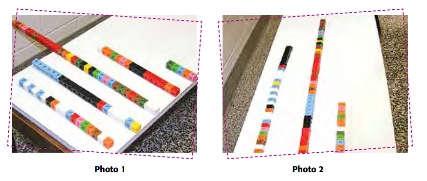 Image Above title "Photo 1": Five towers of different lengths made of colored interlocking cubes are lined up on a table. Above title "Photo 2": Three towers of different lengths made of colored interlocking cubes are lined up on a table.
Ask students to compare the different representations and to indicate some of the information that can be determined from each. For example, from the representation in increments of 3, they could say that the category 7-9 represents the number of activities in which the greatest number of students indicated that they would like to participate. They could also point out that from each of the representations, it can be concluded that a very small number of students want to participate in more than 10 activities.
Later, students could construct a pictograph or bar graph using the scales selected when constructing the concrete representation.
Before Learning (Warm-Up)
Duration: approximately 100 minutes
Research the Olympics with the students or read a children's book that contains this theme. Then introduce them to the 100-metre race, one of the events in the Summer Olympics, explaining that a 100-metre run is about the length of a soccer field.
Show students the results of the men's 100 metre gold medalists over the years by presenting Appendix 3.2. Encourage students to complete the appendix with results from the most recent Olympic Games. Encourage them to interpret this data by asking questions such as:
- How is the table organized?
- What information does this table give us?
- What do you notice about the results? (They are reported in seconds and parts of a second. For example, the result 9.95 means that the athlete completed the race in 9 seconds and 95 parts of 100 of another second, or almost 10 seconds)
- Who ran the fastest? the slowest? (Donovan Bailey, Allen Well)
- Why is the difference in results so small?
- What do you think the results of these same athletes would be in the 200 metres? Why?
Ask each student to estimate the number of seconds they think they will take to complete the 100-metre race, and then have them conduct an experiment to see how accurate they were.
Present the Task
Ask students to pose a question of interest which indicates the intent of the experiment (for example, How long does it take Grade 3 students to run the 100-metre race?) Remind them that the question should be clearly worded and should lead to data collection.
With the students, measure a 100-metre route in the gym or on the school grounds. Provide them with a few stopwatches.
Note: If students have never used a stopwatch before, allow them to take turns exploring how it works to ensure they are able to start, stop and reset it to 0.
Collecting Data
Discuss the most effective method of collecting and recording each student's results by asking questions such as:
- What information do we want to collect? (The time required for each student to run the 100-metre race.)
- How can the results be recorded? (By recording them in a table)
- Is it necessary to write down the names of the students when recording the results? Why? (No, it is not necessary to write down the name of each student because we are only interested in the time required to run the 100 metres. However, it can be done to ensure that all students complete the race and that no one runs it twice.)
- How can we ensure that the time for each run is measured accurately? (Each run can be timed by two people. If the results are too different, the student is asked to do the run again.)
Prepare a table on a large sheet of paper to record the results of the race. Discuss the essential components of the table, which are:
- the title (for example, Student Results in the 100 m);
- the number of columns or rows required;
- the designation of each column or row (for example, Name and Result in Seconds).
Have students take turns running the 100 metre race. When students have completed their race, they are given their results and asked to record them in the table.
When all students have run the 100 metres, transcribe the results to the computer and print a copy of the results table for each team of two students.
Example
| Student Results in the 100 m Race | |
|---|---|
| Name | Result in Seconds |
| Oriana | 35 |
| Isabel | 30 |
| Louise | absent |
| Terece | absent |
| Mireille | 29 |
| Julien | 26 |
| Chloe | 32 |
| Mia | 25 |
| Sienna | 30 |
| Patrick | 30 |
| André | 30 |
| Daniel | 26 |
| Matthias | 27 |
| Jean-Yves | 29 |
| Nicolas | 25 |
| Severn | 37 |
| Éloïse | 29 |
| Nicolas L. | 26 |
| Jack | 27 |
| Cameron | 37 |
| Alicia | 29 |
Active Learning (Exploration)
Duration: approximately 60 minutes
Organize the Data
Group students together and distribute a copy of the race results table to each team. Ask them to represent these results in a frequency table.
Example
Class Results in the 100 m Race
| Number of Seconds | Count | Number of Students |
|---|---|---|
| 25 |
| | |
2 |
| 26 |
| | | |
3 |
| 27 |
| | |
2 |
| 29 |
| | | | |
4 |
| 30 |
| | | | |
4 |
| 32 |
| |
1 |
| 35 |
| |
1 |
| 37 |
| | |
2 |
Distribute a large sheet of paper to each team and ask them to represent the results using the graph of their choice.
Circulate and observe students' work. If necessary, intervene by asking questions such as:
- What is the question of interest of our experiment?
- How do you represent the results of the race in each category?
- What intervals did you choose to define the categories?
As you circulate, select a few pictographs and bar graphs to use in the consolidation. Ensure that the selected graphs have some diversity in their components (title, axis labels, categories, legend, scales of intervals).
Consolidation of Learning
Duration: approximately 40 minutes
Analyze Data and Interpret Results
First, display to the class the pictographs selected during the exploration. Encourage students to analyze the data presented by asking questions related to each pictograph.
The following questions are specific to some of the graphs obtained during the learning situation; they are intended to provide an example of the paths to follow during the consolidation. It is preferable to work on only a few concepts per graph so that it is not always the work of the same team that is analyzed. Modify the questioning according to the graphs produced by the students.
Example 1
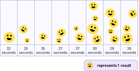 Image A table has 8 columns. Every yellow smiley face represents one result. The "32 seconds" column has one yellow smiley face. The "25 seconds" column has two yellow smiley faces. The "35 seconds" column has one yellow smiley face. The "27 seconds" column has two yellow smiley faces. The "37 seconds" column has two yellow smiley faces. The "30 seconds" column has 4 yellow smiley faces. The "29 seconds" column has 4 yellow smiley faces. And the "26 seconds" column has three yellow smiley faces.
- Do we know what the graph represents? Why? (No, because there is no title.)
- What does a picture represent? How do you know? (Each picture represents a student. This is indicated in the key.)
- What do you notice about the categories? (They are not in ascending order and each category represents only one race time)
- How can this mislead us? (Since 32 seconds is the first category, we may mistakenly think that this is the shortest time the students took to run the 100 metres.)
Example 2
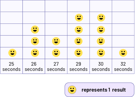 Image A table has 6 columns. Every yellow smiley face represents one result. The "25 seconds" column has one yellow smiley face. The "26 seconds" column contains three yellow smiley faces. The "27 seconds" column contains two yellow smiley faces. The "29 seconds" column contains 4 yellow smiley faces. The "30 seconds" column contains 4 yellow smiley faces. And the "32 seconds" column contains one yellow smiley face.
- How does this graph differ from the first? (The pictures are in a grid and the categories are placed in ascending order.)
- Why were some numbers between 25 and 37 not entered as a category? (Because these numbers correspond to race times that were not achieved.)
- Is it important to include these numbers? Why? (Yes, it is important because a category that has no data provides information. If this category does not appear on the graph, it could look like all the times from 25 to 37 seconds have been reached.)
- If all the categories from 25 to 37 were listed, there would be 13 categories in the graph. What could be done to reduce this number? (Categories could be grouped by intervals.)
Example 3
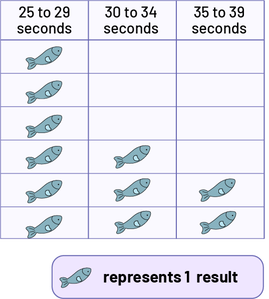 Image A table has three columns. Every fish image represents 1 result. In the "25 to 29 seconds" column, there are 6 fish. In the "30 to 34 seconds" column, there are 3 fish. And in the "35 to 39 seconds" column, there are 2 fish.
- What do you think of the picture used in this graph? (This may not be the best choice of picture because it may look like the graph represents the results of an experiment about fish.)
- How were the data grouped? What are the advantages and disadvantages of this grouping? (They were grouped into three categories based on 5-second intervals, so we can see that the majority of students run the 100-metre race in a time that varies between 25 and 29 seconds. However, a more accurate interpretation of the results could be made if we had a graph with smaller time intervals.)
Example 4
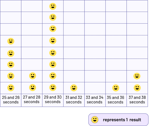 Image A table has 7 columns. Every yellow smiley face represents a result. The "25 and 26 seconds" column has 5 yellow smiley faces. The "27 and 28 seconds" column has 2 yellow smiley faces. The "29 and 30 seconds" column has 8 yellow smiley faces. The "31 and 32 seconds" column has one yellow smiley face. The "33 and 34 seconds" column has no yellow smiley faces. And the "37 and 38 seconds" column has two yellow smiley faces.
Note: This graph illustrates a questioning according to the three levels of comprehension.
Reading the Data (Level 1)
- How does this graph differ from the previous one? (The categories correspond to 2-second intervals and are represented at the bottom of the graph. Each picture represents 1 student.)
- In what time interval is the most data found? (In the 29 to 30 second interval.)
- What information can we determine from the graph in relation to the 33 to 34 second category?(We note that no students ran the 100 metre in 33 or 34 seconds.)
- How many students ran the 100-metre race in 25 seconds? (It is not possible to answer this question from the graph. All we can say is that 5 students completed the race in 25 or 26 seconds.)
Reading Between the Data (Level 2)
- What can you tell by comparing the data for some of the categories? (There are as many students in the 27 to 28 second interval as there are in the 37 to 38 second interval.)
Note Encourage the use of the phrases there is "more than," "less than," or "as many as" when students compare data.
- How many students ran the 100 metres in 30 seconds or less? (15 students)
Reading Beyond the Data (Level 3)
- What answer could be given to the question formulated at the beginning of the experiment, How long does it take for Grade 3 students to run the 100-metre race? (One could say that Grade 3 students take between 25 and 37 seconds to run the 100-metre race, but that the majority complete it in 30 seconds or less.)
- Based on the data in the graph, what do you think the class results would be in the 200-metre race? Justify your answer. (The 200-metre results could be in the range of 50-74 seconds because if you double the length of the race, you will double the time. You might even anticipate that it will be more, since you might slow down before the end of the race because you are tired.)
- Do you think students in another Grade 3 class would do the same in the 100-metre race? Why? (There may be some differences, but since they are the same age as us, the results should be similar.)
- If we ran outside instead of in the gym, would the results be the same? (They might be a little different because of the difference in the courses.)
- What could you do to improve your personal result? (I could practice running. I could race outside since it's a straight track.)
- Why is there so much difference between your results and those of the Olympic runners? (Because the Olympic runners are adults and have trained for a long time before competing in this event.)
Then display the bar graphs chosen during the exploration and repeat the same process, adapting the questioning to the specific components of the bar graph (for example, arrangement of the bars, choice of scale). Point out the similarities and differences between these graphs and the previous pictographs.
Differentiated Instruction
The learning situation can be modified to meet the different needs of the students.
| To Facilitate the Task | To Enrich the Task |
|---|---|
|
Provide students with:
|
Ask students to:
|
Follow-Up at Home
At home students can:
- research the results of the 400-metre race at the Olympics and compare them to the results of the experiment;
- run the 100-metre race with family members, time the runs with a watch, and represent the results in a graph. The next day, they can compare the range of data collected by all students to the range obtained from the survey (for example, 25 to 37 seconds).
Source: translated from Guide d’enseignement efficace des mathématiques, de la maternelle à la 3e année, Traitement des données et probabilité, p. 235-247.
Learning Situation 2: Books Well Organized!
Total duration: approximately 200 minutes
Summary
In this learning situation, students apply the inquiry process to the classification of picture books.
| Overall Expectation | Specific Expectations |
|---|---|
| D1. Data Literacy
Manage, analyze, and use data to make convincing arguments and informed decisions, in various contexts drawn from real life. |
D1.1 Sort sets of data about people or things according to two and three attributes, using tables and logic graphs, including Venn, Carroll, and tree diagrams, as appropriate. D1.2 Collect data through observations, experiments, and interviews to answer questions of interest that focus on qualitative and quantitative data, and organize the data using frequency tables. D1.3 Display sets of data, using many-to-one correspondence, in pictographs and bar graphs with proper sources, titles, and labels, and appropriate scales. D1.5 Analyse different sets of data presented in various ways, including in frequency tables and in graphs with different scales, by asking and answering questions about the data and drawing conclusions, then make convincing arguments and informed decisions. |
Learning Goals
The purpose of this learning situation is to have students:
- collect primary data;
- construct a bar graph;
- create and interpret a Venn diagram;
- make a classification according to certain criteria;
- practice the steps of the inquiry process.
| Learning Context | Prerequisites |
|---|---|
|
In the primary grades, students have used different ways of collecting and recording data (for example, frequency tables) and representing them (for example, pictographs, bar graphs, Venn diagrams) through inquiry. In Grade 3, they further develop their skills in interpreting results and constructing various graphs, again using the inquiry process. |
This learning situation allows students to build their skills related to data management by using the inquiry process to solve a problem situation. To be able to carry out this learning situation, students must be able to construct and interpret:
|
Mathematical Vocabulary
data collection, horizontal bar graph, vertical bar graph, Venn diagram, inclusion criteria, scale, frequency table, label
Materials
- illustrated books (1 per team)
- markers
- rules
- hoops (3, optional)
- containers (4)
- sticky notes
- Appendix 4.1 (1 per team)
- Appendices 4.2, 4.4 and 4.5 (1 copy of each per team)
- Appendix 4.3 (1 copy per student)
- Appendix 4.6 (optional)
Optional Preparatory Activity
This optional activity allows students to refresh their knowledge of constructing and interpreting a Venn diagram, as needed. Draw a Venn diagram on the board (Figure 1) and identify every category by one of the following inclusion criteria: multiple of 2, multiple of 5, and number greater than 25. Remind students that every criterion is used to determine whether an item (number, object…) is included in the category or excluded.
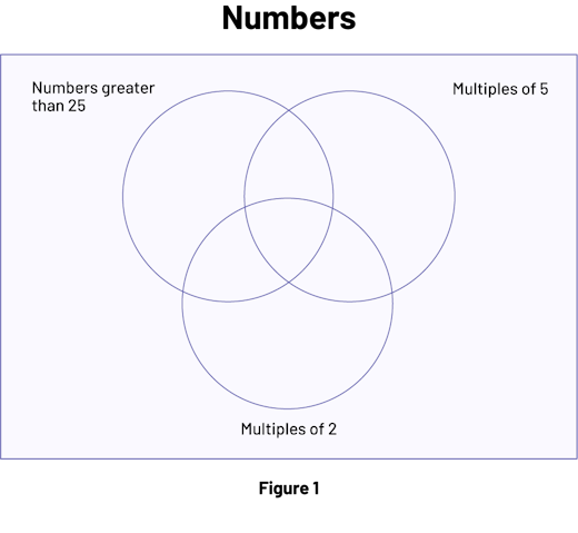 Image Figure one is a Venn diagram named “Numbers” that has 3 interlocking empty circles. The circle on the left is labeled "Number greater than 25", the circle on the right is labeled "Multiples of 5", and the bottom circle is labeled "Multiples of two".
Add some numbers (for example, 5, 12, and 20) in the graph (Figure 2) and ask students to interpret them (for example, where the number 20 is placed in this graph shows that it is both a multiple of 2 and a multiple of 5, but is not greater than 25).
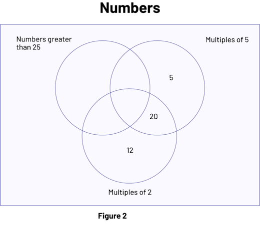 Image Figure two is a Venn diagram named “Numbers” that has 3 interlocking circles. The circle on the left is named "Number greater than 25" and is empty. The right circle is called "Multiples of 5"; it contains the number 5 in its exclusive part and it contains the number 20 in its part shared with the bottom circle. The bottom circle is named "Multiples of two"; it contains the number 12 in its exclusive part and it contains the number 20 in its part shared with the right circle.
Then invite students to place other numbers (for example, 63, 6, 7, 57, 52, 10, 18, 28, 13, 15, 35, 40, 31) in the diagram according to the criteria and explain their reasoning.
Before Learning (Warm-Up)
Duration: approximately 20 minutes
Day 1
Choose the illustrated books to be classified beforehand. Identify each book by a letter written on two sticky notes (the purpose of the second sticky note is explained later). Provide one book per team.
Note: Students will be asked to classify these books based on three attributes: font size, sentence length, and number of sentences. It is important that the books chosen represent a range of these attributes. The more similar the books are, the more difficult it will be for students to define the criteria for inclusion. Books that contain a short story are more suitable for this activity than non-fiction books, textbooks, or comic books.
Present the following scenario to students:
In Ms. Isabelle's* Grade 2 class, the books in the reading centre are not sorted. She is asking us to help her sort them into four groups based on their level of reading difficulty. The books in the same group will be put in the same container. She says that the level of difficulty of a book should be determined by the following attributes: font size, total number of sentences per book, and number of words in 10 sentences.
* To make it more authentic, use the name of a school staff member.
To help students understand the context, present two previously chosen books for each attribute, asking which one is easier to read. Let students explain their choice. For example, present:
- a book with a large font size (for example, 14 point, 16 point) and one with a smaller font size (for example, 10 point, 8 point);
- one book with few sentences (little text) and one book with many sentences (much text);
- one book with short sentences and one with long sentences (read a passage from each book).
Briefly explain the meaning of these three attributes.
- Font size: Font is the form of writing letters in a publication (for example, Arial Narrow or Times New Roman). Font size is defined in points. Project Appendix 4.1 (Font Size) to show students, for example, that a character with a size of 10 points is smaller than one with a size of 16 points.
- Total number of sentences per book: Review what a sentence is. In general, the way to recognize a sentence is to find its boundaries, either with the capital letter that marks the beginning and the period that marks the end.
- Number of words in 10 sentences: an attribute often used to assess the reading difficulty level of a book is the average number of words per sentence, in other words, the average length of sentences. However, since Grade 3 students have not yet fully mastered the concept of mean, it is sufficient to explain that they will have to count the total number of words in 10 randomly selected sentences in the text.
Active Learning (Exploration)
Duration: approximately 50 minutes
Note: The books will be categorized according to criteria related to the attributes. To determine these criteria, information about the books that will be categorized must first be available, so students will first need to conduct data collection on the three attributes: font size, total number of sentences in the book, and number of words in 10 randomly selected sentences.
Group students together and provide each team with a lettered book, Appendix 4.1 (Font Size) and a copy of Appendix 4.2 (Data Related to Books to be Graded).
Model a way to determine the font size used in a book. Then invite teams to determine what size is used in their book and record it on Appendix 4.2. Circulate among teams and assist students as needed.
Once all teams have finished, briefly review the definition of a sentence and model a strategy for determining the total number of sentences in a book. Invite teams to do the same with their books and record the result in Appendix 4.2. Circulate among teams and assist students as needed. Then model a strategy for determining the number of words in 10 randomly selected sentences, and have teams do the same with their books and record the result in Appendix 4.2.
As a class, emphasize that each team collected data for their book. In discussion with students, have them recognize that in order to determine the criteria for categorizing books by reading difficulty, it is important to have an overview of the data collected. Suggest that the tables in Appendix 4.2 would be helpful in organizing the data.
On large sheets of paper, reproduce the three tables and ask each team in turn to come up and record their results on these tables, and ask the other students to fill in their tables in Appendix 4.2 as the data are provided.
Once the tables are completed, initiate an interpretation of the results by prompting students to state conclusions (for example, among the books, font 14 is the most used; some books have few sentences; several books have short sentences).
Facilitate the discussion by asking questions such as:
- Does this data allow us to classify books into four categories at first glance? (No)
- Is there data that can help us group books? (Yes, if we compare one attribute at a time. For example, a book with many sentences is harder to read than one with fewer sentences.)
- Ms. Isabel chose her attributes so that the categories would reflect the level of reading difficulty of the books. Based on our results, is book A easier or harder to read than book G? (Book G has fewer sentences and fewer words than book A. The font size of book G is larger than that of book A. So, book G is easier to read than book A.)
- Based on our data, does one book seem easier to read than another? (It is difficult to compare the data in the three tables simultaneously.)
- How can we more quickly perceive the differences between books for the same attribute? (We would need to find a different way to organize and represent the data. Creating a bar graph would provide a different look at the data.)
Day 2
Duration: approximately 60 minutes
Review the previous task and suggest that students organize the data set by attribute using three bar graphs.
Re-form the same teams as on Day 1 and assign each team the responsibility of constructing a bar graph representing the data for one attribute, so there will be more than one team working on the graph representing the same attribute.
Distribute to every student a copy of Appendix 4.3 (Grid Paper) that will be used to construct the graph. Specify that this will be done in two parts: one student will construct a graph representing the data for one half of the books (for example, books identified by the letters A through H) and the other will do the same for the remaining books (for example, books identified by the letters I through O). Tell them that they will then have to combine the two graphs into one to illustrate the data set. Explain that it is important for both team members to determine in advance the orientation of the bars (horizontal or vertical) and the scale to be used (for example, each square represents 10 sentences).
As each student builds his or her section of the graph, circulate among the teams and assist them as needed. Take the opportunity to identify specific graphs that might enrich the discussion during the math exchange.
Once the individual graphs are done, take the two graphs of a team and model how to put them together, which is:
- fold the graph corresponding to the second half of the books along the vertical axis for vertical bar graphs (Figure 1) or along the horizontal axis for horizontal bar graphs;
- join the two graphs with tape or glue (Figure 2), taking care to keep the space between the bars the same.
Example
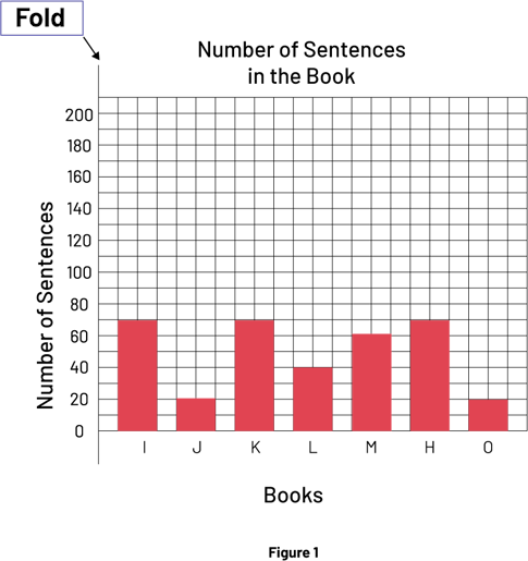 Image Figure one is a red 5-bar diagram named "Number of sentences in the book". Its vertical axis is named "Books" while its vertical axis is named "Number of sentences". The instruction "Fold" is indicated in the left corner. The first bar is located at the letter I on the horizontal axis and goes up to the number 70 on the vertical axis. The second bar is located at the letter J and goes up to the number 20. The third bar is located at the letter K and goes up to the number 70. The fourth bar is located at the letter L and goes up to the number 40. The fifth bar is located at the letter M and goes up to 60. The sixth bar is located at the letter N and goes up to the number 70. The seventh bar is located at the letter O and goes up to the number 20.
 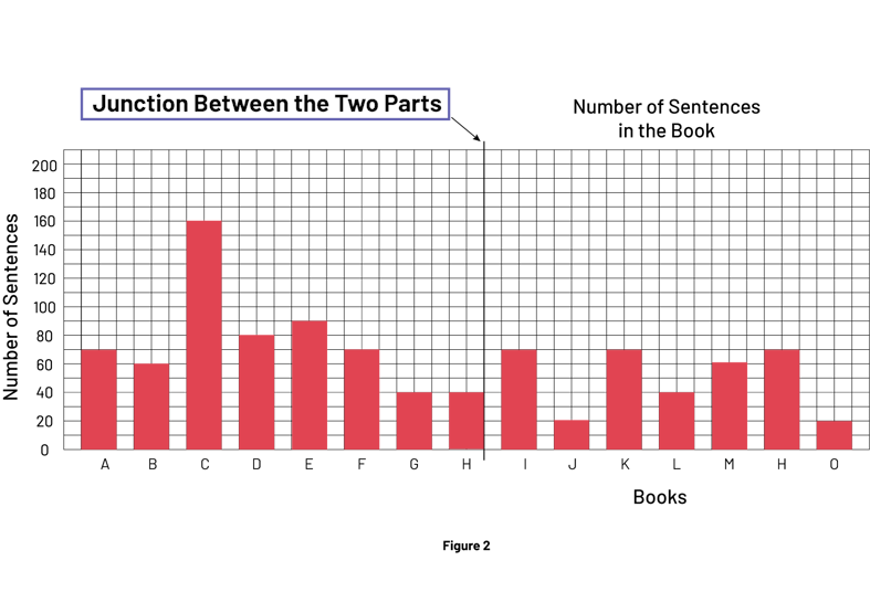 Figure two is a red 15-bar diagram named "Number of sentences in the book". Its vertical axis is labeled "Books" while its vertical axis is labeled "Number of Sentences". The instruction " Junction between the two parts " points at the top of the diagram, between the letter H and the letter I. The first bar is located at the letter A on the vertical axis and goes up to the number 70 on the horizontal axis. The bar B goes up to the number 60. The bar C goes up to 160. The bar D goes up to 80. The bar E goes up to 90. The bar F goes up to 70. The bar G goes up to 40. The bar H goes up to 1. The bar I goes up to 70. The bar J goes up to 20. The bar K goes up to 70. The bar L goes up to 40. The bar M goes up to 60. The bar N goes up to 70. And the bar O goes up 20.
Tell students to delete a title and label if they end up with duplicates. Once all the graphs are collected, display them on the wall, grouping them by attribute. Invite students to come up and look at the graphs showing the font size of the books. Invite one team to present and explain their graph.
Note: As an example, Appendix 4.4 (Bar graphs) presents a bar graph for each attribute, corresponding to the data collected during the testing of this learning situation. Most of the interpretations proposed in the following are derived from these graphs.
Encourage students to interpret the graphs by asking questions such as:
- Which of the graphs is easier to read or interpret? Why?
- What is the role of the title, labels, scale and bars in a bar graph?
- What is the difference between these graphs? (The scale, spacing of the bars, direction of the bars, color of the bars, width of the bars, etc., are different from one graph to another.)
- What is the effect of using a different scale on a graph? (The larger the scale, the clearer the difference between the values.)
- Looking at the graphs, what conclusions can be drawn? (For example, books G and J have the largest font size.)
- What font size comes up most often? What does it mean? (It's 14, which means that 14 point is the most common size used in our books.)
- What are the font sizes of our books? (Between 12 and 22 points.)
- Is it easier to compare the font size of the books in the graphs or in the table? Why? (In the graphs, because you can compare the length of the bars and, therefore, the font size of the books at a glance.)
Note: The purpose of this exchange is to point out to the class that all of these graphs of the same attribute represent the same data, regardless of scale or the length, width, and orientation of the bars.
Quickly redo the same exercise with the graphs corresponding to the other two attributes. Encourage students to recognize that, since every bar graph compares books based on a single attribute, it would be useful to find another type of graph to compare books based on multiple attributes. To do this, ask questions such as:
- From all these graphs, is it possible to classify our books into four groups reflecting the level of difficulty, according to the three attributes at the same time? (This is still difficult.)
- Could another kind of graph be used to compare all three attributes at the same time? (Have students suggest the Venn diagram.)
Tell students that the learning situation will continue the next day.
Day 3
Duration: approximately 55 minutes
Review previous tasks and explain to students that they will be using a Venn diagram to help them classify books according to their reading difficulty level.
Draw a large rectangle on the board. Inside the rectangle, attach three hoops with masking tape or draw three circles to form a Venn diagram.
Tell students that every circle will group books that are judged to have a higher level of reading difficulty based on one of the attributes. Explain that in order to complete the Venn diagram, each attribute must first be assigned an inclusion criterion, in other words, the threshold at which the level of reading difficulty is judged to be higher. Every criterion must therefore differentiate between easy and difficult books, and ensure that a certain number of books meet the criterion and are included in the set, and that others are not.
For each of the three attributes, select a graph from those constructed by the students and display them on the board. Invite students to investigate the graph representing font size, propose an inclusion criterion and justify their choice. Discuss the suggestions as a class and agree on the inclusion criteria by consensus. Record this criterion as a label in the Venn diagram on the board.
For example, in Graph 1 (Appendix 4.4), we see that the font size of all books is between 12 and 22 points. Almost half of the books are 14 points or smaller. Based on this observation, books with a font size of 14 points or smaller could be used as a criterion for inclusion in the first set, since text with a smaller font size is more difficult to read. Another criterion would be equally valid (for example, the size is 16 points or smaller, or even 18 points or smaller) as long as it is established by consensus.
Repeat the same process for each of the other two graphs.
As examples,
- in Graph 2 in Appendix 4.4, we see that the number of sentences in the books ranges from 27 to 161. One could then agree that the inclusion criterion will be 55 sentences or more, since the more sentences in a book, the more difficult it is likely to be to read.
- in Graph 3 (Appendix 4.4), we see that the total number of words in 10 sentences ranges from 55 to 162. We could then agree that the criterion for inclusion would be 80 words or more, since the more words in a text, the more difficult it is to read.
Re-form the same teams as on Day 2 and distribute a copy of Appendix 4.5 (Venn diagram) to each team. Ask them to complete the labels for each set as agreed upon and then to locate their book (using the letter identification) in the Venn diagram.
Note: It is important for students to justify where their book is placed; to make this easier, it may be suggested that they complete a copy of Appendix 4.6 (Criteria Analysis).
Sample Explanation Using Appendix 4.6
| Our book is identified by the letter K. | |
| The font size is 16. | The inclusion criterion for font size is 14 or less. Our book is therefore outside the circle corresponding to this attribute. |
| In our book, there are 73 sentences. | The inclusion criterion for the number of sentences is 55 or more. Our book is therefore inside the circle corresponding to this attribute. |
| In the 10 selected sentences, there are 55 words. | The inclusion criterion for the number of words in 10 sentences is 80 or more. Our book is therefore outside the circle for this attribute. |
| Our book is outside the circle for font size, inside the circle for number of sentences and outside the circle for number of words in 10 sentences. | |
This team then indicates the location of their book as follows.
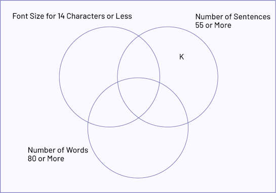 A Venn diagram has 3 interlocking circles. The left circle is named "Font size for 14 characters or less" and is empty. The right circle is named "Number of sentences 55 or more"; it contains the letter K in its exclusive part. The bottom circle is named "Number of words 80 or more" and is empty.
Have students fill in their Venn diagrams as they go(Appendix 4.5), then invite them to interpret the results and state conclusions by asking questions such as:
- What can be said about a book that is enclosed in a single circle? (It meets only one criterion.)
- What can be said about a book that is enclosed in two circles? (It meets two criteria.)
- What makes Book A different from Book C? (Book A meets two criteria, as it has more than 80 words in 10 sentences and more than 55 sentences, but the font size is not 14 point or smaller. Book C, on the other hand, meets all three criteria.)
- Are there any books that do not meet any of the criteria? Where are they found? (Yes. These books are placed in the rectangle, but outside the circles.)
- Do all books meet the same number of criteria? (No)
Consolidation of Learning
Duration: approximately 15 minutes
Encourage students to interpret the Venn diagram, asking questions such as:
- Where are the easiest to read books located in the diagram? Why are they said to be easier to read than the others? (They are located outside the three sets, but within the rectangle. They are easier to read because according to our data, a relatively large font is used and these books have few sentences and short sentences.)
- Based on the attributes used and the criteria stated, where are the most difficult books to read? How can you justify their degree of difficulty? (They are located within the intersection of the three circles. They are more difficult to read because according to our data, a relatively small font is used and these books have a large number of sentences and long sentences.)
- How could this diagram be used to categorize books into four groups based on their level of reading difficulty? (Books can be grouped according to whether they meet no criteria or one, two, or three criteria.)
Place four containers in front of the class and ask each team to place their book in the appropriate container, in other words, one container for books that meet no criteria, a second for those that meet one criterion, a third for those that meet two, and a fourth for those that meet three.
Ask the following questions:
- How are the books classified? (They are classified according to their level of reading difficulty based on the attributes given by Ms. Isabelle)
- How would we go about classifying new books for Ms. Isabelle's class? (Now that we have established the inclusion criteria for each attribute, we would check the font size, the number of sentences in the book, and the number of words in 10 randomly selected sentences. Then, depending on how many of the criteria the book meets, we would place it in the appropriate container, thus classifying it according to its reading difficulty level.)
Differentiated Instruction
The activity can be modified to meet the needs of the students.
| To Facilitate the Task | To Enrich the Task |
|---|---|
|
|
Follow-Up at Home
Ask students to determine whether the selection of books in Ms. Isabel's classroom reading centre is a good distribution of the four levels of reading difficulty and to construct an appropriate graph to support their answer. For example, they can construct a bar graph to represent the number of books at each level of difficulty and then compare the lengths of the bars. If the lengths are similar, then there are approximately the same number of books at each level of difficulty, so the distribution is good.
Source: translated from Guide d’enseignement efficace des mathématiques, de la 4e à la 6e année, Traitement des données et probabilité, p. 177-192.