D1.3 Display sets of data, using many-to-one correspondence, in pictographs and bar graphs with proper sources, titles, and labels, and appropriate scales.
Skill: Representing Data Sets
Once the data from an inquiry have been grouped into categories in a frequency table or similar, it is often very useful to represent it using a graph because of its visual impact. In effect, a graph:
- presents information in an organized manner;
- is generally easier to read and interpret than data represented using text or a table;
- allows you to see all the data at a glance and to get a first impression (for example whether or not the data is evenly or unevenly distributed between the categories);
- facilitates the next step in the inquiry process, which is the analysis of the data and interpretation of the results.
Source: translated from Guide d’enseignement efficace des mathématiques, de la maternelle à la 3e année, Traitement des données et probabilité, p. 86.
For example, students can represent a set of statistical data much more succinctly and effectively with a table or graph than with an oral description. However, they must learn to use the various conventional representations of data (for example, frequency table, pictograph, bar graph) correctly to ensure that the message being conveyed is the correct one and is understood by others. They can then use these representations to justify a reasoning or support an argument in a mathematical discussion with the class.
Source: translated from Guide d’enseignement efficace des mathématiques, de la maternelle à la 3e année, Traitement des données et probabilité, p. 30.
Representing data in tables and graphs helps communicate information for the purpose of interpreting that data.
Students must determine the best way to group the data collected in order to facilitate their analysis, and then choose an appropriate representation and construct it in such a way that ensures the clarity of the conveyed message.
Once the data has been collected and recorded, students must group it within a limited number of categories. There is no rule that dictates how to group the data. The choice of grouping depends largely on the type of data collected.
Source: translated from Guide d’enseignement efficace des mathématiques, de la maternelle à la 3e année, Traitement des données et probabilité, p. 80-81.
The source, titles, and labels provide important information about data in a graph or table:
- The source indicates where the data was collected.
- The title introduces the data contained in the graph or table.
- Labels provide additional information, such as the labels on the axes of a graph that describe what is being measured (the variable).
The order of the categories in graphs does not matter for qualitative data.
Source: The Ontario Curriculum. Mathematics, Grades 1-8 Ontario Ministry of Education, 2020.
Knowledge: Types of Graphs
Line Plot
The line plot is useful for representing a large amount of numerical data. Every data item is represented by an X and the Xs corresponding to the same quantity are arranged one above the other to form columns. Since the height of every column then suits the size of the frequency it represents, data analysis is easy.
Example
Teachers ask their students to check how many years their parents have lived in their current home. The results are represented by the following line plot.
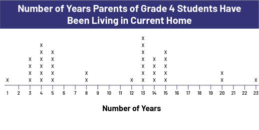 Image The count line is titled: "Number of parents grade 4 have been living in current home.” The line labeled "Number of Years" is scaled from 1 to 23. The number 1 shows the presence of one X. Number two has no Xs. Number 3 has 4 Xs. Number 4 has 6 Xs. Number 5 shows 5 X's. Numbers 6 and 7 show no Xs. Number 8 has two X's. Numbers 9, 10 and 11 have no Xs. Number 12 has one X. Number 13 has 7 X's. Number 14 has 4 X's. Number 15 has 5 X's. Numbers 16, 17, 18 and 19 have no X. Number 20 has 2 X's. The numbers 21 and 22 have no X. Number 23 has one X.
It is easy to see from the distribution of X's that there were two waves of moves, 3-5 years ago and 13-15 years ago, which could be the result of new housing construction or new jobs in the city.
Characteristics of a line plot:
- It has a title.
- It has a graduated horizontal axis with a label.
- Each piece of data is represented by an X. The Xs that represent the same numerical data are stacked and separated from each other by a constant space.
Source: translated from Guide d’enseignement efficace des mathématiques, de la 4e à la 6e année, Traitement des données et probabilité, p. 83-84.
Knowledge: Pictograph
A pictograph is similar to a bar graph except that pictos are used to form the bars. This type of graph is not only used in the primary grades; it is also used in newspapers and magazines.
A picto is a drawing or a pictorial symbol representing a physical object.
The choice of the picture is important. Ideally, the picture should evoke the data it represents. In addition, it is usually helpful to choose a picture that is easy to draw or copy and easy to cut into halves or quarters.
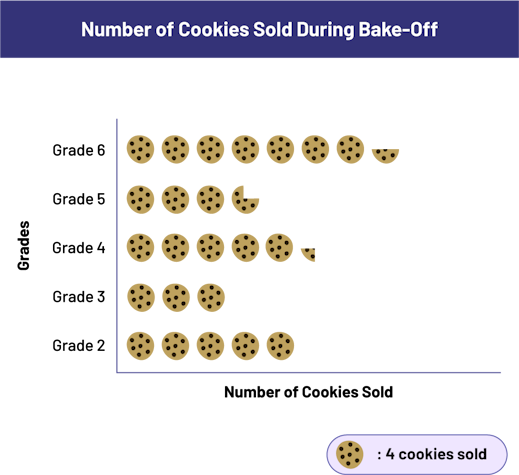 Image The pictogram chart is titled: "Number of cookies sold during bake-off". The horizontal axis is labeled "Number of Cookies Sold" and the vertical axis is labeled "Grades". The legend indicates that each cookie pictogram equals 4 cookies sold. Grade two displays 5 cookies. Grade 3 displays 3 cookies. Grade 4 displays 5 cookies and a quarter. Grade 5 displays 3 and three quarter cookies. Grade 6 displays 7 and a half cookies.
Characteristics of a pictograph:
- It has a title.
- It has an axis that indicates the categories.
- Both axes have a label.
- It uses a repeated picture to represent, horizontally or vertically, the number of data in each category.
- The spacing between the pictures is constant.
- It has a key that indicates what the picture represents.
Source: translated from Guide d’enseignement efficace des mathématiques, de la 4e à la 6e année, Traitement des données et probabilité, p. 82-83.
Knowledge: Bar Graph
The bar graph is used to represent the frequencies of a data set. It is composed of rectangular bars whose length corresponds to the size of the frequencies. It allows the reader to see, at a glance, the distribution of the data in each category.
Note: To facilitate the construction of bar graphs, it is recommended that students use graph paper.
In Grade 3, students begin to construct bar graphs in which they use a scale other than 1. However, this skill is not necessarily mastered by the time they reach the junior grades.
Teachers should provide students with activities that help them consolidate this skill. For example, they could be asked to represent the frequencies in the following table with a bar graph.
Birthdays According to the Seasons
| Season | Number of Students |
|---|---|
| winter | 24 |
| spring | 30 |
| summer | 48 |
| fall | 34 |
Some students might use intervals of 1 and construct a vertical bar graph (or a horizontal bar graph drawn along the length of the sheet). In this case, the longest bar will be 48 squares. Others might use intervals of 2 or 3 and construct their horizontal bar graph across the width of the paper. Teachers can then encourage students to compare the different graphs constructed, discuss the advantages and disadvantages of each and determine which one they like best. For example:
- With a scale of 1, it is easier to read the length of the bars, but the graph is very long and not very wide, and takes up a lot of space, which makes it look unattractive.
- With a scale of 2, the horizontal bar graph takes up almost the entire width of the page, and is also long and narrow.
- With a scale of 3, more care must be taken to determine the length of some of the bars (for example, the bar that represents 34 students). On the other hand, the graph only takes up about half the width of the page, and the ratio of the length to the width of the graph makes it pleasing to the eye. Students might then agree that the scale of 1 square to 3 students is the most practical.
After some time, students might reason as follows.
- I want my graph to take up about half the width of the page.
- According to the frequency table, the data goes up to 48.
- If each square represents 1 student, I don't have enough room.
- If each square represents 2 students, it takes up the entire width of the page.
- If each square represents 3 students, it takes up about half the page.
- So I can scale the horizontal axis from 0 to 48 by counting in intervals of 3.
This would give them the following graph.
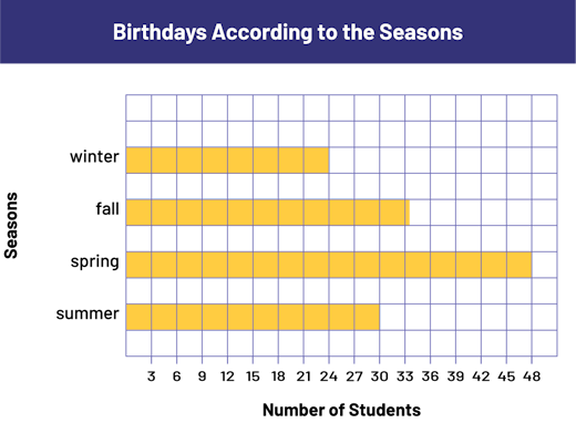 Image A diagram with 4 horizontal yellow bars is called "Birthdays Acccording to the Seasons". The horizontal axis is labeled "Number of Students", and the vertical axis is labeled "Seasons". In the spring, the bar indicates 30 students. In the summer, the bar indicates 48 students. In the fall, the bar indicates slightly more than 33 students. And in the winter, the bar indicates 24 students.
The frequencies 24, 30, and 48 are multiples of 3 and the bars representing them end precisely on vertical lines. To represent frequency 34, students must understand that since every square represents 3 students, the last square used must be divided into 3 equal parts. Students sometimes have challenges placing numbers along the number axis when they need to represent intervals other than 1. For example, some students tend to write 1, 2, 3 first and then continue by writing the numbers in intervals of 3 as shown below.
Therefore, teachers support them in recognizing that this is incorrect since the first three squares represent 1 student each while the subsequent squares represent 3.
Characteristics of a bar graph:
- It has a title (for example, Birthdays by season).
- It has an axis (vertical or horizontal) graduated in an appropriate scale.
- It has another axis that represents categories (for example, spring, summer, fall, winter).
- The two axes each have a label (for example, Number of Students, Seasons).
- The bars have the same width and their length corresponds, according to the scale chosen, to the size of the population they represent (for example, if the scale is in intervals of 1, a bar with a length of 3 represents a population of 3).
- The bars are separated by equal spaces.
Source: translated from Guide d’enseignement efficace des mathématiques, de la 4e à la 6e année, Traitement des données et probabilité, p. 71-74.