D1.3 Display sets of data, using many-to-one correspondence, in pictographs and bar graphs with proper sources, titles, and labels, and appropriate scales.
Activity 1: Jump Rope (Choose the Appropriate Type of Graph)
Materials
- skipping ropes (1 rope per team of two);
- large sheets of paper (1 sheet per group of 2);
- bingo marker;
- sticker;
- coloured pencils;
- rules;
- class list (1).
Summary
In this activity, students choose the type of graph that best represents the different data collected.
Procedure
The first part of the activity can be done as part of the physical education period. Group students in pairs and distribute a skipping rope to each team. Tell them that every student must take turns jumping until he or she misses a jump and that the other team member must count the jumps. Then have students switch roles.
Upon returning to class, have every student write their score next to their name on the class list. Give a copy of the class list with the results to every team, along with a large sheet of paper. Instruct students to construct a graph of their choice to represent the data on the number of successful skips. Circulate and ask questions such as:
- What type of graph did you choose and why?
- How will you organize your data?
- How did you label your axes?
- What does this number mean on your horizontal axis?
- Why did you use this scale?
Then invite teams to present their graphs and justify some of their choices (for example, choice of graph, labels, scale). If necessary, draw students' attention to problems that some graphs might pose.
Example 1
One team used the following intervals to organize their data: 0-5 jumps; 5-10 jumps; 10-15 jumps, etc. Ask them to explain in which interval they placed the data corresponding to 5 successful jumps; in the 0 to 5 jump interval or in the 5 to 10 jump interval? Then encourage them to create intervals that do not overlap.
Example 2
One team has constructed a bar graph in which there is a bar for each different number of successful jumps. Point out that it is difficult to interpret such a graph when there are a lot of bars and that creating intervals is a good way to reduce the number of bars.
Source: translated from Guide d’enseignement efficace des mathématiques, de la maternelle à la 3e année, Traitement des données et probabilité, p. 250-251.
Activity 2: Pictograph
Propose the question of interest below and guide the students while they collect and represent the data.
| Question of Interest | When two dice are rolled, what is the most likely result? |
| Type of Inquiry | Probability experiment |
| Type of Information | Quantity |
| Grouping of Data | Numerical categories |
| Data Representation | Pictures, one-to-one correspondence |
| Pictograph |  Image The title of the grid is "Rolling two dice, 20 times". The horizontal axis is called
"Dice total" while the vertical axis is called "Result Numbers". Total two gets one result, total 3 gets two
results, total 4 gets no result, total 5 gets 3 results, total 6 gets two results, total 7 gets 6 results,
total 8 gets one result, total 9 gets two results, total 10 gets no result, total 11 gets one result and
total 12 gets two results. Image The title of the grid is "Rolling two dice, 20 times". The horizontal axis is called
"Dice total" while the vertical axis is called "Result Numbers". Total two gets one result, total 3 gets two
results, total 4 gets no result, total 5 gets 3 results, total 6 gets two results, total 7 gets 6 results,
total 8 gets one result, total 9 gets two results, total 10 gets no result, total 11 gets one result and
total 12 gets two results. |
Sample questions:
- How can the data be collected? By observation, by survey, by experiments?
- What type of information are we looking for?
- What is the attribute described by the categories? (qualitative data or quantitative data)
- Which type of graph best represents the data?
- Would a range be needed for quantitative data?
Source: translated from Guide d’enseignement efficace des mathématiques, de la maternelle à la 3e année, Traitement des données et probabilité, p. 95.
Activity 3: Pictograph
Propose the question of interest below and guide the students while they collect and represent the data.
| Question of interest | What is the favourite fruit of the students in the class? |
| Type of inquiry | Survey |
| Type of information | Preference |
| Grouping of data | Nominal categories |
| Data representation | Pictures, two-to-one correspondence |
| Pictograph | 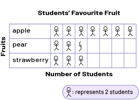 Image Title of the chart: Students' favorite fruits. Three fruits are named: apple, pear and
strawberry. Under the chart, it says, “Number of Students”. A matchstick figure represents two students. The
apple has one matchstick figure, the pear has two and a half matchstick figures, and the strawberry has
three matchstick figures. Image Title of the chart: Students' favorite fruits. Three fruits are named: apple, pear and
strawberry. Under the chart, it says, “Number of Students”. A matchstick figure represents two students. The
apple has one matchstick figure, the pear has two and a half matchstick figures, and the strawberry has
three matchstick figures. |
Sample questions:
- How can the data be collected? By observation, by survey, by experiments?
- What type of information are we looking for?
- What is the attribute described by the categories? (qualitative data or quantitative data)
- Which type of graph best represents the data?
- Would a range be needed for quantitative data?
Source: translated from Guide d’enseignement efficace des mathématiques, de la maternelle à la 3e année, Traitement des données et probabilité, p. 96.
Activity 4: Bar Graph
Propose the question of interest below and guide the students while they collect and represent the data.
| Question of interest | How many minutes do students take to bike to school from home? |
| Type of inquiry | Measurements |
| Type of information | Size |
| Grouping of data | Scales |
| Data representation | Bars of equal width |
| Bar graph | 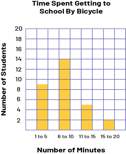 Image A yellow 4-bar grid chart illustrates the Time Spent Getting to School By Bicycle. The
horizontal axis is the number of minutes, and the vertical axis is the number of students. From 1 to 5
minutes, the bar counts 9 students. From 6 to 10 minutes, the bar counts 14 students. From 11 to 15 minutes,
the bar counts 5 students. And from 15 to 20 minutes, the bar counts 2 students. Image A yellow 4-bar grid chart illustrates the Time Spent Getting to School By Bicycle. The
horizontal axis is the number of minutes, and the vertical axis is the number of students. From 1 to 5
minutes, the bar counts 9 students. From 6 to 10 minutes, the bar counts 14 students. From 11 to 15 minutes,
the bar counts 5 students. And from 15 to 20 minutes, the bar counts 2 students. |
Sample questions:
- How can the data be collected? By observation, by survey, by experiments?
- What type of information are we looking for?
- What is the attribute described by the categories? (qualitative data or quantitative data)
- Which type of graph best represents the data?
- Would a range be needed for quantitative data?
Source: translated from Guide d’enseignement efficace des mathématiques, de la maternelle à la 3e année, Traitement des données et probabilité, p. 97.
Activity 5: Reorganize Our Data
Present Appendix 5.6 (Survey Results) Invite students to interpret the results by asking various questions such as:
- Whose house has the same number of televisions as yours? The same total number of residents in the house? The same number of children?
- Are there students who share more than one characteristic with you?
- What is the mode of each category?
- If we were to take this survey in our class, would the results be very different? Why?
Survey students in the class to determine, for each of the characteristics, the mode of data for each category. Ask them to compare the class data to that of the Grade 5 class at Sunflower School.
Source: translated from Guide d’enseignement efficace des mathématiques, de la 4e à la 6e année, Traitement des données et probabilité, p. 218.