D1.5 Analyse different sets of data presented in various ways, including in frequency tables and in graphs with different scales, by asking and answering questions about the data and drawing conclusions, then make convincing arguments and informed decisions.
Activity 1: What are Our Ecological Habits? (Collection and Analysis of Data Represented in a Frequency Table)
Summary
In this activity, students collect data about their good environmental habits and then represent them in a frequency table and interpret it.
Procedure
Discuss with the students the importance of taking environmentally friendly actions to protect their environment. Support them to recognize that an effective way to check if they have good environmental habits is to note in a table all the actions they take every week. Tell them that the next day they will take part in a survey that asks them how many environmental actions they took today.
As soon as the students arrive the next morning, ask them to record in a table the number of green actions they took during the day yesterday. Do the same for each day of the week, from Monday to Friday, recording the number of actions taken in the appropriate column of their table. This will help the students to develop a picture of their ecological habits.
Example
Number of Green Actions Taken on a Daily Basis
| Day of the Week | Number of Environmental Actions Taken |
|---|---|
| Monday | 3 |
| Tuesday | 2 |
| Wednesday | 5 |
| Thursday | 6 |
| Friday | 5 |
| Total | 21 |
After the data collection is complete, on a large sheet of paper or on the interactive whiteboard, draw a frequency table to determine the number of green actions taken by each student during the week.
Example of a frequency table
Green Actions Taken During the Week
| Number of Actions Taken | Frequency |
|---|---|
| No action taken | 0 |
| 1 to 5 actions | 6 |
| 6 to 10 actions | 9 |
| 11 to 15 actions | 8 |
| 16 to 20 actions | 6 |
| More than 20 actions | 1 |
Then encourage students to analyze and interpret the data presented above by asking questions such as:
- Did we collect data from every student in the class? How do you know? (Yes, we have all the data since there are 30 students in the class and if we calculate the total frequency, we get 30)
- The school environmental committee encourages students to take 6-10 green actions per week to protect their environment. Based on the data collected, are the students in our class taking enough action? (Just under a third of the students in our class are meeting the challenge. It is therefore important to continue to promote simple actions to be more environmentally friendly in our daily lives)
- Is it possible to know from this table how many students in our class took 7 green actions during the week? (No, this is not possible because the data has been grouped into categories. According to the frequency table above, 9 students did between 6 and 10 green actions during the week. It is therefore impossible to know how many students did 6, 7, 8, 9 or 10 things)
- In general, in your opinion, could we conclude that the students in our class have good environmental habits? Why or why not?
Note: Lead students to recognize that it is difficult to make such a judgment on data taken in a single week and that it would be better to collect such data over a period of at least a few months before drawing conclusions.
As an extension, have students represent the data in the frequency table using pictographs or bar graphs.
Source: adapted and translated from Guide d’enseignement efficace des mathématiques, de la maternelle à la 3e année, Traitement des données et probabilité, p. 248-250.
Activity 2: Comparison of Graphs
Two teams of students have created a bar graph to represent the data in the frequency table below. The teachers show both graphs to the class and ask them to check whether each one correctly represents the data.
Pancakes Eaten During Three Carnival Breakfasts
| Number of Pancakes | Frequency |
|---|---|
| 0-3 | 25 |
| 4-7 | 30 |
| 8-11 | 15 |
| 12-15 | 20 |
| 16-19 | 10 |
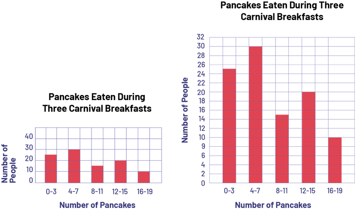 A red five-bar graph is titled "Pancakes Eaten During Three Carnival Breakfasts". The horizontal axis is called "Number of Pancakes" while the vertical axis is called "Number of People". Bar 0 to 3 goes up to number 25, bar 4 to 7 goes up to 30, bar 8 to 10 goes up to 15, bar 12 to 15 goes up to 20 and bar 16 to 19 goes up to 10.
Once students have confirmed that each graph correctly represents the data, encourage them to compare the graphs by asking questions such as:
- Do the two graphs lead you to the same conclusions?(No. The Team 1 graph leads me to conclude that the frequencies are about evenly distributed among the five categories. However,the Team 2 graph makes me see more clearly how much difference there is in the frequency of each category)
- What might explain why the two graphs do not lead you to the same conclusions?(The teams did not use the same scale along the vertical axis.)
- Which of the two graphs do you think best represents the data? Why?(I think it's the Team 2 graph because it's clearer that the frequencies are not evenly distributed among the categories.)
Source: translated from Guide d’enseignement efficace des mathématiques, de la maternelle à la 3e année, Traitement des données et probabilité, p. 111-112.