D1. Data Literacy
Manage, analyse, and use data to make convincing arguments and informed decisions, in various contexts drawn from real life.
Learning Situation: An Activity Full of Twists and Turns
Total duration: about 1.5 hours
Summary
In this learning situation students use a double-bar graph to compare primary and secondary data.
| Overall Expectation | Specific Expectations |
|---|---|
|
D1. Data Literacy manage, analyse, and use data to make convincing arguments and informed decisions, in various contexts drawn from real life. |
D1.2 Collect data from different primary and secondary sources to answer questions of interest that involve comparing two or more sets of data, and organize the data in frequency tables and stem-and-leaf plots. D1.3 Select from among a variety of graphs, including multiple-bar graphs, the type of graph best suited to represent various sets of data; display the data in the graphs with proper sources, titles, and labels, and appropriate scales; and justify their choice of graphs. D1.5 Determine the mean and the median and identify the mode(s), if any, for various data sets involving whole numbers, and explain what each of these measures indicates about the data. D1.6 Analyse different sets of data presented in various ways, including in stem-and-leaf plots and multiple-bar graphs, by asking and answering questions about the data and drawing conclusions, then make convincing arguments and informed decisions. |
Learning Goals
The purpose of this learning situation is to have students:
- analyze the data contained in a frequency table or table and draw conclusions;
- conduct an experiment for the purpose of collecting primary data;
- effectively and accurately represent and communicate the comparison between two data sets;
- apply problem-solving strategies.
| Learning Context | Prerequisites |
|---|---|
|
In previous grades, students have worked with data and the idea that representing data correctly is essential for accurate interpretation. In activities, they have used a variety of data representations, such as the frequency table, the pictograph and the bar graph. In Grade 4, students extend their knowledge of these representations and learn to use a multiple bar graph to represent and compare data. |
This learning situation exposes students, in the context of an experiment, to collect primary data and use this data set to compare with another data set from a secondary source, through the use of a double-bar graph. To be able to complete this learning situation, students will:
|
Materials
- Appendix 5.3
-
table tennis balls (one per team)
-
measuring tapes (one per team)
-
masking tape
-
large sheet of paper (one per team)
-
different coloured markers (two per team)
Mathematical Vocabulary
bar graph, double bar graph, legend, label, scale, frequency table, primary data, secondary data, mode.
Before Learning (Warm-Up)
Duration: approximately 20 minutes
Note: This activity can be done in the classroom, outside, in a hallway or in the gym.
Present students with the following scenario:
A manufacturing company is developing a new ball, the Bondiball. According to its inventors, this ball bounces very easily. The company believes that this characteristic is important to users, and has developed the following graph to demonstrate the bounciness of the Bondiball. (Present Appendix 5.1.)
image The purple five bar graph is titled: 'Number of Bondi Ball rebounds in relation to the height it falls from'. The horizontal axis is named 'Height in meters' while the vertical axis is named 'Number of rebounds'. The bar at zero point one on the horizontal axis goes up to two on the vertical axis. The bar at zero point five goes up to 4. The bar at one goes up to 9. The bar at one point five goes up to ten. And the bar at two goes up to 11.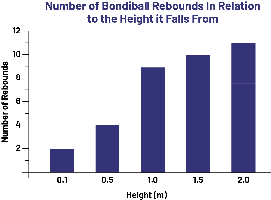
Ask students to identify the information that is communicated through this graph. Give them a few minutes to observe and analyze the data presented.
After having collected a number of observations, continue with the situation:
Convinced that their new ball is the best bouncing ball, the company suggests that we compare the bounces of the Bondiball with the bounces of another ball. I suggest that we take up their challenge and use a table tennis ball. Which ball do you think will have the most amount of bounces, and why?
Accept students' hypotheses, then suggest that they conduct an experiment to test them. To help them plan for data collection, ask questions such as:
- How could the results be obtained with the table tennis ball? (You could drop a table tennis ball and count the bounces)
- How do you think we should proceed to make our comparison valid? (We should drop the ball from the same heights as shown in the Bondiball diagram)
- What are some ways we can make sure the data we are collecting is aligned to the secondary data that was given? (We need to make sure the same location of the ball is being used to measure the height from which it is being dropped - top of the ball, bottom, etc. We need to make sure we drop the ball without giving it momentum. We should also do the experiment several times to ensure we get similar results each time.)
Tell students that they will be conducting the experiment in teams. Explain that each team will drop a table tennis ball ten times from an assigned height and will record the number of times the ball bounces on each attempt. Then model the procedure to follow during the experiment:
- go to a workstation with a table tennis ball, masking tape and measuring tape;
- mark on the wall, with a piece of masking tape, one of the heights that will be assigned (for example, 2 m);
- without applying force, drop the ball from the height indicated by the masking tape;
- count the number of bounces as the students do and record it on a piece of paper (specify what constitutes a bounce and when to stop counting bounces).
Repeat the last two steps a few times. Emphasize that the goal of the experiment is to obtain data for the table tennis ball that is comparable to the data provided by the company, and that a representation of this data will need to be found that shows the comparison.
Active Learning (Exploration)
Duration: approximately 50 minutes
Form teams. Assign each team a workstation and one of five heights (0.1 m, 0.5 m, 1 m, 1.5 m, or 2 m) from which to conduct the experiment, making sure to assign each height to two different teams.
Have students complete 10 trials at each height. Suggest that they first determine a way to record the results of their experiment, in other words, the number of times the ball bounces at each height for each trial. Then provide them with a table tennis ball, masking tape, and a tape measure.
Allow sufficient time for all teams to complete the experiment. Circulate and observe student work, and engage them in conversations about their work by asking questions such as:
- How are you recording your results?
- Are you surprised by the results? Why?
- Why did you choose this type of table?
| Possible Observations | Possible Interventions |
|---|---|
| One team is having difficulty counting the number of rebounds correctly. |
Review what constitutes a rebound. Suggest that they count the bounces aloud and systematically record each result on a chart. |
| A team lacks rigor when counting rebounds. |
Model again the last two steps of the procedure. Emphasize the importance of being consistent in order to achieve appropriate results. |
Have each team identify the most accurate number of bounces for each height and record these into the class results table.
Results table
| Team | Height (m) | Number of Bounces of the Table Tennis Ball | |||||||||
|---|---|---|---|---|---|---|---|---|---|---|---|
| 1 | |||||||||||
| 2 | |||||||||||
| 3 | |||||||||||
| 4 | |||||||||||
| 5 | |||||||||||
| 6 | |||||||||||
| 7 | |||||||||||
| 8 | |||||||||||
| 9 | |||||||||||
| 10 | |||||||||||
When all teams have recorded their results, present the results table. As a class, ask students to suggest a value for each of the heights that would best represent the number of bounces the table tennis ball makes. Lead students to recognize that the most frequent result would be an appropriate value and that this result is called the mode of a data set. Have students determine the mode of the data for each of the heights and record these results in a frequency table. Once the frequency table is completed, ask the question, "What graph would allow us to compare, for each of the heights, the number of bounces of the Bondiball and the number of bounces of the table tennis ball?" Allow students to present their suggestions.
Show Appendix 5.3, which shows the Bondiball manufacturer's bar graph (graph 1) as well as an example of a double bar graph (graph 2) showing sport preferences for a Grade 5 class. Invite students to compare the two types of graphs and point out similarities and differences. For example, the double bar graph has the same components as the bar graph, namely:
- a title (Favourite Sports of Grade 5);
- a label on each axis (Number of students, Sports);
- an appropriate vertical scale (intervals of two);
- bars of the same width;
- the same distance between the bars;
- category designations (field hockey, basketball, soccer, soccer, other).
On the other hand, the double bar graph includes:
- one coloured bar per category (one yellow and one red bar);
- a legend that indicates what each colour represents (yellow bars represent data for girls and red bars represent data for boys).
Lead students to see that the double bar graph allows for easy comparison of results, interpretations and drawing of conclusions.
Have students reform their teams and give each team a large sheet of graph paper and two different coloured markers. Have each team create a double bar graph to represent the data from the frequency table (number of bounces with the Bondiball and the table tennis ball).
Allow time for students to complete their diagrams. Circulate and, if necessary, assist students by asking questions such as:
- Are the bars the same width?
- Is there the same gap between the double bars?
- What do the yellow bars represent? The green bars?
- What is the title of your graph?
- Can you show me the tape that shows the number of bounces the Bondiball makes when it falls from a height of 1.5 metres?
Consolidation of Learning
Duration: approximately 15 minutes
Invite a few teams to present their graphs to the class and explain them. Allow other students to speak, while asking them to justify their comments and questions. If necessary, ask questions such as:
- When you look at the graphs, is there anything that you wonder about?
- What does this bar represent?
- How are the graphs the same? How are they different?
Discuss the results of this experiment by asking questions such as:
- Why didn't you all get the same results in the experiment?
- In general, do you come to the same conclusion?
- What measures were taken to ensure that the data is consistent (reliable) between all of the teams?
- Based on your results, can we determine which ball bounces higher? How could we verify this? (Since the experiment did not involve measuring bounce height, we cannot determine which ball bounces higher. To do so, we would need to obtain data from the manufacturer regarding the bounce height of the Bondiball and then conduct an experiment to obtain data comparable to the table tennis ball.)
Lead students to recognize the usefulness of the double bar graph in this situation and to formulate conclusions. For example:
- From the double bar graph, we can recognize that the further the balls fall, the higher the number of bounces.
- The table tennis ball makes more bounces than the Bondiball.
Differentiated Instruction
The activity can be modified to meet the needs of the students.
| To Facilitate the Task | To Enrich the Task |
|---|---|
| To make it easier, eliminate the 0.1 m and 0.5 m heights from the experiment. |
|
Follow-Up at Home
Bring a stack of mail from various sources to class and present the following scenario:
When I get home at the end of the day, I pick up my mail. I've gotten into the habit of sorting it into two categories: envelopes and advertising flyers. (Model sorting with the mail brought in.) Your parents may be doing the same thing with the contents of your mailbox. The other day, as I was sorting, two questions came to mind:
- In general, are we getting more envelopes or more flyers?
- Does the number in each category vary by day of the week?
Suggest that students help you answer these questions by taking part in a survey. Ask them to check the mail they receive at home every night for a week and record the number of envelopes and flyers in it. Make sure everyone understands the task at hand.
Each day, determine with students the total number of documents received by the entire class in each of the two categories and record this data in a frequency table like the following table.
Example
| Day | Number of Envelopes | Number of Advertising Flyers |
|---|---|---|
| Monday | 68 | 84 |
| Tuesday | ||
| Wednesday | ||
| Thursday | ||
| Friday |
A few times during the week, prompt students to analyze the data by asking questions such as:
- Were there more envelopes or flyers yesterday?
- So far, which category has the highest frequency?
- Based on the data collected so far, are you able to predict whether, by the end of the week, flyers will represent more than half or less than half of the mail received?
When all the data have been collected, have students note the data in the frequency table, plot the data on a bar graph, and answer the two questions that prompted the survey. Analyze the graphs and the answers to the questions as a class.
Alternative
Keep the data collected and repeat the experiment at another time of year (for example, around a holiday, winter break). It would then be possible to compare the two sets of data, draw further conclusions and make interesting connections.
Source: translated from Guide d’enseignement efficace des mathématiques, de la 4e à la 6e année, Traitement des données et probabilité, p. 207-216.