D1.3 Select from among a variety of graphs, including multiple-bar graphs, the type of graph best suited to represent various sets of data; display the data in the graphs with proper sources, titles, and labels, and appropriate scales; and justify their choice of graphs.
Activity 1: Choosing the Most Appropriate Representation for a Data Set
Present the following scenario to the students.
Using a written questionnaire, Vincent asks a question of interest to the students in his class and their parents about the choice of food for the end-of-year celebration: What food would the children and parents like for the end-of-year celebration?
He has represented the data that he collected in the following frequency table and graphs.
Food Chosen by Children and Parents
| Food | Children | Parents |
|---|---|---|
| Hamburgers | 4 | 10 |
| Hot dogs | 7 | 2 |
| Pizza | 9 | 8 |
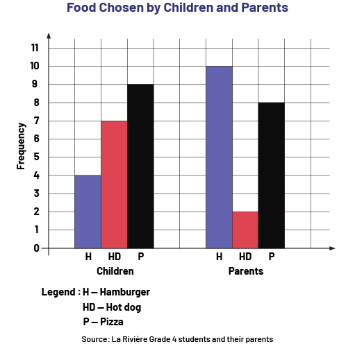 image The violet and red 6-bar chart is titled: "Food chosen by children and parents". The source is from La Rivière Grade 4 students and their parents. Caption: The six purple and red bar graph is entitled: "Food chosen by children and parents". The source is from the students and parents of the fourth grade class at La Rivière School. Legend: EN equals children. CC equals hot dog. The horizontal axis shows the pizza, hot dog and hamburger dishes chosen by the children and then by the parents. The vertical axis corresponds to the frequency. For pizza, the purple bar named EN goes up to 9. The red bar named P goes up to 8. For hot dogs, the purple bar named EN goes up to 7, and the red bar named P goes up to two. For hamburgers, the purple bar named EN goes up to 4, while the red bar named P goes up to ten.
Source: translated from En avant, les maths!, 4e année, ML, Données, p. 7-8.
Ask students to indicate which representation best illustrates the answer to the question and to justify their answer.
Activity 2: Representing Data with Frequency Tables
Present the frequency table below to students. It represents the answer to the question, "What is your favourite game?".
Favourite Games
| Games | Children | Parents | Grandparents |
|---|---|---|---|
| Puzzles | 1 | 5 | 19 |
| Lawn Bowling | 0 | 9 | 22 |
| Iron | 0 | 8 | 16 |
| Board games | 2 | 6 | 14 |
| Electronic games | 17 | 9 | 0 |
| Other | 0 | 3 | 9 |
Ask students to create a representation of the data.
Then, ask the students the following questions.
- Why did you choose to represent the data with these graphs?
- Which of the graphs do you think best represents the data above? Why?