D1.4 Create an infographic about a data set, representing the data in appropriate ways, including in frequency tables, stem-and-leaf plots, and multiple-bar graphs, and incorporating any other relevant information that helps to tell a story about the data.
Activity 1: Creating an Infographic to Represent a Data Set
Present the following situation to the students.
The Grade 4 students at Grands Prés School would like to put on a talent show during the school year to raise money for the end of year field trip. In order to convince the school administration of their fundraising idea, the students decided to collect data and create an infographic of it.
Here are two questions of interest that were posed to the junior students at Grands Prés School in preparation for the upcoming school year.
- How many shows would you like to participate in or attend?
- If you want to participate in the shows, what is your talent?
Here are the results:
Number of Talent Shows for the Next School Year
| Number of Talent Shows | Number of Grade 4 Students | Number of Grade 5 Students | Number of Grade 6 Students |
|---|---|---|---|
| 1 | 31 | 28 | 21 |
| 2 | 43 | 29 | 21 |
| 3 | 11 | 16 | 20 |
| 4 | 4 | 2 | 12 |
| 5 | 0 | 1 | 7 |
| Other | 0 | 2 | 1 |
The Talents of the Students of Des Grands Prés School Who Wish to Participate in the Shows
| Talents | Number of Grade 4 Students | Number of Grade 5 Students | Number of Grade 6 Students |
|---|---|---|---|
| Singing | 4 | 2 | 2 |
| Musical instruments | 0 | 3 | 3 |
| Dance | 3 | 5 | 7 |
| Sports | 4 | 1 | 0 |
| Theater | 0 | 1 | 3 |
| Other | 1 | 1 | 0 |
After surveying some of the students' parents, here is the amount of money that parents are willing to pay to attend the Grands Prés school show.
| Amount ($) That Parents are Willing to Pay for Each Ticket | |
|---|---|
| Parents of Grade 4 Students | 30; 25; 20; 15; 5; 5; 10; 15; 30; 5; 5; 30; 30; 25; 20; 20; 20; 15; 5; 10; 5; 30; 15; 25; 20; 25; 20; 25; 5; 5; 10; 15; 5; 5 |
| Parents of Grade 5 Students | 5; 10; 15; 30; 25; 25; 25; 15; 5; 5; 5; 5; 10; 15; 10; 10; 5; 5; 30; 5; 10; 10; 5; 5; 5; 5; 30; 25; 10; 10; 15; 5; 5; 5 |
| Parents of Grade 6 Students | 5; 5; 5; 10; 15; 15; 15; 20; 30; 10; 10; 5; 15; 5; 5; 5; 5; 20; 20; 20; 15; 30; 5; 10; 30; 15; 20; 25; 5; 10; 5; 5 |
Have students present the above data using various types of graphs and create an infographic that allows them to tell a story about these sets of data.
Source: translated from En avant, les maths!, 4e année, ML, Données
Activity 2: Analyzing an Infographic and Identifying its Various Components
Present the infographic below to students.
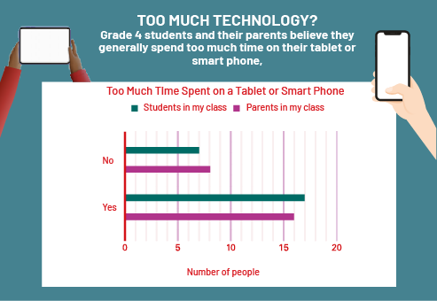
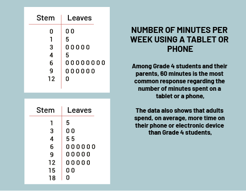
image 1) At the top of the infographic is the title: Technology at Our Service, under which appear illustrations of hands holding smartphones. At the bottom, it says: "Completed March 30th". Below this image is a graph with blue-gray and plum-coloured bars entitled "Reasons for using a tablet or a phone". The horizontal axis is named "Reasons", while the vertical axis is named "Number of people". The blue-gray colour corresponds to the results of the students in my class while the plum colour corresponds to the results of the parents in my class. For texts, the blue-gray bar rises to three while the plum bar rises to 5. For calls, there is no blue-gray bar while the plum bar rises to 5. For the games, the blue-gray bar rises to 8 while the plum bar rises to one. For photos, the blue-gray bar rises to one while the plum bar rises to 4. For videos and movies, the blue-gray bar rises to 11 while the plum bar rises to 4. And for social media, there is no blue-gray bar, while the plum bar rises to three. To the left of the diagram and below it, we find the following text: REASONS TO USE IT. The survey shows that the reasons for using a smart device vary among Grade 4 students and their parents. Students mainly use their device for films and games, whereas parents use them to text or make phone calls.2) First illustration: One chart reads, "Too much technology? Grade 4 students and their parents believe they generally spend too much time on their tablet or smart phone." The green and purple horizontal bar graph is titled "Too much time spent on a tablet or phone." The horizontal axis is named "Number of People" while the vertical axis offers yes or no options. The green bars correspond to the students in my class, while the purple bars correspond to the parents in my class. For the no option, the green bar reaches the number 7, while the purple bar reaches the number 8. For the yes option, the green bar reaches the number 17, and the purple bar reaches the number 16.Second illustration : “Among Grade 4 students and their parents, 60 minutes is the most common response regarding the number of minutes spent on a tablet or a phone.The data also shows that adults spend, on average, more time on their phone or electronic device than Grade 4 students.” Two tables with two columns count stems and leaves. For the first table, at zero stems, the number zero is found twice in the "leaves" column. At one stem, the number five is found once in the "leaves" column. At three stems, we find five times the number zero in the "leaves" column. At 4 stems, the number five is found once in the "leaves" column. At 6 stems, we find 8 times the number zero in the column "leaves". At 9 stems, we find 6 times the number zero in the column "leaves". And at 12 stems, we find one time the number zero in the column "leaves". For the second table, for one stem, we find once the number five in the column "leaves". For 3 stems, we find two zeros in the column "leaves". For 4 stems, we find twice the number five in the column "leaves". For 6 stems, we find 6 times the number zero in the column "leaves". For 9 stems, we find five times the number zero in the column "leaves". For 12 stems, we find five times the number zero in the column "leaves". For 15 stems, we find two times the number zero in the column "leaves". And for 18 stems, we find once the number zero in the column "leaves". Source: Grade 4 students from the school Les étoiles du monde.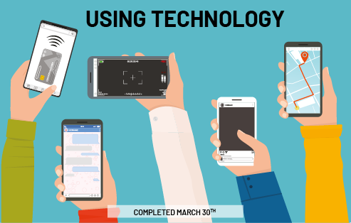

Source: translated from En avant, les maths!, 4e année, ML, Données, p. 18.
Ask students the following questions:
- What is this infographic for?
- What are its characteristics?
- Who is the target audience?
- What data representations were used in this infographic?
- What information do you find interesting?