D1.6 Analyse different sets of data presented in various ways, including in stem-and-leaf plots and multiple-bar graphs, by asking and answering questions about the data and drawing conclusions, then make convincing arguments and informed decisions.
Activity 1: Analysis of a Double Bar Graph
Conduct a survey of a set of students in the school, according to their grade, and present the results in a double bar graph or present them with the following graph.
image A chart with yellow and purple horizontal double bars is titled "Pets of Grade 1 to 6 Students ." The yellow bars correspond to students in grades one through three, while the purple bars correspond to students in grades four through six. The horizontal axis is named "Number of Students" and is graduated from 0 to 50, while the vertical axis is named "Pets". For the dog, the yellow bar stops between 40 and 45 while the purple bar goes slightly over 45. For the cat, the yellow bar is slightly over 35 while the purple bar is slightly over 30. For the bird, the yellow bar reaches five while the purple bar stops before five. For fish, the yellow bar stops between 15 and 20 while the purple bar stops between five and ten. For "other animal", the yellow bar stops a little before ten and the purple bar goes slightly over ten. And for "no animal", the yellow bar reaches 40 while the purple bar reaches 35.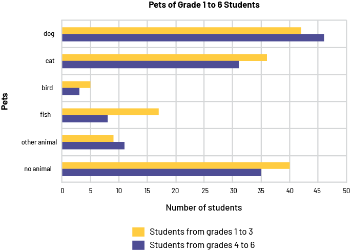
Read the Data
Relevant questions
- What is the graph about? (The pets of students in grades 1-6 are listed.)
- How many students in grades 1-3 have a bird? How do we know? (Five students have a bird. You can tell by the fourth orange bar above the horizontal axis.)
- How many categories are there? (There are six categories.)
- What is the scale on the horizontal axis? (The horizontal axis is graduated from 0 to 50, in intervals of 10.)
- What does the vertical axis represent in this bar graph? (The vertical axis represents the categories of pets.)
- What does the longest blue bar represent? (It represents the number of students in grades 4-6 who have a dog as a pet.)
- What is the most common pet for students in grades 1 to 3? for students in grades 4 to 6? (For elementary students, the most common pet is a dog: 42 students. For junior students, it is also a dog: 46 students.)
Read Between the Data
Relevant questions
- Can we say that the bird is the least common pet among students in grades 1-6? How can we demonstrate this? (Yes, the bird is the least common pet among students. For each category, we add the length of the orange bar and the length of the blue bar, which is the total number of students in that category. We get the lowest total, 8, for the bird.)
- Do more students own a cat than the total number of students who own a fish or other animal? (Yes, there are more students who have a cat than students who have a fish or other animal, as 67 students have a cat, while 25 students have a fish and 20 students have another animal, for a total of 45 students)
- According to Canadian research, cats followed by dogs are the two most popular pets in Canada. Is this the case for the pets of the students in the graph? (No, because if we add up the data for elementary and junior students in each category, we get, in descending order, 88 students who have a dog, 75 students who have no pets, 67 students who have a cat, 25 students who have a fish, 20 students who have some other animal, and 8 students who have a bird)
Reading Beyond the Data
Relevant questions
- Do you think that dogs are the most common pet in Kindergarten classrooms? Why? (Possibly, because according to the table, many more students in grades 1-6 have a dog than any other animal and this must be the situation among Kindergarten students.) or (The survey does not tell because it was only conducted with students in grades 1-6 and it is known that students' tastes may be different depending on their age)
- If the survey is repeated with other response choices, do you think the results will be similar? (Yes, if the dog is kept as one of the choices, since that choice is still likely to get the highest frequency. On the other hand, if the dog is not one of the animals presented, it may be that the "other animal" category gets the highest frequency.)
- How else might the data be organized? (By grouping the data for students in grades 1-6 as in the table below, we can analyze student preference in general.)
Pets for Students in Grades 1-6
| Pets | Number of Students |
|---|---|
| dog | 88 |
| cat | 67 |
| bird | 8 |
| fish | 25 |
| other animal | 20 |
| no animals | 75 |
| Total | 283 |
- What new information does the table provide? (The overwhelming majority of students discussed have pets and prefer four-legged animals, with 155 students having dog(s) and cat(s) at home.)
- What other questions can you ask from the graph? (Comparing the Primary and Junior students, in which category is there the greatest difference? Which animals might be in the "other animal" category?)
Source: translated from Guide d’enseignement efficace des mathématiques, de la 4e à la 6e année, Traitement des données et probabilité, p. 91-97.
Activity 2: Analysis and Comparison of Double Bar Graphs
The following graphs were constructed from secondary data collected in various tables on the Natural Resources Canada website.
image Graph1: A purple and red double bar graph is entitled "Metal Production in Ontario and Canada in 2004". The purple bars are for Ontario, while the red bars are for Canada. The horizontal axis represents the metals while the vertical axis represents the quantity in thousands of tons. For copper, the purple bar stops just before 200, while the red bar stops between 500 and 600. For nickel, the purple bar stops very slightly above 100, while the red bar stops very slightly below 200. And for zinc, the purple bar stops slightly below 100 while the red bar stops between 700 and 800. Figure Two is a purple and red double bar graph titled "Metal Production in Ontario and Canada in 2004". The purple bars are for Ontario, while the red bars are for Canada. The horizontal axis represents the metals while the vertical axis represents the quantity in tons, from zero to 2500. For cadmium, the purple bar stops between zero and 500, and the red bar stops above 500. For cobalt, the purple bar stops before 1500, and the red bar exceeds 2000. For gold, the purple bar stops just above zero, as does the slightly longer red bar. For platinum, the purple and red bars form a thin line above zero. For silver, the purple bar stops closer to zero than 500, and the red bar stops between 1000 and 1500.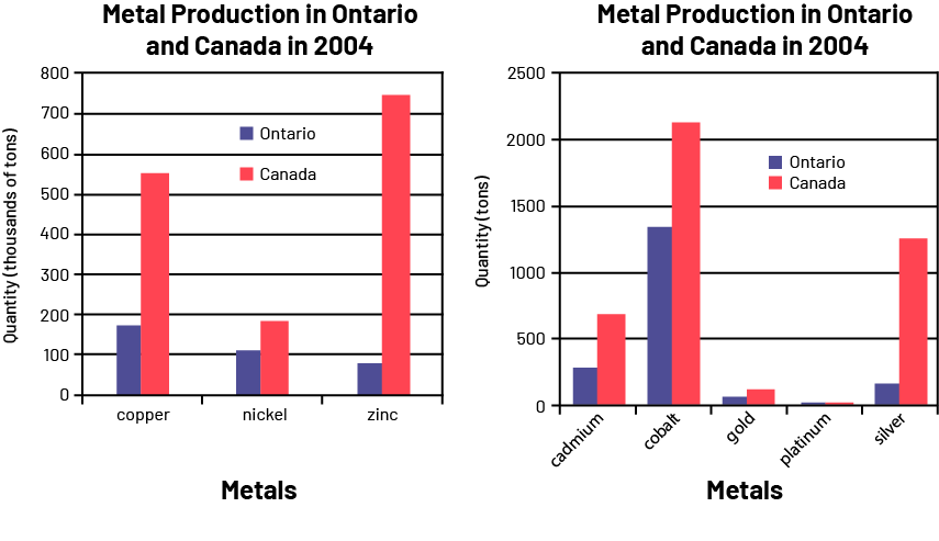
Possible Relevant Questions
- Of the metals produced in Canada in 2004, did Ontario account for more than half of the production? (Yes, nickel, cobalt, gold and platinum.)
- In 2004, did Ontario produce more cobalt or more zinc? (Ontario produces more zinc than cobalt.)
- Which of the metals shown is the most produced in Canada? in Ontario? (Zinc is the most produced metal in Canada. Copper is the most produced metal in Ontario.)
- What is the main difference between the two graphs? (The vertical axes are not on the same scale. In the first graph, the quantities are presented in thousands of tons, while in the second graph, they are presented in tons.)
- One student says that Ontario produces about the same amount of copper as silver, 200. Another student says that Ontario produces almost 1000 times more copper than silver. Who is right? Why? (The second student is right. Ontario produces almost 200 000 tonnes of copper and 200 tonnes of silver.)
- Why were these data presented in two graphs instead of one? (The data were presented in two graphs, with different scales, because of the very large range of values. To see the small values and the large values clearly, the vertical scale would have to be very large and larger than a standard page.)
Source: translated from Guide d’enseignement efficace des mathématiques, de la 4e à la 6e année, Traitement des données et probabilité, p. 93-95.
Activity 3: Analysis and Comparison of Bar Graphs
The following two graphs are displaying the same data using different categories.
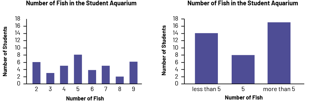 image A purple bar graph is named "Number of Fish in the Student Aquarium". The horizontal axis is named "Number of Fish" and is graduated from zero to 9, while the vertical axis is named "Number of Students" and is graduated from zero to 18. The bar at number two goes up to 6. The bar at number three goes up to three. The bar at number four goes up to five. The bar at number five goes up to eight. The bar at number 6 goes up to 4. The bar at number 7 goes up to five. The bar at number 8 goes up to two. And the bar at number 9 goes up to 6.
Relevant Questions
- What conclusions can you draw from each bar graph? (The first graph shows the number of aquariums that contain 2, 3, 4, 5, 6, 7, 8, or 9 fish, respectively. The second graph shows that eight aquariums contain five fish, 14 aquariums contain less than five fish, and 17 aquariums contain more than five fish.)
- Does the second graph give you all the information you need about the number of fish in the aquariums? (No, because it does not reveal the number of fish in each aquarium.)
- Do you think the results would be the same if you asked this question of other classes? Why? (It is possible. However, the interest of students in other classes in fish might be very different.)
- If I want to convince the principal that students have experience caring for multiple fish, which graph should I show them? (I would show them the second graph because the "more than 5" band is the longest and the principal would see that many students have experience caring for multiple fish).
Source: translated from Guide d’enseignement efficace des mathématiques, de la 4e à la 6e année, Traitement des données et probabilité, p. 98.
Activity 4: Data Analysis (Three Levels of Comprehension)
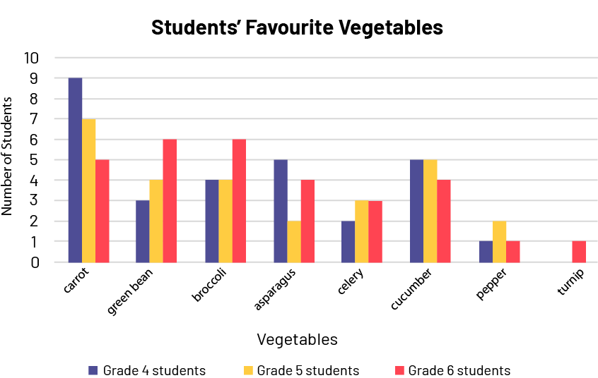
Students in grades 4, 5, and 6 at a school were surveyed and the results are shown in the following table and the multiple-bar graph.
Students' Favourite Vegetables
| Vegetable | Number of Grade 4 Students | Number of Grade 5 Students | Number of Grade 6 Students |
|---|---|---|---|
| carrot | 9 | 7 | 5 |
| bean | 3 | 4 | 6 |
| broccoli | 4 | 4 | 6 |
| asparagus | 5 | 2 | 4 |
| celery | 2 | 3 | 3 |
| cucumber | 5 | 5 | 4 |
| bell pepper | 1 | 2 | 1 |
| turnip | 0 | 0 | 1 |
To get students to read the data, teachers ask questions such as:
- What is the title of this table/graph? (Students' favourite vegetables)
- What does this graph represent? (Favourite vegetables of 4th, 5th and 6th graders.)
- What can be found on the horizontal axis? (The choice of vegetables.)
- How many categories of vegetables are there? Name them. (There are eight categories of vegetables: carrot, green bean, broccoli, asparagus, celery, cucumber, bell pepper and turnip.)
- Were any of the vegetables offered not chosen? (Yes, students in grades 4 and 5 did not choose the turnip.)
- Which vegetable is the favourite vegetable of five Grade 4 students? (There are two vegetables that five Grade 4 students say they prefer, asparagus and cucumber.)
To get students to read between the data, teachers ask questions such as:
- How many students prefer broccoli? (There are 14 students who prefer broccoli: four 4th graders, four 5th graders, and six 6th graders [4 + 4 + 6 = 14].)
- What is the most popular vegetable? (The most popular vegetable is the carrot [9 + 7 + 5 = 21].)
- Are there more students who prefer cucumbers to green beans? How do you know? (Yes, there are more students who prefer cucumber (14 students in total) to green beans (13 students in total). This can be seen by comparing the frequencies in the table and comparing the height of the bands corresponding to these vegetables in the graph.)
- Are there more students who prefer carrots than students who do not? (We must first add the number of students whose favorite vegetable is a vegetable other than carrots, which gives us 65 students. Since only 21 students prefer carrots, there are therefore more students whose favourite vegetable is not the carrot.)
To get students to read beyond the data, teachers ask questions such as:
- What conclusions can you draw from the table or multi-bar graph to answer the original question, which is the favourite vegetable of students in grades 4, 5 and 6? (It can be concluded that carrots are the favorite vegetable of students in grades 4 to 6.)
- Do you think there is a difference between Primary and Junior students? (From the two representations we have, we cannot answer this question. We would have to ask the same question of the primary students in order to be able to draw conclusions.)
- Do you think the results would be the same if you asked the same question of other classes in the school? Why? (The results could be similar or completely different because of the variability in preferences and the fact that the sample used in this survey included only junior students.)
Source: adapted and translated from Guide d’enseignement efficace des mathématiques, de la 4e à la 6e année, Traitement des données et probabilité, p. 99-100.