D1. Data Literacy
Manage, analyse, and use data to make convincing arguments and informed decisions, in various contexts drawn from real life.
Learning Situation: Questioning, Drawing Conclusions and Making Arguments Based on Stacked-Bar Graphs and Misleading Graphs
Total duration: 60 minutes
Summary
In this learning situation, students will read, analyze, and interpret data presented in a stacked-bar graph and in misleading graphs.
|
Overall Expectation |
Specific Expectations |
|
D1. Data Literacy Manage, analyse, and use data to make convincing arguments and informed decisions, in various contexts drawn from real life. |
D1.3 Select from among a variety of graphs, including stacked-bar graphs, the type of graph best suited to represent various sets of data; display the data in the graphs with proper sources, titles, and labels, and appropriate scales; and justify their choice of graphs. D1.6 Analyse different sets of data presented in various ways, including in stacked-bar graphs and in misleading graphs, by asking and answering questions about the data, challenging preconceived notions, and drawing conclusions, then make convincing arguments and informed decisions. |
Learning Goals
Students:
- show their understanding of stacked-bar graphs;
- recognize misleading graphs;
- analyze and interpret various data in graphs.
Materials
- calculator
- coloured pencils
- graph paper
- ruler
Guided Exploration
Course of Action
- Introduce students to Example 1, as outlined below.
- Allow students the time required to complete the assignment. At this stage, students will learn various strategies for interpreting data in stacked-bar graphs and recognizing misleading graphs.
- Ask a few students to share their solution with the class and explain the strategies they used to analyze the data in the various graphs. Invite other students to ask questions to check for understanding. Following the discussion, ensure that students make connections between the elements of the stacked-bar graphs and the information contained in them while recognizing misleading graphs.
- Encourage students to improve their work by adding missing elements.
- If necessary, present Example 2, which involves analyzing and interpreting data from stacked-bar graphs representing the leisure activities of youth in different age groups and analyzing a misleading bar graph.
Example 1
- The frequency table and stacked-bar graph below present data collected from a survey of Grade 5 students' responsibilities at home.
Analyse the data by answering the following questions:
- Which category has the largest number of students?
- Which category has the smallest number of students?
- How many students in Class 5A, Class 5B, and Class 5C participated in the survey? How many Grade 5 students are there in total?
- How many more students have one responsibility than students have two responsibilities?
- What types of responsibilities do you think Grade 5 students have?
- What conclusion can you draw from the analysis of the data in the stacked-bar graph? Why do you think there are more students who have three responsibilities?
Grade 5 Student Responsibilities
Number of Responsibilities at Home 5A 5B 5C 0 3 4 2 1 8 2 9 2 2 9 1 3 12 10 13 image The title of the stacked bar diagram is: Responsibilities at Home - Grade 5 Students - Group A, B, C. Under the title it says: Source: Voilier School. The title of the x-axis is: Number of responsibilities. The x-axis is graduated by one, i.e. 0, 1, 2 and 3. The title of the y-axis is: Number of students. The y-axis is graduated by 5, i.e. 0, 5, 10, up to 35. There is a legend: the yellow bar represents Class 5C, the red bar represents Class 5B and the blue bar represents Class 5A. The first of the stacked bars is at zero on the x axis and is 9 on the y axis. The blue stripe represents 3 students from Class 5A, the red stripe represents 4 students from Class 5B and the yellow stripe represents 2 students from Class 5C. The second of the stacked bars is at one on the x-axis and is at 19 on the y-axis. The blue stripe represents 8 students in Class 5A, the red stripe represents 2 students in Class 5B, and the yellow stripe represents 9 students in Class 5C. The third of the stacked bars is at two on the x-axis and is 12 on the y-axis. The blue stripe represents 2 students from Class 5A, the red stripe represents 9 students from Class 5B, and the yellow stripe represents 1 student from Class 5C. The fourth and last of the stacked bars is at three on the x-axis and reaches 35 on the y-axis. The blue bar represents 12 students in Class 5A, the red bar represents 10 students in Class 5B, and the yellow bar represents 13 students in Class 5C.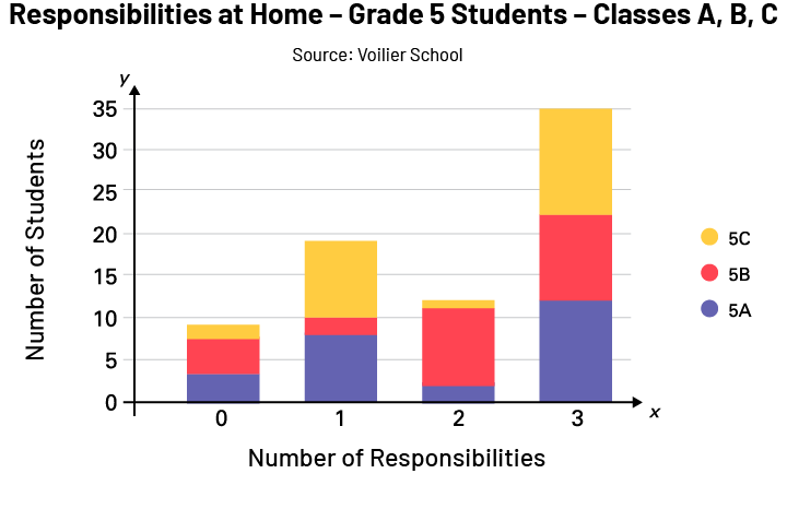
Strategy 1 - Reading the Data
- Which category has the largest number of students?
In the category of students with three responsibilities, there are 35 students in total.
- Which category has the smallest number of students?
In the category of students with no responsibilities, there are nine students in total.
Strategy 2 - Reading Between the Data
- How many students from Class 5A, Class 5B, and Class 5C participated in the survey?
Class 5A: 25 students, because 3 + 8 + 2 + 12 = 25
Class 5B: 25 students, because 4 + 2 + 9 + 10 = 25
Class 5C: 25 students, because 2 + 9 + 1 + 13 = 25
There are a total of 75 Grade 5 students who participated in the survey.
- How many more students have one responsibility than students have two responsibilities?
There are seven more students with one responsibility.
Strategy 3 - Reading Beyond the Data
- What types of responsibilities do you think Grade 5 students have?
In my opinion, students in Grade 5 can perform the following household tasks:
- Make their bed
- Wash and dry dishes.
- Vacuum or sweep.
- Pick up personal items and put them away.
- Dust the furniture.
- What conclusion can you draw from the analysis of the data in the stacked-bar graph? Why do you think there are many students who have three responsibilities?
I notice that most of the Grade 5 students, 66 out of 75, have at least one responsibility at home. By starting to participate in household chores early, young people my age develop independence and responsibility and gain confidence in themselves. I believe that many Grade 5 students have three responsibilities because it allows them to develop many skills such as organizing their time, having responsibilities, setting goals, and learning new skills. In addition, it allows kids my age to understand that chores are a part of everyday life for adults and children.
- The bar graph below shows the data collected from a survey of Grade 7 students' responsibilities at home. Is this graph misleading? If so, explain why. Then create a new bar graph to compare the two graphs.
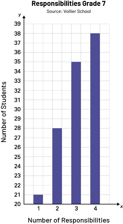 image The title of the bar diagram is: Responsibilities, Grade 7. Under the title it says: Source: Voilier School. The title of the x-axis is: Number of responsibilities. The x-axis is graduated by one, i.e. 1, 2, 3 and 4. The title of the y-axis is: Number of students. The y-axis is graduated by one, from 20 to 39. The first bar is at one on the x-axis and reaches 21 on the y-axis. The second bar is at two on the x-axis and reaches 28 on the y-axis. The third bar is at three on the x-axis and reaches 35 on the y-axis. The fourth bar is at four on the x-axis and reaches 38 on the y-axis.
Strategy 4 - Checking the Accuracy of a Graph
I find that the graph is misleading because the values on the scale do not start at 0, which changes the slope of the curve. The graph on the left gives the impression that there are a considerable number of students having two and three responsibilities and that there are very few students having only one responsibility. I observe that the number of students with two responsibilities is approximately half of the number of students with three responsibilities. I created a new graph to compare them. I start with the value "0" on the y axis.
image The title of the bar diagram is: Responsibilities, Grade 7. Under the title it says: Source: Voilier School. The title of the x-axis is: Number of responsibilities. The x-axis is graduated by one, i.e. 1, 2, 3 and 4. The title of the y-axis is: Number of students. The y-axis is graduated by one, from 20 to 39. The first bar is at one on the x-axis and reaches 21 on the y-axis. The second bar is at two on the x-axis and reaches 28 on the y-axis. The third bar is at three on the x-axis and reaches 35 on the y-axis. The fourth bar is at four on the x-axis and reaches 38 on the y-axis. Graph2: The title of the bar diagram is: Responsibilities, Grade 7. Under the title it says: Source: Voilier School. The title of the x-axis is: Number of responsibilities. The x axis is graduated by one, from 0 to 4. The title of the y-axis is: Number of students. The y-axis is graduated by five, from 0 to 35. The first bar is at one on the x-axis and slightly above 20 on the y-axis, i.e. at 21. The second bar is at two on the x-axis and is between 25 and 30 on the y-axis, i.e. at 28. The third bar is at three on the x-axis and reaches 35 on the y-axis. The fourth bar is at four on the x-axis and is under 40 on the y-axis, or at 38.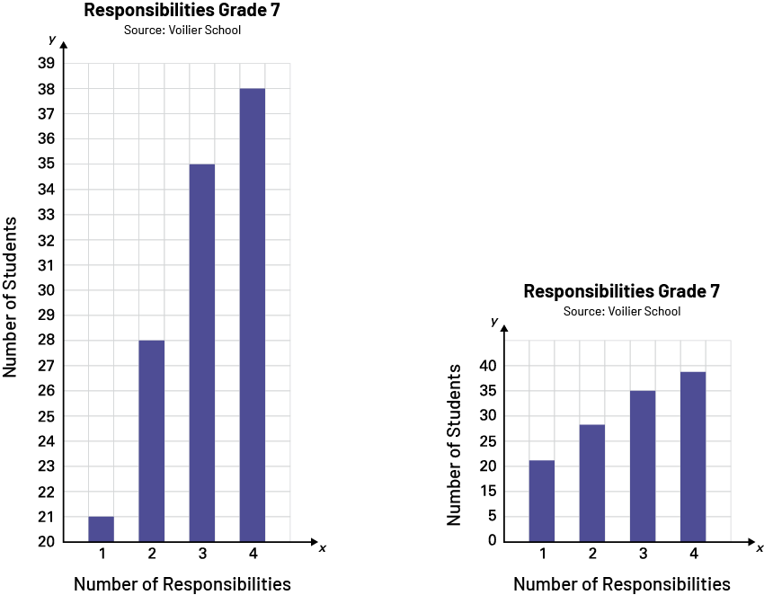
I notice that the information gives me a much more accurate and realistic picture of the situation. There is little discrepancy between the categories and the information presented in the graph. The one I created allows me to draw more relevant conclusions.
Example 2
The relative frequency tables and stacked-bar graphs below represent the leisure activities of students at two schools.
| Rose des Vents School | Marais School | |||||
|---|---|---|---|---|---|---|
| 9-10 year-olds | 11-12 year-olds | 13-14 year-olds | 9-10 year-olds | 11-12 year-olds | 13-14 year-olds | |
| Listening to music | 4 % | 26 % | 35 % | 2 % | 20 % | 30 % |
| Playing Sports | 35 % | 35 % | 32 % | 25 % | 35 % | 20 % |
| Reading | 31 % | 19 % | 20 % | 38 % | 34 % | 40 % |
| Artistic activity | 30 % | 20 % | 13 % | 35 % | 11 % | 10 % |
Source: École Rose des vents and École des Marais
image The title of the stacked bars diagram is: Favourite hobbies for youth aged 8 to 14. Under the title it says: Source: Rose des vents School. The title of the x-axis is: Hobbies. The x-axis is scaled by age group, i.e., 8-10 years, 10-12 years and 12-14 years. The title of the y-axis is: Relative frequency of votes in percent. The y-axis is scaled by twenty-five, from 0% to 100%. There is a legend: the green bar represents Artistic Activity, the yellow bar represents Reading, the red bar represents Sports and the purple bar represents Listening to Music. The first of the stacked bars is at 8-10 years on the x-axis and reaches 100 percent on the y-axis. The purple bar represents 4 percent of students, the red bar represents 35 percent, the yellow bar represents 31 percent, and the green bar represents 30 percent. The second of the stacked bars is at 10-12 on the x axis and reaches 100 percent on the y axis. The purple bar represents 26 percent of students, the red bar 35 percent, the yellow bar 19 percent, and the green bar 20 percent. The third of the stacked bars is at 12-14 on the x axis and reaches 100 percent on the y axis. The purple bar represents 35 percent of students, the red bar 32 percent, the yellow bar 20 percent, and the green bar 13 percent.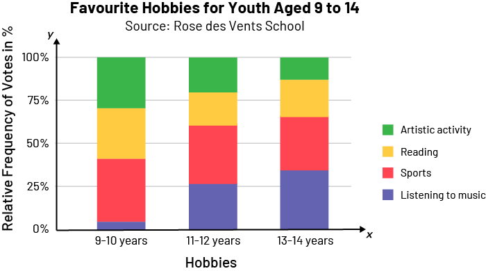 image The title of the stacked bars diagram is: Favourite hobbies for youth aged 8 to 14. Under the title it says: Source: Marais School. The title of the x-axis is: Hobbies. The x-axis is scaled by age group, i.e., 8-10 years, 10-12 years and 12-14 years. The title of the y-axis is: Relative frequency of votes in percent. The y-axis is scaled by twenty-five, from 0% to 100%.The title of the y-axis is: Relative frequency of votes in percent. The y-axis is scaled by twenty-five, from 0% to 100%. There is a legend: the red bar represents Artistic Activity, the blue bar represents Reading, the yellow bar represents Sports and the purple bar represents Listening to Music. The first of the stacked bars is at 9-10 years on the x-axis and reaches 100 percent on the y-axis. The purple bar represents 2 percent of students, the yellow bar represents 25 percent, the blue bar represents 38 percent, and the red bar represents 35 percent. The second of the stacked bars is at 10-12 on the x axis and reaches 100 percent on the y axis. The purple bar represents 20 percent of students, the yellow bar 35 percent, the blue bar 34 percent, and the red bar 11 percent. The third of the stacked bars is at 12-14 on the x axis and reaches 100 percent on the y axis. The purple bar represents 30 percent of students, the yellow bar 20 percent, the blue bar 40 percent, and the red bar 10 percent.
Analyze the data by answering the following questions:
- What is the preferred activity for 11-12 year-olds and 13-14 year-olds at each school?
- How many 11- to 12-year-olds prefer artistic activities at each school?
- What activity seems to be popular with 9-14 year-olds in both schools?
- According to this survey, at which school do more students prefer music?
- At which school do students enjoy reading the most? What might explain it?
STRATEGY 1 - Reading the Data
- What is the preferred activity for 11-12 year-olds and 13-14 year-olds at each school?
Preferred activities for different age groups
| Rose des Vents School | Marais School | |
|---|---|---|
| 11-12 year-olds | Playing Sports | Playing Sports |
| 13-14 year-olds | Listening to music | Reading |
How many 11- to 12-year-olds prefer artistic activities at each school?
Rose des Vents School: 20
Marais School: 11
STRATEGY 2 - Reading Between the Data
- What activity seems to be most popular with 9-14 year-olds at each of the two schools?
Rose des Vents School: Playing sports 35% (ages 9-10), 35% (ages 11-12), 32% (ages 13-14)
Marais School: Reading 38% (ages 9-10), 34% (ages 11-12), 40% (ages 13-14)
- According to this survey, at which school do more students prefer music?
At Rose des Vents school, because if I add up the values presented in each age group, I get 65%, because 4% + 26% + 35% = 65%. If I add up the values for each age group at the Marais School, I only get 52%, because 2% + 20% + 30% = 52%.
STRATEGY 3 - Reading Beyond the Data
- At which school do students like to read the most? What could explain this?
The students at Marais School enjoy reading the most. I think what explains this is that teachers inspire students to become engaged readers. Also, the involvement of the entire school, families, and communities can contribute to the fact that young people in this school prefer reading.
- Look closely at the two graphs. What could be misleading about the comparison of the data?
I notice that some colours were used in both graphs, but not for the same categories, which could be misleading. In order to properly compare the two stacked-bar graphs, it would be best to use the same colours for the same categories. Also, blue was used twice in the second graph and the shades could be confusing when interpreting the data, so having different colours for the various sections of the graph would be desirable.
Source: translated from En avant, les maths!, 5e année, ML, Données, p. 2-10.