D1.3 Select from among a variety of graphs, including stacked-bar graphs, the type of graph best suited to represent various sets of data; display the data in the graphs with proper sources, titles, and labels, and appropriate scales; and justify their choice of graphs.
Activity 1: Represent Data Using a Graph
Present the following situation to the students.
Triathlon is a sport that involves three events: swimming, biking and running. The coach of the Hope Triathlon Club has created a table showing how much time each athlete has spent on each of the three sports during a 50-hour period.
Time Spent in Each Sport of the Discipline (in Hours)
| Athletes | Swimming | Cycling | Running |
|---|---|---|---|
| Boris | 14 | 12 | 24 |
| Audrey | 20 | 14 | 16 |
| Yassine | 19 | 18 | 13 |
| Myrna | 10 | 20 | 20 |
| Doreen | 17 | 18 | 15 |
Have students create a relative-frequency table and stacked-bar graph to represent the data.
Source: translated from En avant, les maths!, 5e année, ML, Données, p. 11-13.
Activity 2: Choose the Most Appropriate Graph to Represent Various Data Sets
Present the following situation to the students.
An athlete trains daily. Here are two graphs that summarize the number of minutes he spends on each component of his training plan.
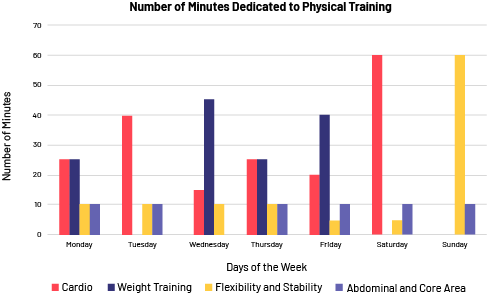
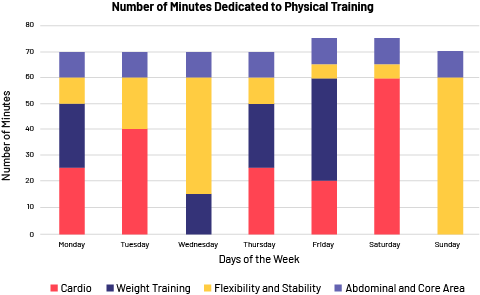 image Stacked bar chart with the title: Number of minutes spent on physical training. The title of the x-axis is: Days of the week. It is scaled in days, from Monday to Sunday. The title of the y-axis is: Number of minutes. It is graduated by 10, from 0 to 70. There is a legend. Red represents Cardio, blue represents Weight Training, yellow represents Flexibility and Stability, purple represents Abdominals and Core Area. On the x-axis, the first stacked bar is Monday, there are the four bars. The second stacked bar is Tuesday, there is a red bar, a yellow bar and a purple bar. The third stacked bar is Wednesday, there is a red bar, a blue bar and a yellow bar. The fourth stacked bar and the fifth stacked bar are Thursday and Friday, there are all four bars. The sixth stacked bar is Saturday, there is a red bar, a yellow bar and a purple bar. The seventh stacked bar is Sunday, there is a yellow bar and a purple bar.
Ask students the following questions:
- Which of these two graphs do you think best represents the data? Why?
- How are the two graphs the same and different?
- What does the multiple-bar graph tell you?
- What are your conclusions from the analysis of the stacked-bar graph?