D1.6 Analyse different sets of data presented in various ways, including in histograms and broken-line graphs and in misleading graphs, by asking and answering questions about the data, challenging preconceived notions, and drawing conclusions, then make convincing arguments and informed decisions.
Activity 1: Analyzing a Histogram
This is the age of the population that visits the Love of Reading Library during a year.
 image The coloured bar graph is titled " Age of People who Go to The Love of Reading Library". A zigzag line on the strips emphasizes the variations. The horizontal axis, graduated from zero to 90, is named "Age in Years," while the vertical axis, graduated from zero to 2,000, is named "Number of People. The first bar, from zero to ten, is light purple and rises slightly above a thousand. The second bar, from ten to twenty, is orange and stops slightly below a thousand. The third bar, from twenty to thirty, is green, and stops slightly below 600. The fourth bar, from thirty to forty, is dark red and stops slightly above a thousand. The fifth bar, from forty to fifty, is medium dark purple and stops slightly above 1200. The sixth bar, from 50 to 60, is yellow and stops between 1,800 and 2,000. The seventh bar, from 60 to 70, is dark purple and stops at a thousand. The eighth bar, from 70 to 80, is gray and stops at 400. And the ninth bar, from 80 to 90, is pink-red and stops slightly below 200.
Reading the Data
Relevant questions
- What is this graph about? (It is about the age of the population that goes to The Love of Reading Library in a year.)
- How many people between the ages 70 and 80 go to The Love of Reading Library? How do we know? (400 people between the ages of 70 and 80 go to The Love of Reading Library. This can be seen from the height of the second to last bar.)
- How many intervals are there? (There are nine intervals.)
- What is the scale on the vertical axis? (The vertical axis has a range of 2000, and intervals of 200.)
- What does the horizontal axis represent in this histogram? (The horizontal axis represents the age of people who go to The Love of Reading Library.)
- Looking at the graph, which age group goes to The Love of Reading Library the most? (People between the ages of 50 and 60 go to the library the most.)
Reading Between the Data
Relevant questions
- Can we say that people aged 50 and under are the most frequent users of The Love of Reading Library? How do you know? (Yes, people aged 50 and under are the most frequent users of the library. For each category of 50 years and under, we add up the length of the bars. We get about 5000 people. For each category of 50 years and over, we add up the length of the bars. We get about 3500 people. We can see that there are more people aged 50 and under who use the library.)
- Knowing that many people retire in their early sixties, approximately how many retired people use The Love of Reading Library? (About 1550 retired people use the library. This number is obtained by adding up the frequency of the last three categories: 60 to 70 years, 70 to 80 years, and over 80 years.)
Reading Beyond the Data
Relevant questions
- Do you think that the data collected in the neighbouring city will be similar, given that the population is much older? Why?
- If we repeat the survey with other intervals, do you think the results will be similar?
- How could the data be organized to discover more information?
- Should the library make sure to keep a certain type of book in stock (for example, children's stories)? Why?
- What other questions can you answer from this graph?
Activity 2: Misleading Graph
Present the graph below from a professional journal.
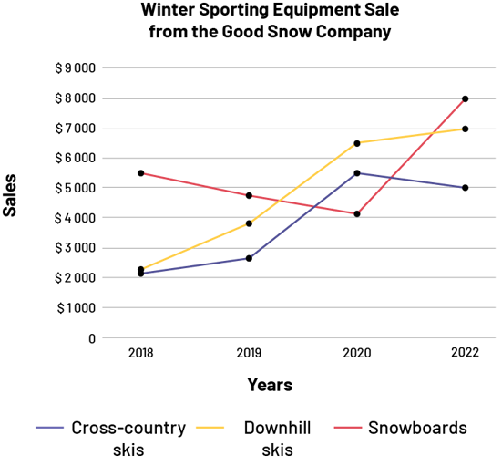 image This diagram titled "Winter Sporting Equipment Sale from the Good Snow Company" contains three coloured broken lines. The horizontal axis, named "Years," is graduated from 2018 to 2022, while the vertical axis, named "Sales ($)," is graduated from zero to $9000. The purple broken line corresponds to Cross Country Skis, the yellow broken line corresponds to Downhill Skis and the red broken line corresponds to Snowboards. For the purple line, at 2018, the first dot is very slightly above $2000. At 2019, the dot is below $3000. At 2020, the dot is between $5000 and $6000. And at 2022, the dot is at $5000. For the yellow line, at 2018, the dot is above $2000. At 2019, the dot is below $3000. At 2020, the dot is between $6000 and $7000. And at 2022, the dot is at $7000. For the red line, at 2018, the dot is between $5000 and $6000. At 2019, the dot is below $5000. At 2020, the dot is very slightly above $4000. And at 2022, the dot is at $8000.
Teachers can assist students to interpret the data by asking questions such as: "According to the graph, the Good Snow Company experienced an increase in sales of downhill skis from 2020 to 2022. Do you agree?" Students should be able to recognize that the graph is missing important data. In 2021, no data has been recorded according to the graph. It is impossible to determine whether there was an increase in sales of downhill skis from 2021 to 2022. Teachers can then lead students to recognize that, in order to represent the data without being misleading, it is important to add the data collected for 2021.
 image This diagram titled "Winter Sporting Equipment Sale from the Good Snow Company" contains three coloured broken lines. The horizontal axis, named "Years," is graduated from 2018 to 2022, while the vertical axis, named "Sales ($)," is graduated from zero to $9000. The purple broken line corresponds to Cross Country Skis, the yellow broken line corresponds to Downhill Skis and the red broken line corresponds to Snowboards. For the purple line, at 2018, the first dot is very slightly above $2000. At 2019, the dot is below $3000. At 2020, the dot is between $5000 and $6000. At 2021, the dot is at $4000. And at 2022, the dot is at $5,000. For the yellow line, at 2018, the dot is above $2000. At 2019, the dot is below $3000. At 2020, the dot is between $6000 and $7000. At 2021, the dot is between $8000 and $9000. And at 2022, the dot is at $7000. For the red line, at 2018, the dot is between $5000 and $6000. At 2019, the dot is below $5000. At 2020, the dot is very slightly above $4000. At 2021, the dot is under $6000. And at 2022, the dot is at $8000.
In this new broken-line graph, a more accurate picture of the data is obtained. Referring to this one, students can now say that there was an increase in downhill ski sales from 2020 to 2021 followed by a decrease from 2021 to 2022.
Source: adapted and translated from Guide d’enseignement efficace des mathématiques, de la 4e à la 6e année, Traitement des données et probabilité, p. 105-106.