D1.1 Explain why percentages are used to represent the distribution of a variable for a population or sample in large sets of data, and provide examples.
Skill: Explaining Why Percentages are Used to Represent the Distribution of a Variable
It is easier to compare categories by comparing relative values, such as percentages, rather than absolute values. For example, let's say that in a survey of 65 000 tourists, 6323 people say they visited historic buildings and 7247 people say they visited a museum. At first glance, the museum appears to be much more popular than the historic buildings, since nearly 1000 more people visited it. However, it is easier to compare relative values. In this case, 10% of tourists visited historic buildings compared to 11% who visited a museum. It's fair to say that both choices are equally popular.
Places Visited by Tourists
| Places Visited | Frequency |
|---|---|
| Museums | 7247 |
| Beaches | 12 452 |
| Parks | 9562 |
| Cinemas | 3625 |
| Restaurants | 8982 |
| Hotels | 11 645 |
| Walking trails | 5164 |
| Historic buildings | 6323 |
| Total | 65 000 |
Table of Relative Frequencies
Places Visited by Tourists
| Places Visited | Frequency | Relative Frequency (Fractions) | Relative Frequency (Decimal Numbers) | Relative Frequency (%) |
|---|---|---|---|---|
| Museums | 7247 | \(\frac{7\ 247}{65\ 000}\) | 0.11 | 11 % |
| Beaches | 12 452 | \(\frac{12\ 452}{65\ 000}\) | 0.19 | 19 % |
| Parks | 9562 | \(\frac{9\ 562}{65\ 000}\) | 0.14 | 14 % |
| Cinemas | 3625 | \(\frac{3\ 625}{65\ 000}\) | 0.06 | 6 % |
| Restaurants | 8982 | \(\frac{8\ 982}{65\ 000}\) | 0.14 | 14 % |
| Hotels | 11 645 | \(\frac{11\ 645}{65\ 000}\) | 0.18 | 18 % |
| Walking trails | 5164 | \(\frac{5\ 164}{65\ 000}\) | 0.08 | 8 % |
| Historic buildings | 6323 | \(\frac{6\ 323}{65\ 000}\) | 0.10 | 10 % |
| Total | 65 000 | \(\frac{65\ 000}{65\ 000}\) | 1.00 | 100 % |
Note: Since all other relative frequencies were rounded up, the relative frequency for the "Parks" category was rounded down to balance the data and obtain a plausible total of 100%.
Circle Graph
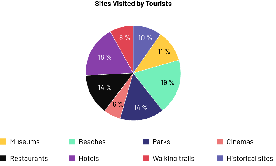 Image A pie chart is titled "Sites Visited by Tourists". It is divided into 8 parts of different colours. The Museums portion is eleven percent. The Beaches portion is 19 percent. The Parks portion is 14 percent. The Cinemas portion is six percent. The Restaurants portion is 14 percent. The Hotels portion is 18 percent. The Pedestrian Paths portion is eight percent. And the Historical Sites portion is ten percent.
Skill: Giving Examples to Explain or Justify the Use of Percentages
Here is an example of why it is better to choose percentages when the numbers in the Frequency column are large.
The Ministry of the Environment, Conservation and Parks is investigating whether citizens of the City of Toronto are using environmentally friendly methods of travel to reduce their carbon footprint. A survey was conducted with a sample of 88,500 Toronto residents between the ages of 25 and 35. The data collected from the survey was represented in a frequency table and a circle graph.
Frequency Table
Means of Travel Used by 25 to 35 Year-Old Citizens of Toronto
| Means of Travel | Frequency |
|---|---|
| Car | 35 209 |
| Carpooling | 4235 |
| City bus | 17 121 |
| Bike | 8754 |
| On foot | 2420 |
| Metro | 20 761 |
| Total | 88 500 |
Circle Graph
Means of Travel Used by 25 to 35 Year-Old Citizens of Toronto
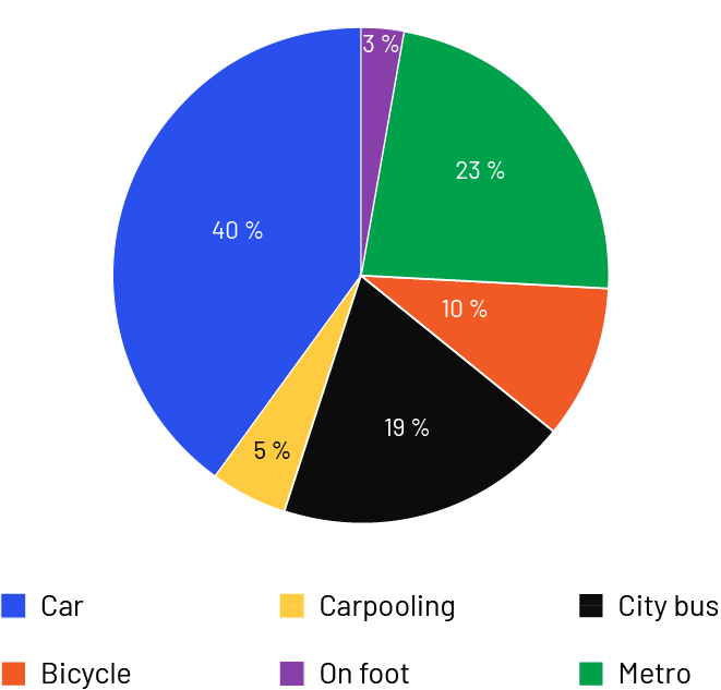 Image The pie chart is entitled: "Means of Transportation Used by 25 to 35 Year Old Citizens in Toronto". It is divided into six parts. The "Car" section occupies 40 percent of the chart. Carpooling occupies 5 percent. City bus occupies 19 percent. Bicycle occupies 10 percent. Walking occupies three percent. And the subway takes up 23 percent.
The frequency table gives an overall idea of how the data are distributed, but does not have the advantage of easily comparing the categories with each other, as the circle graph does. The circle graph shows relative frequencies expressed as percentages, so that the data can be analyzed quickly. The frequency table shows, for example, that 35 209 individuals use their own car and 4235 individuals carpool to get around. The same data are much easier to interpret by comparing percentages, saying that 40% of individuals use their own car and 5% carpool. This makes it easier to interpret the distribution of the data.
Source: translated from En avant,les maths!, 7e ML, Données, p. 6-7.
Knowledge: Population
In the Data strand, the set of objects, events or individuals to be studied is called the population. In planning data collection, the first step is to define the target population or group of individuals or objects the inquiry is about. The choice of the population is, in part, dictated by the intent of the inquiry and the statement of the question of interest.
Examples of Populations
- The people of Canada
- Baseball fans
- Grade 7 students from the school
- Intermediate students
- Parents of intermediate students
Source: translated from Guide d’enseignement efficace des mathématiques, de la 4e à la 6e année, Traitement des données et probabilité, p. 52.
Knowledge: Representative Sample of a Population
In the Data strand, the set of objects, events or individuals to be studied is called the population. The fraction of the population observed, measured or surveyed is called the sample.
In Grades 5 and up, inquiries may involve a population of such size that it is impossible to survey, measure, or observe the entire population. Students must then survey only a portion of that population. This subgroup, called the sample, must be representative of the population being surveyed. In mathematics, the selection of a sample is governed by complex statistical standards, based on concepts of probability, that ensure the validity and reliability of the results. In the Junior and Intermediate Divisions, students need not concern themselves with these standards; they need only develop an intuitive understanding of what might be, for the purposes of the inquiry, a representative sample of the target population.
The idea that the results of a survey of a small group can reflect the reality of a larger population is not necessarily easy to grasp. Students need to understand that the sample is part of a whole and that even a small portion of the population, when properly selected, gives a good idea of the whole. In the junior grades, they begin to grasp this concept informally. While some have an intuitive understanding, others have misconceptions that need to be corrected.
The sample allows conclusions to be drawn and generalizations to be made about the entire population without having to interview the entire population. However, these conclusions are valid only if the sample is representative of the entire target population.
Examples of Misconceptions
- Sampling does not work because it is impossible to account for all the different characteristics of the population (variability).
- To be fair, we must always have the same number of individuals in each category.
- The results are not good because we did not interview everyone.
When planning data collection, students should have an intuitive understanding of how the accuracy of the representation of a sample to the population relates to the following three factors: sample size, selection process, and stratification process.
Sample Size
In order for the inquiry results to be representative of the population, the sample size must be considered. Teachers should help students find a balance between a sample that is too large and one that is too small.
Selection Process
Simple Random Sampling
Students should understand that one of the best ways to have a good bias-free sample is to choose it randomly, that is, so that all individuals have an equal chance of being included.
Source: translated from Guide d’enseignement efficace des mathématiques, de la 4e à la 6e année, Traitement des données et probabilité, p. 52-55.
Systematic Random Sampling
Systematic random sampling is used when the subjects from a population are selected through a systematic approach that has been randomly determined. For example, a sample could be determined from an alphabetized list of names, using a starting name and count (for example, every fourth name) that are randomly selected.
Source: Ontario Curriculum, Mathematics Curriculum Grades 1-8, 2020, Ontario Ministry of Education.
Stratification Process
In some surveys, one might want to ensure that certain subgroups of the population are represented in the sample, so the population is said to be stratified (divided into mutually exclusive groups) and one wants each stratum (group) to be represented in the sample.
Source: translated from Guide d’enseignement efficace des mathématiques, de la 4e à la 6e année, Traitement des données et probabilité, p. 56.
Stratified Random Sampling
Stratified random sampling involves dividing the population into strata and then taking a random sample from each stratum; for example, a school population could be divided into two sub-populations (strata): one with students who take the bus to school and one with those who do not. Then, a survey could be conducted with 10% of the randomly selected population from each of these strata.
Source: Ontario Curriculum, Mathematics Curriculum Grades 1-8, 2020, Ontario Ministry of Education.
Knowledge: Percent
A ratio expressed using the percentage symbol: %. The word percent means "out of a hundred"; for example, 30% means 30 out of 100. A percent can be represented by a fraction with a denominator of 100; for example, 30 percent = 30 out of 100.
Source: Ontario Curriculum, Mathematics Curriculum Grades 1-8, 2020, Ontario Ministry of Education.
Knowledge: Variable
Any attribute, number or quantity that can be measured or counted.
Source: Ontario Curriculum, Mathematics Curriculum Grades 1-8, 2020, Ontario Ministry of Education.
Knowledge: Data Sets
Group of interrelated data.
Source: Ontario Curriculum, Mathematics Curriculum Grades 1-8, 2020, Ontario Ministry of Education.