D1.4 create an infographic about a data set, representing the data in appropriate ways, including in tables and circle graphs, and incorporating any other relevant information that helps to tell a story about the data.
Skill: Creating an Infographic that Appropriately Represents a Data Set
Grade 7 students will create an infographic that represents a data set by incorporating relevant information that helps tell a story about the data collected. To do this, students must understand what makes an infographic. They must determine the audience for the infographic and the messages they wish to convey.
Starting with the data, students organize and illustrate the information using a representation of their choice. These representations, such as tables and graphs, present all of the data clearly and accurately so that the reader can quickly and easily discern pieces of information and data. Students also need to organize the visual elements (data and information) in an attractive way. To do this, they need to focus on the information they will need to include in order to convey their message to their target audience in a visual way. The style and format of the presentation of the content needs to be carefully chosen to ensure that the information is clear and concise. The infographics are created with the help of computer software with very little text. There are also narrative descriptions that often go along with the data, which help the reader to better understand the entire content of the infographics.
Source: adapted and translated from En avant, les maths!, 5e année, CM, Données, p. 9.
<Students should be sure to include all the features of an infographic.
a) Infographics have :
- a title, a completion date and a source;
- various data representations, such as tables and graph;
- very little text;
- clear and accurate information;
- information presented in an attractive manner;
- information relevant to a specific target audience.
b) Infographics communicate:
- the results of one or more research studies;
- the context of the research;
- information related to an important topic.
Source: En avant, les maths!, 4e année, CM, Données, p. 11.
Example
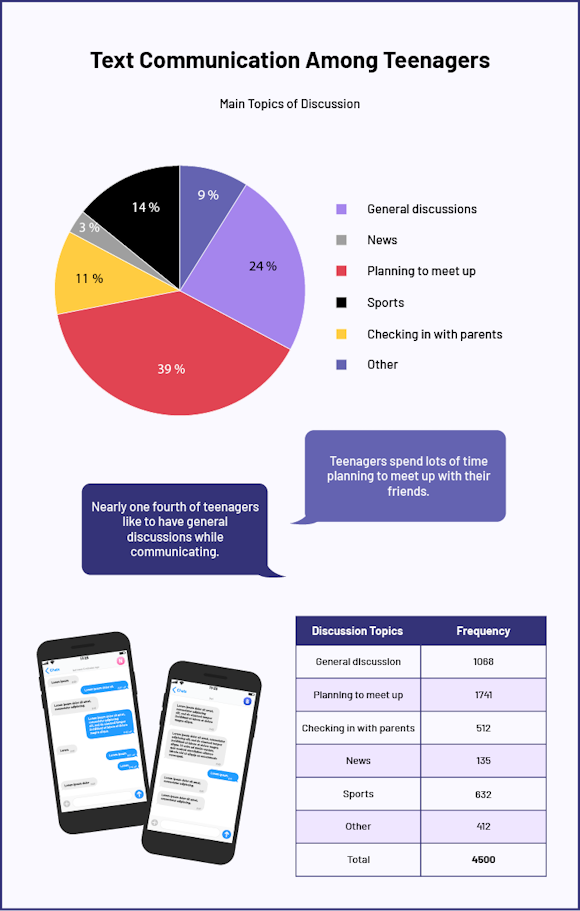 Image Infographic title: Text Communication Among Teenagers. A colourful pie chart is titled, " Main Topics of Discussion" The topic "General Discussions" represents 24 percent of the circle. News represents 3 percent of the circle. Planning to meet up represents 39 percent of the circle. Sports represents 14 percent of the circle. Checking in with parents accounts for 11 percent. And "Other" represents five percent. A darker purple phylactery contains the following text: "Nearly one quarter of teenagers like to have general discussions while communicating.” A lighter purple phylactery contains the following text, " Teenagers spend lots of time planning to meet up with their friends." Next to the image of two phones displaying a messaging conversation is a table with two columns. The first is called "Discussion Topics" and the second is called "Frequency". For general discussions, the frequency is 1068. For planning to meet up, the frequency is 1741. For checking with parents, the frequency is 512. For news, the frequency is 135. For sports, the frequency is 632. And for other topics, the frequency is 412. The total frequency is 4500.
Source: translated from En avant, les maths!, 7e année, ML, Données, p. 7.