D1.6 Analyse different sets of data presented in various ways, including in circle graphs and in misleading graphs, by asking and answering questions about the data, challenging preconceived notions, and drawing conclusions, then make convincing arguments and informed decisions.
Skill: Examining and Analyzing Data Represented in Various Graphs, Including Circle Graphs and Misleading Graphs
The ability to interpret results is related to the ability to reason in that it requires a certain amount of thinking and analysis. Teachers need to help students develop this skill by providing a variety of activities that focus on interpreting results and by asking questions that encourage students to look closely at those results. In doing so, they will also be contributing to the development of students' data literacy skills.
Gal (2002) suggests that the interpretation of the results should be done from two points of view, that of the investigator and that of the reader. From the investigator's perspective, students examine data that they have collected and that they have summarized in graphs or tables. They then interpret them to answer the question of interest they asked at the start of the inquiry. From the reader's point of view, students examine data that comes from outside, that is, has been collected by others. In this context, the teacher can take the opportunity to present data related to other subjects; for example, science and technology, social studies, physical education and health.
When presenting a table or graph to students, teachers should ensure that students are given sufficient time to reflect on it so that they can examine the data and form a general idea. This reflection can be done individually or in small groups. Teachers should then ask students open questions to help them translate their observations and ideas into their own words and to develop ideas from those of other students in the class. For example, teachers might ask:
- What do you notice about this graph?
- What is interesting about this graph?
- What can you say about this data?
- What can you say about this graph?
These open-ended questions elicit a variety of responses, allowing students to communicate their observations, descriptions, and conclusions in a general way. Teachers can then ask students more specific questions to help them develop the ability to make sense of the data. In data processing, this skill involves three levels of comprehension: reading the data, reading between the data, and reading beyond the data.
| Level of Comprehension | Description of the Level |
|---|---|
| Reading the data | Identify the data as represented in the table or graph. |
| Reading between the data | Compare and combine data in order to establish relationships between them. |
| Reading beyond the data | Infer or predict implicit or explicit information from a graph or table and make conclusions. |
Teachers sometimes tend to focus on the first level, but Friel et al. (2001) suggest that teachers should be careful to always ask questions related to all three levels, regardless of the representation or organization of the data. This will help students develop independence in interpreting graphs and tables and in using statistical measures.
What follows is a more detailed explanation of each of the three levels of comprehension, along with examples of relevant questions that teachers might ask during an activity interpreting the results.
Reading the Data
At this first level of comprehension, students are able to determine:
- the components of the representation, such as the title of the table or graph, the scale or key, the designation of the axes and the choice of categories;
- the value of certain data represented.
Examples of Relevant Questions:
- What is this graph about? (The title)
- How many… in the category? How do we know?
- How many categories are there?
- What is the scale on the horizontal axis?
- What does the vertical axis represent in this graph?
- What does the largest area represent?
Reading Between the Data
This level of comprehension requires viewing data less as "[…] an amalgam of personal data each with its own characteristics" and more as "[…] a collective data set with new properties" (Konold & Higgins, 2003). This level of comprehension is more difficult to achieve because students must analyze individual data by combining them or comparing data sets.
At this second level of comprehension, students are able to:
- compare data using expressions such as more than, less than, as much as, the most, the least, a little more than, three times less than, there is a small difference between;
- compare the heights of bars in a bar graph or sectors in a circle graph;
- making connections between different ways of describing a relationship between data;
- combine some data according to certain categories and compare the frequencies of each category;
- describe some advantages and disadvantages of two different representations of the same data;
- determine the value of certain statistical measures (mode, median, mean) of a set of data.
Source: translated from Guide d’enseignement efficace des mathématiques, de la 4e à la 6e année, Traitement des données et probabilité, p. 89-93.
Example
Below are two circle graphs showing part-time hours worked per week by students at two area high schools. A total of 690 students responded to the survey at De La Colline High School and 752 students at Des Cygnes High School.
 image Two pie charts are presented. The first pie chart is titled Number of hours worked by students at De La Colline High School. It is divided into five parts. The share from zero to ten hours is 20 percent, in light purple. The share from eleven to 15 hours is 15 percent, in purple. The share from 16 to 20 hours is 47 percent, in navy blue. The share from 21 to 25 hours is eleven percent, in red. And the share of 25 hours or more is seven percent, in yellow. The second chart is called Number of Hours Worked by Students at Des Cygnes High School. It is divided into five parts. The share from zero to eleven hours is 17 percent, in purple. The share from eleven to fifteen hours is 19 percent, in light purple. The share from fourteen to twenty hours is 41 percent, in navy blue. The share from 21 to 25 hours is 14 percent, in red. And the share from 25 hours and over is nine percent, in yellow.
Sample questions to ask students include:
- According to this survey, at which school is there a higher percentage of students working 11 to 15 hours per week? (15% of students at De La Colline High School work 11 to 15 hours per week, while 19% of students at Des Cygnes High School work the same number of hours, so more students at Des Cygnes High School work 11 to 15 hours per week.)
- How many students from each school work up to 10 hours per week? (138 students at De La Colline High School work up to 10 hours per week compared to approximately 128 students at Des Cygnes High School. Therefore, 266 students in total work up to 10 hours per week.)
- At De La Colline High School, how many hours per week do the majority of students work? What about the students at Des Cygnes High School? (At De La Colline High School, the majority of students work from 16 to 20 hours per week. The same is true for the students at Des Cygnes High School.)
- At which school do students work the most hours per week? (Since we are talking about the most hours, I look at the 25+ hours category. I see that 7% of the students (about 48 students) at De La Colline High School work 25+ hours as opposed to 9% of the students (about 68 students) at Des Cygnes High School. Therefore, there are more students at Des Cygnes High School working 25+ hours per week.)
- Look closely at the two circle graphs. What might be misleading about comparing the data? (I notice that some colours were used in both graphs, but not for the same categories, which could be misleading. Also, blue was used twice in the graphs, and the shades could be confusing in interpreting the data.)
- Why do you think the author of the survey decided to use a circle graph to represent the data? (A circle graph helps determine the largest or smallest category. We can estimate the percentage each area occupies by the magnitude of the angle of each area. Also, we can use fractions to describe the categories when we use a circle graph to represent the data; for example, in this case, we can conclude that almost half (47 %) of the students at De La Colline High School work from 16 to 20 hours each week.)
- By analyzing the circle graph for De La Colline High School, determine the mode of the data represented in it. (Since more students work 16 to 20 hours per week, then the mode is "16 to 20 hours." Therefore, this response is the most popular among students who attend De La Colline High School.)
Source: adapted and translated from En avant, les maths!, 7e année, ML, Données, p. 4-6.
Reading Beyond the Data
At this third level of comprehension, students use several critical and analytical thinking skills. They are able to:
- recognize what the graph or the table does not "tell" directly;
- specify the trend of a data set;
- make inferences and predictions;
- draw conclusions and justify them;
- assess the credibility and logic of predictions and conclusions;
- assess the representativeness of the range, mode, median and mean;
- review the steps in the inquiry process.
Examples of Relevant Questions:
- Do you think that… is the most common in all cities? Why?
- If the survey is redone using other response choices, will the results be similar? Why?
- How could the data be organized to uncover additional information? (For example, by pooling the data from elementary and middle school students, one can analyze student preference in a more general way.)
- What other questions can be answered using the graph?
Source: adapted and translated from Guide d’enseignement efficace des mathématiques, de la 4e à la 6e année, Traitement des données et probabilité, p. 96-98.
Skill: From a Graph, Draw Conclusions, Formulate Arguments and Make Decisions
After examining and analyzing the data (three levels of comprehension, in other words, reading the data, reading between the data, and reading beyond the data) in a graph, students are led and challenged to draw conclusions, formulate arguments, and make decisions.
Interpretation of the results allows you to draw relevant conclusions to answer questions of interest and make informed decisions.
Source: translated from Guide d’enseignement efficace des mathématiques, de la 4e à la 6e année, Traitement des données et probabilité, p. 89.
Decision-making is very important in the inquiry process because without decision-making, the process becomes meaningless. Why would anyone set up an inquiry and then collect, organize, and analyze data if they have no intention of drawing conclusions? In many cases, decision-making is limited to providing an answer to the original question. In other cases, it is about using the answer to decide whether to act in a particular way. Therefore, teachers should engage students in answering the question of interest using all three levels of comprehension, so that they can make decisions based on:
- the relationships established between the data;
- the meaning they have derived from the data;
- the conclusions they drew from it.
Source: translated from Guide d’enseignement efficace des mathématiques, de la 4e à la 6e année, Traitement des données et probabilité, p. 101.
Knowledge: Misleading Graph
A graph displaying information that misrepresents the data. For example, a pictograph that uses different sizes of pictures or symbols for different categories can be misleading because it may appear as if some categories have a greater or lesser count, when they don’t.
Source: The Ontario Curriculum. Mathematics, Grade 1-8 Ministry of Education, 2020
Examples
Note: This graph is misleading, as yellow has been used twice in the graph, and the hues could be confusing in interpreting the data. When creating a graph, it is best to use separate colours for each category so that they can be clearly recognized.
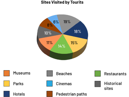 image The pie chart is called Sites Visited by Tourists. It is divided into eight parts. The share of museums is eleven percent, in orange. The share of parks is 14 percent, in yellow. The share of hotels is 18 percent, in navy blue. The share of beaches is 19 percent, in gray. The share of movie theaters is six percent, in light blue. The share of hiking trails is eight percent, in brown. The share of restaurants is 14 percent, in green. And the share of historic buildings is ten percent, in dark gray.
Note: This graph is misleading, as the percentage of people who visited hotels or restaurants appears to be the same based on portion size alone. Yet, 18% of tourists visited a hotel(s) compared to 14% who went to a restaurant. A 4% difference separates the two places visited. That being said, at first glance, we should be able to see that a larger percentage of tourists visited hotels and a smaller percentage of people went to a restaurant(s).
It is important to note that throughout the interpretation of results, teachers should encourage students to make critical judgments about the data presented so that they are aware of the potential limitations of the interpretation. The ability to make critical judgments is an important component of statistical thinking. To help students develop this skill, teachers should teach them to:
- question the representativeness and reliability of the primary or secondary data by asking questions such as:
- Was the data collection done without bias?
- Is the source of the secondary data reliable?
- check whether the representation gives an accurate portrait of the data by asking questions such as: “Is the data represented without leaving false impressions? "
Example
Teachers present the following graph from a trade magazine.
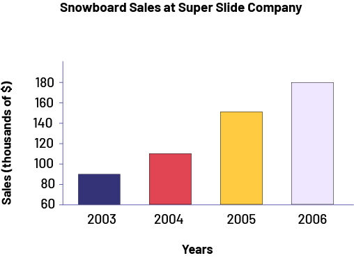 image The bar graph is titled Sales of snowboards of the Super Glisse company. The horizontal axis corresponds to the years while the vertical axis, graduated from 60 to 180, corresponds to sales in thousands of dollars. The 2003 bar, in navy blue, rises to 90. The 2004 bar, in red, rises to 110. The 2005 bar, in yellow, rises to 150, and the 2006 bar, in light purple, rises to 180.
In interpreting the results, the teacher encourages students to question the representation of the data by saying, "From the graph, it looks like sales have doubled from 2004 to 2005. Do you agree?" After analysis, students should be able to recognize that although the yellow bar is twice as long as the red bar, in reality, 2004 sales are about $110 000 and 2005 sales are about $155 000, so they have not doubled. It is important to emphasize that this graph is not incorrect per se, as it represents the data accurately. However, it can be misleading if we do not analyze it carefully.
Teachers can then lead students to recognize that, to represent the data without misleading anyone, it would be sufficient to scale the vertical axis from 0 to 180 as follows.
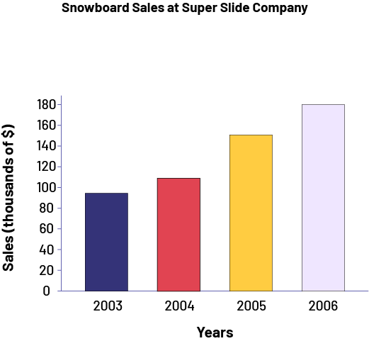 image The bar graph is titled Sales of snowboards of the Super Glisse company. The horizontal axis corresponds to the years while the vertical axis, graduated from zero to 180, corresponds to sales in thousands of dollars. The 2003 bar, in navy blue, rises to 90. The 2004 bar, in red, rises to 110. The 2005 bar, in yellow, rises to 150, and the 2006 bar, in light purple, rises to 180.
In this new chart, since the lengths of the bars are proportional to sales, we get a more accurate representation of the data. It is now clearer that sales did not double from 2004 to 2005 and it can be seen that they almost doubled from 2003 to 2006.
Source: translated from Guide d’enseignement efficace des mathématiques, de la 4e à la 6e année, Traitement des données et probabilité, p. 105-106.