D1.6 analyse different sets of data presented in various ways, including in circle graphs and in misleading graphs, by asking and answering questions about the data, challenging preconceived notions, and drawing conclusions, then make convincing arguments and informed decisions.
Activity 1: Analysis of a Circle Graph (Three Levels of Comprehension)
Present the following graph to students.
Cell Phone Sales
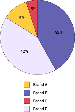 image The pie chart is called Cell Phone Sales. It is divided into four shares. Brand "A" has an eleven percent share. Brand "B" has a 42 percent share. Brand "C" has a five percent share. And brand "D" is 42 percent.
Allow time for students to reflect on the data being represented in the circle graph and form a general impression about it.
- What do you notice about this graph?
- What do you think is interesting about this graph?
- What can you say about this data?
Then ask questions related to each of these three levels of comprehension.
In order to get students to read the data, here are examples of relevant questions to ask them:
- What is this graph about?
- What percentage of sales did Brand C get? How do we know this?
- How many different brands of cell phones are there?
- Which brand represents the blue sector?
In order to get students to read between the data, here are some examples of relevant questions to ask them:
- What is the difference in sales between the company that sells the most and the one that sells the least?
- If the two companies that sell the least join together, would their sales compare to the others?
To get students to read beyond the data, here are examples of relevant questions to ask:
- Do you think the results would be the same if the survey had been done 5 years ago? 5 years from now? Why or why not?
- If you were to survey different age groups about cell phone brands, such as teens 12-18 and adults 25-30, would the results be similar? Different? Why?
Source: adapted and translated from Guide d’enseignement efficace des mathématiques, de la 4e à la 6e année, Traitement des données et probabilité, p. 90-98.
Activity 2: Analysis of Misleading Graphs
The student council of École secondaire des Rivières wants to plan an end-of-year activity. It seeks to know the areas of interest of its school population. In all, 86 students in grades 7 and 8 responded to the survey compared to 162 students in grades 9 to 12.
Have students analyze the circle graphs below by identifying misleading elements.
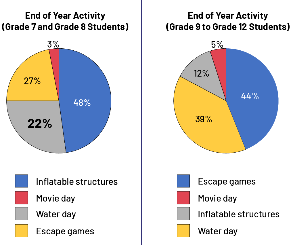 image Two pie charts are presented. The first pie chart is titled End of Year Activity, Grade 7 and grade 8 students. It is divided into four parts. The share for inflatable structures is 48 percent, in blue. The number is written in white while all others are in black. The movie day share is three percent, in red. The water day share is 22 percent, in gray. The number is shown in bold type. And the escape games share is 27 percent, in yellow. The second chart is End of Year Activity, Grade 9 and Grade 12 students. It is divided into four parts. The escape games portion is 44 percent, in blue. The number is written in white while all others are in black. The movie day portion is five percent, in red. The inflatable structures share is twelve percent, in gray. And the water day share is 39 percent, in yellow.
In this case, the same colours were used in both graphs, which may give a sense that you are comparing the same categories when in fact you are not. Moreover, it can be misleading to rely on the percentages of the two graphs, since the total frequency, ie the school population, is not the same; for example, 48% of 86 students in Grades 7 and 8 represent approximately 41 students. However, 44% of 162 students in Grades 9 to 12 represent approximately 71 students. The percentage is lower for the second group of students, but it represents a larger population. Finally, one of the percentages in the first graph is in larger and bolded print. At first glance, the magnified writing of 22% gives the impression that this value is larger than the other percentages. However, the largest value is 48%.