D1.3 Select from among a variety of graphs, including scatter plots, the type of graph best suited to represent various sets of data; display the data in the graphs with proper sources, titles, and labels, and appropriate scales; and justify their choice of graphs.
Skill: Choosing the Appropriate Graph to Represent Various Sets of Data
Representing data in tables and graphs helps communicate information for interpretation.
Source: translated from Guide d’enseignement efficace des mathématiques, de la 4e à la 6e année, Traitement des données et probabilité, p. 62.
How to Organize Data
A variety of tables and graphs are commonly used in data management to represent sets of data clearly and to facilitate analysis. Each has its advantages as well as its limitations. It is important to note, however, that the construction of a table generally precedes the construction of a graph.
In the junior grades, students represent data using a variety of graphs, including multiple-bar graphs, stacked-bar graphs, histograms, and broken-line graphs. In Grade 7, the circle graph is added and in Grade 8, scatter plots are added.
In Grade 8, students can choose any of these representations.
Source : adapted and translated from Guide d’enseignement efficace des mathématiques, de la 4e à la 6e année, Traitement des données et probabilité, p. 66-67.
Skill: Representing Data Using a Graph
Once the data from a survey have been grouped into categories, in a frequency table or a similar representation, it is often very useful to represent it using a graph because of its visual appeal. A graph :
- presents information in an organized manner;
- is generally easier to read and interpret than data represented using text or a table;
- allows you to see all the data at a glance and to get a first impression (for example, whether or not the data is evenly or unevenly distributed between the categories);
- facilitates the next step in the inquiry process, which is the analysis of the data and interpretation of the results.
Source: translated from Guide d’enseignement efficace des mathématiques, de la maternelle à la 3e année, Traitement des données et probabilité, p. 86.
Students must determine the best way to group the data collected in order to facilitate their analysis. There is no rule that dictates how data should be grouped and the choice depends largely on the type of data collected. Students must also choose an appropriate representation and construct it in such a way that the data is clear.
Source: translated from Guide d’enseignement efficace des mathématiques, de la maternelle à la 3e année, Traitement des données et probabilité, p. 80-81.
The order of the categories is important in graphs with quantitative data. Numbers are placed in ascending order. In contrast, the order of the categories is not important in graphs with qualitative data (for example, the colors can be placed in any order).
Sources, titles, labels and scales provide important details about the data in a graph.
- The source indicates where the data was collected.
- The title introduces the data contained in the graph.
- Labels provide additional information, such as the categories that are represented in the sectors of a circle graph. Percentages are often used in circle graphs to describe the categories.
- Scales identify the possible values of a variable along an axis of a graph. Values are arranged in ascending order on a scale.
Source: The Ontario Curriculum. Mathematics, Grade 1-8 Ministry of Education, 2020
Skill: Justifying the Choice of Graph
In order to be able to determine the most appropriate way to represent a set of data, students need to understand the characteristics and purposes of different types of graphs. While a set of data can be visualized with different types of representations, it is important to select the one that provides the best clarity and accuracy given the context. Students should be able to justify their choice of graph with reference to the specific characteristics and purposes of each graph. For example :
- Pictographs, line plots, bar graphs, multiple-bar graphs, and stacked-bar graphs are used to present qualitative data as well as discrete data.
- Histograms present continuous data using intervals. The bars in a histogram have no spaces between them because of the continuous nature of the data. This is in contrast to bar graphs, which have spaces between the bars to show that the categories are discrete.
- Broken-line graphs are used to show change over time and are useful for identifying trends. Students apply their understanding of scales and estimates to create broken-line graphs.
Source: The Ontario Curriculum. Mathematics, Grade 1-8 Ministry of Education, 2020
- Circle graphs are used to show how categories represent parts of a whole data set that can be either qualitative or quantitative data.
- Scatter plots are used to display data points for two continuous variables. The horizontal axis identifies the possible values for one variable and the vertical axis identifies the possible values for the other variable.
Source: The Ontario Curriculum. Mathematics, Grade 1-8 Ministry of Education, 2020
Types of Graphs Involving One Variable
- Pictograph
- Line plot
- Bar graph
- Multiple-bar graph
- Stacked-bar graph
- Histogram
- Circle graph
Types of Graphs Involving Two Variables
- Broken-line graph
- Scatter plot
Source: The Ontario Curriculum. Mathematics, Grade 1-8 Ministry of Education, 2020
Example: Identification of the Type of Graphic Representation
For each of the data sets, the type of graphic representation that will best illustrate the relationships in the data must be chosen.
- Does a person's age affect their ability to hold their breath underwater?
| Age | Average Time Underwater |
|---|---|
| 5 years | 13 seconds |
| 7 years old | 21 seconds |
| 9 years old | 38 seconds |
| 11 years old | 44 seconds |
| 13 years old | 47 seconds |
| 15 years old | 56 seconds |
Source: The Breath Association
A broken-line graph is appropriate because it is a graph that is used to illustrate a change over time. In this situation, the age in years is represented on the horizontal axis and the time underwater is represented on the vertical axis. Sources, titles, labels and appropriate scales should be included.
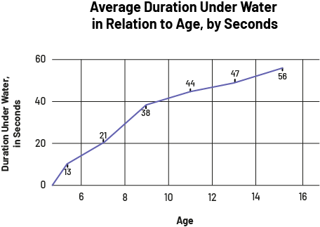 image The broken line graph is titled "Average Duration Under Water in Relation to Age, by Seconds". The horizontal axis is called "Age" and scales from zero to 16. The vertical axis is called "Duration Under Water, in Seconds" and scales from zero to 60. The line starts from zero and goes up diagonally. The dots on the vertical axis are located as follows: 13, 21, 38, 44, 47, 56. On the horizontal axis, the line stops at 15.
- Which search browsers are the most popular?
- Chromium: 43%
- Mozilla Firefox: 22%
- Opera: 16%
- Microsoft Edge: 11%
- Vivaldi: 8%
Since the data are percentages, a circle graph is the best choice of representation to show each part (category) in relation to the whole set of data. Sources, a title, labels and appropriate scales should be included.
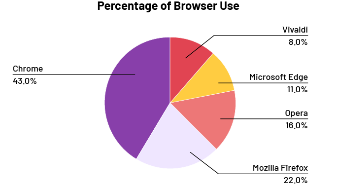 image The pie chart illustrates the percentage of browser use. It is divided into five parts. Chrome represents 43 percent. Vivaldi represents 12 percent. Microsoft Edge represents 11 percent. Opera accounts for 16 percent. And Mozilla Firefox represents 22 percent.
Source: Association of World Paper Encyclopedias
- What is the distribution of working age groups 15 to 64 in Ontario?
| Age Group | Percentage of the Population |
|---|---|
| 15-19 | 9% |
| 20-24 | 9.9% |
| 25-29 | 9.7% |
| 30-34 | 9.6% |
| 35-39 | 9.4% |
| 40-44 | 9.7% |
| 45-49 | 10.4% |
| 50-54 | 11.8% |
| 55-59 | 11% |
| 60-64 | 9.4% |
Source: Government of Ontario
Since the data is continuous and organized into intervals, a histogram is a good representation to show the different age groups. Sources, a title, labels, and to use appropriate scales should be included.
 image The bar graph is titled "Percentage of Population Working by Age Group". The horizontal axis, which is graduated from zero to 60, is named "Age Group", while the vertical axis, graduated from zero to 12, is named "Percentage of Population Working". From zero to 15 on the horizontal axis, the bar rises to nine on the vertical axis. From 15 to 20, the bar rises to 9 point 9. From 20 to 25, the bar rises to 9 point 7. From 25 to 30, the bar rises to 9 point 6. From 30 to 35, the bar rises to 9 point 4. From 35 to 40, the bar rises to 9 point 7. From 40 to 45, the bar rises to 10 point 4. From 45 to 50, the bar rises to eleven point eight. From 50 to 55, the bar rises to eleven. And from 55 to 60, the bar rises to nine point four.
Source: translated from En avant, les maths!, 8e année, CM, Données, p. 4-7.
Knowledge: Graph
A schematic representation of a set of data. There are different types of graphs (for example, bar graph, multiple-bar graph, stacked-bar graph, broken-line graph, histogram, circle graph, scatter plot).
Note: A graph can reflect a bias if it is not well constructed.
Example
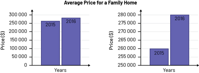 image Two diagrams with two bars are titled "Average price for a single-family home". The horizontal axes of both diagrams are named "Years" and the vertical axes are named "Price in dollars". For the first diagram, the vertical axis is graduated from zero to 300,000. For the year 2015, the bar rises slightly above 250 000. For the year 2016, the bar rises between 250,000 and 300,000. For the second diagram, the vertical axis is graduated from 250 000 to 280 000. For the year 2015, the bar rises to 260,000. And for the year 2016, the bar rises to 280,000.
The price of a house increased by $20,000 in one year. The first graph clearly shows the small increase in the price of a house in one year (from 2015 to 2016), since the gap between the bars is minimal. The second graph is misleading, suggesting that the increase in the price of a house tripled in one year (from 2015 to 2016), since the gap between the bars is larger due to the choice of scale for the vertical axis.
Source: translated from En avant, les maths!, 7e année, CM, Données, p. 2-3.
Knowledge: Axis
A reference line used in a graph or coordinate system. There is a horizontal axis and a vertical axis. The horizontal axis is called the x-axis (x-axis) and the vertical axis is called the y-axis (y-axis) in the cartesian plane.
Source: The Ontario Curriculum. Mathematics, Grade 1-8 Ministry of Education, 2020
Example
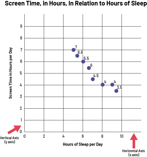 image The broken line graph is titled "Screen Time, in Hours, In Relation to Hours of Sleep". The horizontal axis, scaled from zero to ten, is named "Hours of Sleep per Day", while the vertical axis, scaled from zero to 9, is named "Screen Time in Hours per Day". A red arrow points to the vertical axis, indicating that it is also called the "why" axis. A red arrow points to the horizontal axis, indicating that it is also called the "x" axis. The dots are located at the following points. Between four and six on the horizontal axis, one dot is at 7 and the other at six point six on the vertical axis. At six on the horizontal axis, the dot is at five point five on the vertical axis. Between six and eight on the horizontal axis, one dot is at six and the other at four point five. At eight on the horizontal axis, the dot is at four on the vertical axis. At nine on the horizontal axis, the dot is at four on the vertical axis. And between eight and ten on the horizontal axis, the dot is at three point five on the vertical axis.
Source: translated from En avant, les maths!, 8e année, ML, Données, p. 10.
Knowledge: Title
The title introduces the data contained in the graph.
Source: The Ontario Curriculum. Mathematics, Grade 1-8 Ministry of Education, 2020
Example
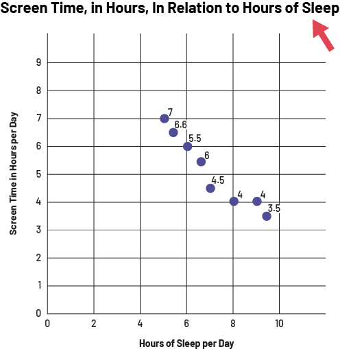 image The broken line graph is titled "Screen Time, in Hours, In Relation to Hours of Sleep". A red arrow points the title. The horizontal axis, scaled from zero to ten, is named "Hours of Sleep per Day", while the vertical axis, scaled from zero to 9, is named "Screen Time in Hours per Day".The dots are located at the following points. Between four and six on the horizontal axis, one dot is at 7 and the other at six point six on the vertical axis. At six on the horizontal axis, the dot is at five point five on the vertical axis. Between six and eight on the horizontal axis, one dot is at six and the other at four point five. At eight on the horizontal axis, the dot is at four on the vertical axis. At nine on the horizontal axis, the dot is at four on the vertical axis. And between eight and ten on the horizontal axis, the dot is at three point five on the vertical axis.
Source: translated from En avant, les maths!, 8e année, ML, Données, p. 10.
Knowledge: Variable
An attribute, number, or quantity that can be measured or counted.
Source: The Ontario Curriculum. Mathematics, Grade 1-8 Ministry of Education, 2020
Knowledge: Single-Variable Data Set
One-variable data refers to one data set from a sample or a population that can be either qualitative or quantitative. Situations involve representing and analyzing the data based on that one variable to answer a question like “What is the average height of all the students in the class?”
Source: The Ontario Curriculum. Mathematics, Grade 1-8 Ministry of Education, 2020
Knowledge: Two-Variable Data Set
Two-variable data refers to two data sets from the same sample or population that can be either qualitative or quantitative. Situations involve representing and analyzing the data based on two variables to answer questions like “Is there a relationship between a person’s height and the length of their arm span?”
Source: The Ontario Curriculum. Mathematics, Grade 1-8 Ministry of Education, 2020
Knowledge: Scale (of a Graph)
A sequence of numbers associated with marks that subdivide an axis. An appropriate scale is chosen to ensure that all data are represented on the graph. For example, if the range of a variable goes to 200, the scale for the axis showing the variable might go in increments of 10, instead of increments of 1, up to 200 or greater.
Source: The Ontario Curriculum. Mathematics, Grade 1-8 Ministry of Education, 2020
Example
 image The broken line graph is titled "Screen Time, in Hours, In Relation to Hours of Sleep". A red arrow points the horizontal axis, scaled from zero to ten, which is named "Hours of Sleep per Day". A red arrow points the vertical axis, scaled from zero to 9, which is named "Screen Time in Hours per Day".The dots are located at the following points. Between four and six on the horizontal axis, one dot is at 7 and the other at six point six on the vertical axis. At six on the horizontal axis, the dot is at five point five on the vertical axis. Between six and eight on the horizontal axis, one dot is at six and the other at four point five. At eight on the horizontal axis, the dot is at four on the vertical axis. At nine on the horizontal axis, the dot is at four on the vertical axis. And between eight and ten on the horizontal axis, the dot is at three point five on the vertical axis.
Source: translated from En avant, les maths!, 8e année, ML, Données, p. 10.
Knowledge: Source
The source indicates where the data was collected.
Source: The Ontario Curriculum. Mathematics, Grade 1-8 Ministry of Education, 2020
Example
Source: The Ontario Curriculum. Mathematics, Grade 1-8 Ministry of Education, 2020
Knowledge: Label
Labels on the axes of a graph describe what is being measured (the variable).
Source: The Ontario Curriculum. Mathematics, Grade 1-8 Ministry of Education, 2020
Example
 image The broken line graph is titled "Screen Time, in Hours, In Relation to Hours of Sleep". A red arrow points the horizontal axis, scaled from zero to ten, which is named "Hours of Sleep per Day". A red arrow points the vertical axis, scaled from zero to 9, which is named "Screen Time in Hours per Day".The dots are located at the following points. Between four and six on the horizontal axis, one dot is at 7 and the other at six point six on the vertical axis. At six on the horizontal axis, the dot is at five point five on the vertical axis. Between six and eight on the horizontal axis, one dot is at six and the other at four point five. At eight on the horizontal axis, the dot is at four on the vertical axis. At nine on the horizontal axis, the dot is at four on the vertical axis. And between eight and ten on the horizontal axis, the dot is at three point five on the vertical axis.
Source: translated from En avant, les maths!, 8e année, ML, Données, p. 10.
Knowledge: Discrete Data
A form of quantitative data. Discrete data is data that can be counted, such as the number of pets, the number of siblings, or the number of buttons.
Source: The Ontario Curriculum. Mathematics, Grade 1-8 Ministry of Education, 2020
Knowledge: Continuous Data
A form of quantitative data. Continuous data is data that can be measured but not counted, such as time, height, and mass.
Source: The Ontario Curriculum. Mathematics, Grade 1-8 Ministry of Education, 2020
Knowledge: Spreadsheet
Software that allows you to create graphic representations.
Source: translated from En avant, les maths!, 7e année, CM, Données, p. 3.
Knowledge: Types of Graphs (Prior Knowledge)
Line Plot
A graph that shows a mark (usually an “X”) above a value on the number line for each entry in the data set.
Source: The Ontario Curriculum. Mathematics, Grade 1-8 Ministry of Education, 2020
Bar Graph (vertical or horizontal)
The bar graph is used to represent the frequencies of a data set. It is composed of bars whose length corresponds to the size of the frequencies. It allows the reader to see, at a glance, the distribution of the data in each category.
Note: To facilitate the construction of bar graphs, it is recommended that students use graph paper.
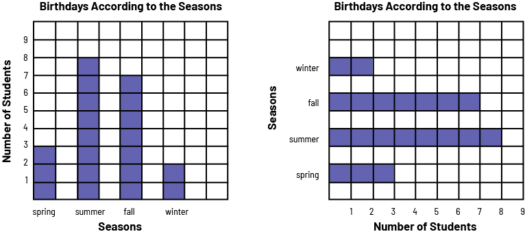 image A red 4 bar chart is titled "Birthdays According to the Seasons". The horizontal axis is named "Seasons," and the vertical axis is named "Number of Students". In spring, the bar goes up to 3. In summer, the bar goes up to 8. In the fall, the bar goes up to 7. And in the winter, the bar goes up to two.A diagram with 4 horizontal red bars is titled "Birthdays According to the Seasons". The horizontal axis is named "Number of Students", and the vertical axis is named "Seasons". In the spring, the bar indicates three students. In the summer, the bar indicates 8 students. In the fall, the bar indicates 7 students. And in the winter, the bar indicates two students.
Characteristics of a Bar Graph:
- It has a title (for example, Birthdays by season).
- It has an axis (vertical or horizontal) graduated on an appropriate scale.
- It has another axis that represents categories (for example, spring, summer, fall, winter).
- The two axes each have a label (for example, Number of Students, Seasons).
- The bars have the same width and their length corresponds, according to the scale chosen, to the size of the population they represent (for example, if the scale is in intervals of 1, a bar of length 3 represents a population of 3).
- The bars are separated by equal spaces.
Source: translated from Guide d’enseignement efficace des mathématiques, de la 4e à la 6e année, Traitement des données et probabilité, p. 72.
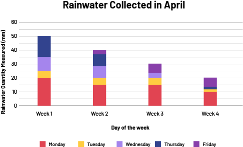
Multiple-Bar Graph
The multiple-bar graph represents more than one set of data simultaneously to facilitate comparisons between them. It has the same characteristics as a bar graph, but each category has two or more bars of data. A key indicates what aspects are represented.
A multiple-bar graph can be constructed in either a horizontal or vertical orientation. The orientation chosen could depend on personal preference or on the purpose of the representation.
 The title of the vertical multiple bar diagram is: Rainwater collected in April. The title of the x-axis is: Day of the week. The axis is graduated in four weeks, i.e. week 1, week 2, week 3 and week 4. The title of the y-axis is: Rainwater quantity measured (in millimeters). The axis is graduated by 5, from 0 to 25. There is a legend: blue is Monday, yellow is Tuesday, red is Wednesday, light blue is Thursday and green is Friday. Below the legend it says "Source: School B Grade 5 Students".
Source: The Ontario Curriculum. Mathematics, Grade 1-8 Ministry of Education, 2020
The data can be organized in a way that makes it easier to compare categories of data with each other. For example, to compare the number and type of pets of students in Grades 1-6, data for Grades 1 to 3 and Grades 4 to 6 could be combined and represented in a double bar.
 image A double horizontal bar graph is titled "Pets of Grade 1 to 6 Students." The yellow bars correspond to students in grades one through three, while the purple bars correspond to students in grades four through six. The horizontal axis is named "Number of Students" and is graduated from zero to 50. The vertical axis is named "Pets". For the dog, the horizontal yellow bar stops between 40 and 45 while the purple bar goes slightly over 45. For the cat, the yellow bar is slightly over 35 while the purple bar is slightly over 30. For the bird, the yellow bar reaches five while the purple bar stops before five. For fish, the yellow bar stops between 15 and 20 while the purple bar stops between five and ten. For "other animal", the yellow bar stops a little before ten and the purple bar goes slightly over ten. And for "no animal", the yellow bar reaches 40 while the purple bar reaches 35.
Stacked-Bar Graph
Stacked-bar graphs present data values proportionally. These graphs can be used to represent percentages or relative frequencies. Each bar in the graph represents the whole, and each of the segments in a bar represents a part (a different category). Different colours are used in each bar to differentiate between categories within the same bar. The stacked-bar graph can be created in more than one way to illustrate different comparisons.
Sources, titles, labels and scales provide important details about the data in a graph.
- The source indicates the origin of the data collected.
- The title presents the data of the graph.
- The labels indicate the categories used to classify the data.
- The scales indicate the values on axes of the graph.
- The values for relative frequencies are indicated using fractions, decimals or percentages.
Example
 image
image
Source: The Ontario Curriculum. Mathematics, Grade 1-8 Ministry of Education, 2020
Broken-Line Graph
The broken-line graph is used to illustrate the trend in data overtime. Continuous data is a form of quantitative data that can be measured, but not counted, such as time, height and mass.
Example
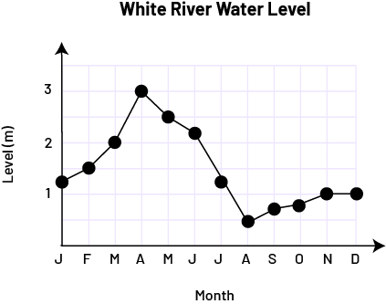 image The broken line diagram with connected dots is titled "White River Water Level". The horizontal axis is named "Month" while the vertical axis, graduated from zero to three, is named "Level in meters". At the letter J, the point is slightly above one. At the letter F, the point is at one and a half. At the letter M, the point is at two. With the letter A, the dot is at three. With the letter M, the dot is two and a half. At the letter J, the point is above two. At the next letter J, the dot is between one and one and a half. At the letter A, the point is at one and a half. At the letter S, the dot is below one. At the letter O, the dot is slightly closer to number one. At the letter N and the letter D, the dot is at one.
Characteristics of a Broken-Line Graph
- It has a title (for example, White River Water Level).
- The axes each have an appropriate scale (for example, 0, 1, 2, 3 and J, F, M…).
- The axes each have a label (for example, Month, Level [m]).
- The data are represented by points.
- Consecutive points are connected by segments that indicate the change between the two corresponding data.
Source: translated from Guide d’enseignement efficace des mathématiques, de la 4e à la 6e année, Traitement des données et probabilité, p. 79-80.
Histogram
A histogram displays continuous quantitative data, such as height, age, or mass, using intervals. For each interval, a bar is drawn so that the width on the x-axis represents the range of its interval and whose height on the y-axis represents the value of the interval. There are no intervals between bars because of the continuous nature of the data. The graph formed by connecting the midpoints of the vertices of the columns of a histogram is called the frequency polygon.
Source: The Ontario Curriculum. Mathematics, Grade 1-8 Ministry of Education, 2020
 image The broken line diagram with connected dots is titled "White River Water Level". The horizontal axis is named "Month" while the vertical axis, graduated from zero to three, is named "Level in meters". At the letter J, the point is slightly above one. At the letter F, the point is at one and a half. At the letter M, the point is at two. With the letter A, the dot is at three. With the letter M, the dot is two and a half. At the letter J, the point is above two. At the next letter J, the dot is between one and one and a half. At the letter A, the point is at one and a half. At the letter S, the dot is below one. At the letter O, the dot is slightly closer to number one. At the letter N and the letter D, the dot is at one.
Circle Graph
A graph in which a circle is used to display data, through the division of the circle proportionally to represent each category.
Source: The Ontario Curriculum. Mathematics, Grade 1-8 Ministry of Education, 2020
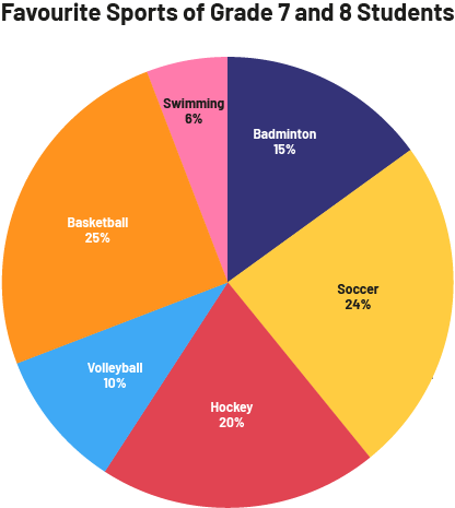 image The pie chart is titled " Favourite Sports of Grade 7 and 8 Students." Badminton represents 15 percent. Soccer accounts for 24 percent. Field hockey is 20 percent. Volleyball accounts for 10 percent. Basketball is 25 percent. And swimming is 6 percent.
Knowledge: Scatter Plot
A graph designed to show a relationship between corresponding numbers from two sets of data measurements associated with a single object or event; for example, a graph of data about marks and the corresponding amount of study time. Drawing a scatter plot involves plotting ordered pairs on a coordinate grid.
When data points form close to a line or a curve, this indicates that there is a strong relationship between the variables.
If data points are more scattered than clustered, this indicates that the relationship between the two variables is not strong.
Source: The Ontario Curriculum. Mathematics, Grade 1-8 Ministry of Education, 2020
Examples
Strong positive relationship
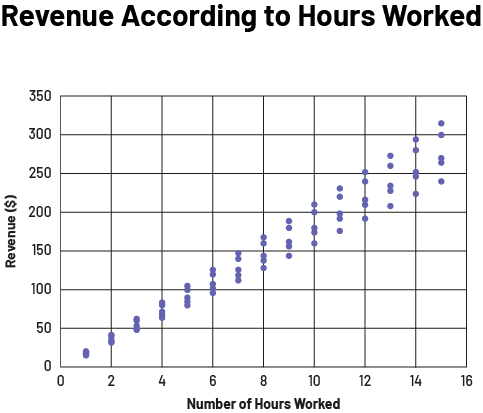 image The scatted diagram is called "Revenue According to Hours Worked". The horizontal axis is graduated from zero to 16 and is called "Number of hours worked", while the vertical axis is graduated from zero to 350 and is called "Revenue in dollars". Between zero and one, the dots are clustered. As we move forward in the chart, they all line up on the diagonal, and tend to spread apart from each other.
Weak negative relationship
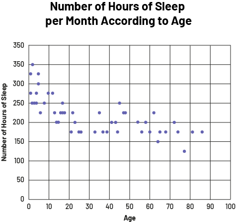 image The scatter diagram is titled "Number of hours of sleep per month according to age". The horizontal axis is scaled from zero to 100 and corresponds to age, while the vertical axis is scaled from zero to 350 and is called "Number of hours of sleep". Between zero and ten years, the dots are between 225 and 350, and then tend to go down with age. The trend goes up a bit between the ages of 35 and 50, and then around 60. The lowest dot is around 125, around age 75.
No relationship
 image The scatter diagram is titled "Student Length of Hair in centimeters According to Age". The horizontal axis is called "Student Age" and is scaled from zero to 18, while the vertical axis is called "Length of hair in centimeters" and is scaled from zero to 70. The scatterplot is quite large.