D1.4 Create an infographic about a data set, representing the data in appropriate ways, including in tables and scatter plots, and incorporating any other relevant information that helps to tell a story about the data.
Skill: Creating an Infographic to Appropriately Represent a Set of Data
Students in Grade 8 should be able to create an infographic to represent a set of data, incorporating relevant information that allows them to tell a story about the data collected. The primary goal is to allow the reader to quickly and easily discern these pieces of information and data. In order to do this, students need to understand what makes an infographic.
From the data, students must target the information that needs to be included in order to convey their message to their target audience. They must organize the visual elements (data and information) in an appealing way through various representations of their choice, such as tables, graphs, and simple illustrations. These representations must present all of the data clearly and accurately. The infographic is created using software and contains very little text. Narrative descriptions often accompany the data to allow for a better understanding of the overall content of the infographic. It should be noted that infographics are used on a daily basis, and can be used in STEM projects.
Source: adapted and translated from En avant, les maths!, 5e année, CM, Données, p. 7-10.
Students should be sure to include all the features of an infographic.
a) Infographics have :
- a title, a completion date and a source;
- various data representations, such as tables and graph;
- very little text;
- clear and accurate information;
- information presented in an attractive manner;
- information relevant to a specific target audience.
b) Infographics communicate:
- the results of one or more research studies;
- the context of the research;
- information related to an important topic.
Source: adapted and translated from En avant, les maths!, 4e année, CM, Données, p. 11.
Example
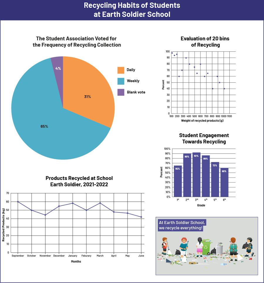 image The infographic is titled "Recycling Habits of Students at Earth Soldier School". First, there is a pie chart titled “The Student Association voted for the frequency of recycling collection". 31 percent voted for daily, 65 percent voted for weekly and 4 percent voted blank. Next, there is a scatter diagram titled "Evaluation of 20 Bins of Recycling". The horizontal axis is named "Weight of recycled products in grams" and is scaled from 100 to 1100, while the vertical axis is named "Percentage" and is scaled from zero to 100. At the beginning of the horizontal axis, the dots are at the top of the vertical axis, and the trend goes in a downward diagonal line.Below the scatter diagram is a bar graph titled "Student Engagement towards Recycling". The horizontal axis is named "Grade" and runs from first to sixth grade. The vertical axis is named "Percentage" and runs from zero to 100. In grade one, the bar rises to 65 percent. In the second year, the bar rises to 90 percent. In the third year, the bar rises to 92 percent. In the fourth year, the bar rises to 86 percent. In the fifth year, the bar rises to 72 percent. And in the sixth year, the bar rises to 60 percent.Below the pie chart is a broken line chart titled "Products recycled at schoolEarth Soldier, 2021 and 2022". The horizontal axis corresponds to the months of September through June , while the vertical axis, graduated from zero to 70, is called "Products Recycled in Kilograms". In September, the dot is at 60 on the vertical axis. In October, the dot is at 50. In November, the dot is at 45. In December, the dot is at 55. In January, the dot is slightly below 60. In February, the dot is at 50. In March, the dot is slightly below 60. In April, the dot is slightly below 50. In May, the dot is between 45 and 50. And in June, the dot is slightly above 40.Underneath the bar graph is an illustration of children picking up trash from a littered floor. It is written, " At Earth Soldier School, we recycle everything!"