D1.6 Analyse different sets of data presented in various ways, including in scatter plots and in misleading graphs, by asking and answering questions about the data, challenging preconceived notions, and drawing conclusions, then make convincing arguments and informed decisions.
Skill: Examining and Analyzing Data Represented in Various Graphs, Including Scatter Plots and Misleading Graphs
The skill of interpreting results is associated with the skill of reasoning in that it requires a certain amount of reflecting and analysing. Educators should help students develop this skill by providing a variety of activities that focus on interpreting results and by asking questions that encourage students to investigate those results closely. These experiences will contribute to the development of data literacy skills.
Gal (2002, p. 1-25) suggests that the interpretation of results should be done from two perspectives: the investigator's and the reader's. From the investigator's perspective, students are looking at data that they have collected in an inquiry and summarized in graphs or tables. Students then interpret the data in order to answer the question of interest that they posed at the beginning of the inquiry. From the reader's perspective, students are looking at data that have been collected externally by others, and teachers should therefore present students with data that relate to other subjects (for example, science and technology, social studies, physical education and health).
When teachers present a table or graph to students, it is important to allow sufficient time for reflection so that students can examine the data and think about what it means. Reflection can be done individually or in small groups. Teachers should then ask open-ended questions to help students communicate their observations and ideas in their own words and develop ideas from those of their peers. For example, teachers might ask:
- What do you notice about this graph?
- What is interesting about this graph?
- What can you say about this data?
- What can you say about this graph?
These open-ended questions elicit a variety of responses, allowing students to communicate their observations, descriptions, and conclusions in a general way. Teachers can then ask students more specific questions to help them develop the ability to make sense of the data. In data processing, this skill involves three levels of comprehension: reading the data, reading between the data, and reading beyond the data.
| Level of Comprehension | Description of the Level |
|---|---|
| Reading the data | Identify the data as represented by the table or graph. |
| Reading between the data | Compare and combine certain data in order to establish relationships between them. |
| Reading beyond the data | Infer or predict implicit or explicit information from a graph or table and make conclusions. |
Teachers sometimes tend to focus on the first level, but Friel et al. (2001, pp. 124-158) suggest that teachers should be careful to always ask questions related to all three levels, regardless of the representation or organization of the data. This will help students develop independance in interpreting graphs and tables and in using statistical measures.
What follows is a more detailed explanation of each of the three levels of comprehension, along with examples of relevant questions that teachers might ask during an activity interpreting the results.
Reading the Data
At this first level of comprehension, students are able to determine:
- the components of the representation, such as the title of the table or graph, the scale or key, the designation of the axes and the choice of categories;
- the value of certain data represented.
Examples of Relevant Questions:
- What is this graph about? (title)
- How many … in the category? How do we know?
- How many variables are there?
- What is the scale on the horizontal axis?
- What does the vertical axis represent in this graph?
Reading Between the Data
This level of comprehension requires viewing data less as "[] an amalgam of personal data each with its own characteristics" and more as "[] a collective data set with new properties" (Konold & Higgins, 2003, p. 202). This level of comprehension is more difficult to achieve because students must analyze individual data by combining them or comparing data sets.
At this second level of comprehension, students are able to:
- examine whether there is a relationship between two variables;
- see if there is some general trend in either variable;
- describe the absence or existence of correlation between two variables with the appropriate terminology (weak or strong positive relationship, weak or strong negative relationship, no relationship);
- identify outliers and eliminate them in order to be able to adjust the curve.
Example
Describe the relationship (if any) between the outside temperature and ice cream sales.
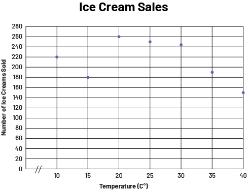 image The scatter diagram is called "Ice Cream Sales". Scaled from ten to 40, the horizontal axis is called "Temperature in degrees Celsius", while the vertical axis is scaled from zero to 280 and is called "Number of ice creams sold". At 10 degrees Celsius, 220 ice creams are sold. At 15 degrees Celsius, 180 ice creams are sold. At 20 degrees Celsius, 260 ice creams are sold. At 25 degrees Celsius, 270 ice creams are sold. At 30 degrees Celsius, 245 ice creams are sold. At 35 degrees Celsius, 190 ice creams are sold. And at 40 degrees Celsius, 150 ice creams are sold.
Examples of Relevant Questions:
- Does the increase in outdoor temperature correspond to the increase in ice cream sales? (No. However, between 15 degrees Celsius and 20 degrees Celsius, there is an increase in ice cream sales)
- How many ice creams in total are sold when the temperature is between 20°C and 30°C? (There are 755 ice creams sold when the temperature is between 20°C and 30°C)
- How many ice creams were sold in total? (1495 ice creams were sold in total)
Reading Beyond the Data
At this third level of comprehension, students use several critical and analytical thinking skills. They are able to:
- recognize what the graph or table does not "tell" directly;
- specify the trend of a data set;
- make inferences and predictions;
- draw conclusions and justify them;
- assess the credibility and logic of predictions and conclusions;
- assess the representativeness of the range, mode, median and mean;
- review the steps in the inquiry process.
Examples of Relevant Questions:
- How can you explain the drop in sales when the temperature reaches 40°C? (You could say that when the temperature reaches 40°C, people go out less to avoid exposure to the extreme heat.)
- What other questions can you answer from this graph?
Source: adapted and translated from Guide d’enseignement efficace des mathématiques, de la 4e à la 6e année, Traitement des données et probabilité, p. 91-98.
Skill: From a Graph, Drawing Conclusions, Formulating Arguments and Making Decisions
After examining and analyzing the data (three levels of comprehension, in other words, reading the data, reading between the data, and reading beyond the data) in a graph, students are led and challenged to draw conclusions, formulate arguments, and make decisions.
Interpretation of the results allows you to draw relevant conclusions to answer questions of interest and make informed decisions.
Source: translated from Guide d’enseignement efficace des mathématiques, de la 4e à la 6e année, Traitement des données et probabilité, p. 89.
Decision-making is very important in the inquiry process because without decision-making, the process becomes meaningless. Why would anyone set up an inquiry and then collect, organize, and analyze data if they have no intention of drawing conclusions? In many cases, decision-making is limited to providing an answer to the original question. In other cases, it is about using the answer to decide whether to act in a particular way. Therefore, teachers should engage students in answering the question of interest using all three levels of comprehension, so that they can make decisions based on:
- the relationships established between the data;
- the meaning that students have derived from the data;
- the conclusions they drew from it.
Source: translated from Guide d’enseignement efficace des mathématiques, de la 4e à la 6e année, Traitement des données et probabilité, p. 101
Knowledge: Misleading Graph
A graph displaying information that misrepresents the data. For example, a pictograph that uses different sizes of pictures or symbols for different categories can be misleading because it may appear as if some categories have a greater or lesser count, when they don’t.
Source: The Ontario Curriculum. Mathematics, Grade 1-8 Ministry of Education, 2020
Example
Here is a graph displaying information that distorts the data. This graph illustrates the relationship between the mass of adult individuals and the mass lifted by those individuals.
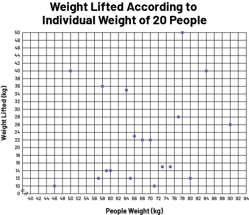 image The scatter diagram is titled "Weight Lifted According to Individual Weight of 20 People". Scaled from 40 to 94, the horizontal axis is called "People weight in kilograms", while the vertical axis is scaled from zero to 50 and is called "Weight lifted in kilograms". The scatter plot is large and spread out.
This graph is misleading because it does not provide any information about the participants (for example, their age). Also, according to the title of the graph, 20 people participated in the survey. However, the graph represents only 19 data values. On closer analysis, the "Weight Lifted" axis has a minimum of 10 and a maximum of 50, which likely eliminated data that would have been less than 10 or greater than 50. The same remark could be made for the horizontal axis.
It is important to emphasize that throughout the stage of interpreting the results, teachers should encourage students to exercise critical judgment of how the data is presented so that they become aware of the possible limits of this representation. The ability to exercise this critical judgment is an important component of statistical thinking. To help students build this skill, teachers support them to:
- question the representativeness and reliability of primary or secondary data by asking questions such as:
- Was the data collection done without bias?
- Is the source of the secondary data reliable?
- check whether the representation gives an accurate portrait of the data by asking questions such as: “Is the data represented without leaving false impressions? "
Example
Teachers present the following graph from a trade magazine.
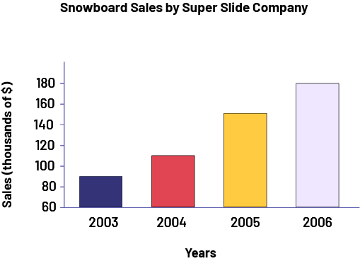 image The bar graph is titled "Snowboard Sales by Super Slide Company". The horizontal axis corresponds to years, while the vertical axis corresponds to sales in thousands of dollars and is graduated from 60 to 180. In 2003, the bar goes up to 90. In 2004, the bar goes up to 110. In 2005, the bar goes up to 150. And in 2006, the bar goes up to 180.
During the interpretation of the results, they encourage the students to question the representation of the data by telling them:
- From the graph, it looks like sales doubled from 2004 to 2005. Is this really the case?
In interpreting the results, the teacher encourages students to question the representation of the data by saying, "From the graph, it looks like sales have doubled from 2004 to 2005. Do you agree?" After analysis, students should be able to recognize that although the yellow bar is twice as long as the red bar, in reality, 2004 sales are about $110 000 and 2005 sales are about $155 000, so they have not doubled. It is important to emphasize that this graph is not incorrect per se, as it represents the data accurately. However, it can be misleading if we do not analyze it carefully.
Teachers can then lead students to recognize that, to represent the data without misleading anyone, it would be sufficient to scale the vertical axis from 0 to 180 as follows.
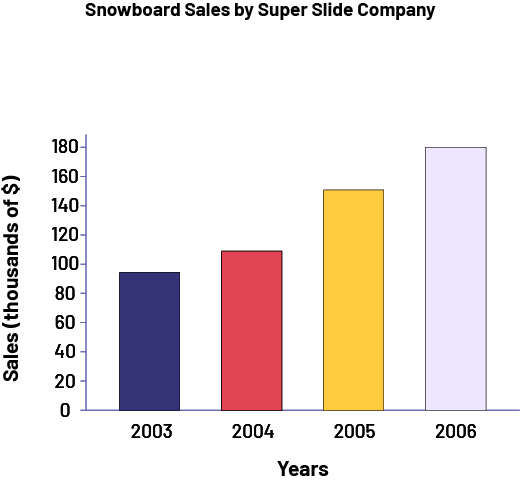 image The bar graph is titled "Snowboard Sales by Super Slide Company". The horizontal axis corresponds to years, while the vertical axis corresponds to sales in thousands of dollars and is graduated from 60 to 180. In 2003, the bar goes up to 90. In 2004, the bar goes up to 110. In 2005, the bar goes up to 150. And in 2006, the bar goes up to 180.
In this new graph, since the lengths of the bars are proportional to sales, we get a more accurate representation of the data. It is now clearer that sales did not double from 2004 to 2005 and it can be seen that they almost doubled from 2003 to 2006.
Source: translated from Guide d’enseignement efficace des mathématiques, de la 4e à la 6e année, Traitement des données et probabilité, p. 104-106.