D1.3 Select from among a variety of graphs, including scatter plots, the type of graph best suited to represent various sets of data; display the data in the graphs with proper sources, titles, and labels, and appropriate scales; and justify their choice of graphs.
Activity 1: Scatter Plot
Ask students the following question:
- Is there a relationship between the width of a strawberry plant and the number of strawberries it produces?
This can be determined by measuring the width of the plants and the number of strawberries harvested. The following table includes such data:
| Width of Strawberry Plants (cm) | Number of Strawberries Produced |
|---|---|
| 24 | 28 |
| 25 | 31 |
| 26 | 35 |
| 26 | 36 |
| 27 | 34 |
| 27 | 35 |
| 27 | 38 |
| 28 | 38 |
| 29 | 40 |
| 29 | 41 |
| 30 | 45 |
| 31 | 44 |
| 31 | 46 |
| 32 | 48 |
| 34 | 47 |
Source: Magasine Agricole
Ask students what kind of graph would be appropriate for this data set. Bring the following points out in the discussion :
This data set involves two variables in which we are asked to determine a relationship between them, so a bar graph is inappropriate. A circle graph is also inappropriate because it does not accommodate two variables. A broken-line graph represents two variables, but is meant to show a trend over time, which is not the case here. A scatter plot is used to show relationships between two variables.
Ask students to construct the scatter plot, and remind them of the success criteria:
- a title for the scatter plot
- a horizontal axis (x-axis) labelled appropriately
- a vertical axis (y-axis), labelled appropriately
- appropriate scales
- points representing the data in the table above.
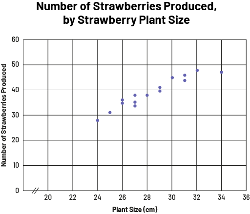 image The scatter diagram is titled "Number of Strawberries Produced, by Strawberry Plant Size". Scaled from zero to 36 with a break between zero and 20, the horizontal axis is called "Plant size in centimeters," and the vertical axis, scaled from zero to 60, is called "Number of strawberries produced. The trail of dots starts at 24 on the horizontal axis and slightly below 30 on the vertical axis. The dots remain rather clustered until the last one, located at 34 on the horizontal axis and between 45 and 50 on the vertical axis.
Allow time for students to reflect on the data in the graph they have just constructed. Reflection can be done individually or in small groups. Teachers should then ask open-ended questions to help students communicate their observations and ideas into their own words and develop ideas from those of their peers. For example, they might ask:
- Looking at your graph, what do you notice?
- Is there a relationship between the width of a strawberry plant and the number of strawberries produced? How do you know?
Activity 2: Scatter Plot
In this activity, students will create a scatter plot with software such as Quattro Pro, Excel, Google Spreadsheet, etc.
Present the following situation to the students.
Students in one class held a bolo competition on a special day. The goal was to hit the ball as many times as possible for as long as possible without missing a shot.

The table below shows the results for 15 students.
| Duration in Seconds | Number of Keystrokes |
|---|---|
| 14 | 28 |
| 12 | 24 |
| 15 | 75 |
| 48 | 48 |
| 28 | 84 |
| 20 | 40 |
| 44 | 132 |
| 22 | 110 |
| 36 | 180 |
| 50 | 200 |
| 57 | 114 |
| 30 | 120 |
| 6 | 24 |
| 25 | 25 |
| 39 | 156 |
Ask students:
- Is there a correlation between the number of hits and the duration?
Tell students that to answer this question, they are to construct a scatter plot using software.
Example of a Scatter Plot
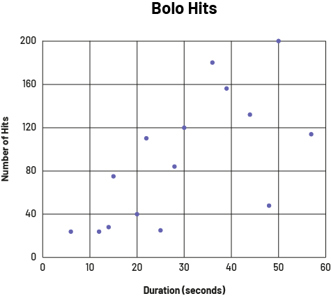
Source: translated from L'@telier - Ressources pédagogiques en ligne (atelier.on.ca)