D1.3 Select from among a variety of graphs, including multiple-bar graphs, the type of graph best suited to represent various sets of data; display the data in the graphs with proper sources, titles, and labels, and appropriate scales; and justify their choice of graphs.
Skill: Choosing the Appropriate Graph to Represent Various Sets of Data
Visualization involves representing data in graphs and tables, helping in the effective communication of information for the purpose of interpretation.
Source: translated from Guide d’enseignement efficace des mathématiques, de la 4e à la 6e année, Traitement des données et probabilité, p. 62.
How to Organize the Data
A variety of tables and graphs are commonly used in data management to represent sets of data clearly and to facilitate analysis. Each has its advantages as well as its limitations. It is important to note, however, that the creation of a table generally precedes the creation of a graph.
Source: translated from Guide d’enseignement efficace des mathématiques, de la 4e à la 6e année, Traitement des données et probabilité, p. 66.
Skill: Representing Data Sets
Representing data in tables and graphs helps communicate information for interpretation.
Students must determine the best way to group the data collected in order to facilitate their analysis, and then choose an appropriate representation and construct it in such a way as to ensure the clarity of the message conveyed.
Once the data have been collected and recorded, students must group them within a limited number of categories. There is no rule that dictates how to group the data; the choice of grouping depends largely on the type of data collected.
Once the data from a survey has been grouped into categories in a frequency table or the like, it is often very useful to represent it using a graph because of its visual impact. Indeed, a graph:
- presents information in an organized manner;
- is generally easier to read and interpret than a data representation using text or a table;
- allows you to see all the data at a glance and to get a first impression (for example whether the data is evenly or unevenly distributed between the categories);
- facilitates the analysis of the data and interpretation of the results.
Source: translated from Guide d’enseignement efficace des mathématiques, de la maternelle à la 3e année, Traitement des données et probabilité, p. 81-83.
For example, students can represent a set of statistical data much more succinctly and effectively with a table or graph than with an oral description. However, students must learn to use various conventional representations of data (for example, frequency table, stem-and-leaf plot, multiple bar graphs) correctly to ensure that the message being conveyed is the correct one and is understood by others. Students can then use these representations to justify a reasoning or support an argument during a mathematical discussion in a class group setting.
Source: translated from Guide d’enseignement efficace des mathématiques, de la maternelle à la 3e année, Traitement des données et probabilité, p. 30.
Sources, titles, labels, and scales provide important details about the data in a graph, among other things:
- the source indicates the origin of the data collected;
- the title presents the data of the graph;
- the labels indicate the categories used to classify the data;
- the scales indicate the values on an axis of the graph.
The order of the categories is important in graphs presenting quantitative data. The numbers are placed in ascending order. In contrast, the order of the categories does not matter in graphs presenting qualitative data (for example, the colours can be placed in any order).
Source : The Ontario Curriculum. Mathematics, Grades 1-8 Ontario Ministry of Education, 2020.
Skill: Justifying Choice of Graph
In order to select the best representation of the data collected, students need to understand the characteristics and purposes of different types of graphs. While data can be visualized using different types of representations, it is important to select the one that provides the best clarity and accuracy of the data in context. For example, pictograph charts, tally lines, bar charts, and multiple bar charts are used to present qualitative and discrete data.
Students in grade 4 are representing sets of data for the first time in stem and leaf plots, and in multiple bar graphs. However, it is important to recall the types of graphs seen in previous grades so that students can select the appropriate graph based on the data and thus justify their choice.
Knowledge: Types of Graphs
Line Plot
The line plot is useful for representing a large amount of numerical data. Each piece of data is represented by an X. Xs that correspond to the same quantity are arranged one above the other to form columns. Since the height of each column corresponds to the frequency it represents, data analysis is made easier.
Example
The teacher asks students to check how many years their parents have lived in their current home. The results are represented by the following line plot.
image The number line is titled: "Number of parents grade 4 have been living in current home.” The line named "Number of Years" is scaled from 1 to 23. The number 1 shows the presence of one X. Number two has no X’s. Number 3 has 4 X’s. Number 4 has 6 X’s. Number 5 shows 5 X's. Numbers 6 and 7 show no X’s. Number 8 has two X's. Numbers 9, 10 and 11 have no X’s. Number 12 has one X. Number 13 has 7 X's. Number 14 has 4 X's. Number 15 has 5 X's. Numbers 16, 17, 18 and 19 have no X. Number 20 has 2 X's. The numbers 21 and 22 have no X. Number 23 has one X.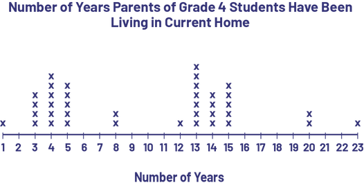
It is easy to see from the distribution of X's that there were two waves of moves, 3-5 years ago and 13-15 years ago, which might be because of new housing construction or the creation of new jobs in the city.
Characteristics of a Line Plot
- it has a title;
- It has a graduated horizontal axis with a label.
- each data is represented by an X. The Xs that represent the same numerical data are aligned and are separated from each other by a constant space.
Source: translated from Guide d’enseignement efficace des mathématiques, de la 4e à la 6e année, Traitement des données et probabilité, p. 83-84.
Bar Graph (vertical or horizontal)
The bar graph is used to represent data for comparison purposes. It is composed of rectangular bars whose length corresponds to the frequency of a value. It allows the reader to see, at a glance, the distribution of data in each category.
Note: To facilitate the creation of bar graphs, it is recommended that students use graph paper.
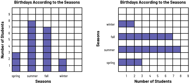 image diagram 1: A purple 4 bar chart is titled "Birthdays According to the Seasons". The horizontal axis is named "Seasons," and the vertical axis is named "Number of Students". In spring, the bar goes up to 3. In summer, the bar goes up to 8. In the fall, the bar goes up to 7. And in the winter, the bar goes up to two. diagram 2: A diagram with 4 horizontal purple bars is named "Birthdays Acccording to the Seasons". The horizontal axis is named "Number of Students", and the vertical axis is named "Seasons". In the spring, the bar indicates three students. In the summer, the bar indicates 8 students. In the fall, the bar indicates 7 students. And in the winter, the bar indicates two students.
Characteristics of a Bar Graph
- It has a title (for example, Birthdays by season).
- It has an axis (vertical or horizontal) graduated on an appropriate scale.
- It has another axis that represents categories (for example, spring, summer, fall, winter).
- The two axes each have a label (for example, Number of Students, Seasons).
- The bars have the same width and their length corresponds, according to the scale chosen, to the size of the population they represent (for example, if the scale is in intervals of 1, a bar of length 3 represents a population of 3).
- The bars are separated by equal spaces.
Source: translated from Guide d’enseignement efficace des mathématiques, de la 4e à la 6e année, Traitement des données et probabilité, p. 71-72.
Knowledge: Multiple Bar Graph
The multiple bar graph is similar to the bar graph, but it is used to compare data from multiple populations for the same characteristic. This data can come from any type of data collection, including:
- a data collection by observation (for example, comparing the font size of different types of books in the Grade 2, Grade 3 and Grade 4 reading centers);
- a data collection by means of an experiment (for example, you want to compare the relationship between the number of hours of sunlight, the amount of water and the growth of four different types of tomato plants);
- a poll survey (for example, you want to compare the favourite sports of students in class 4A, class 4B and class 4C);
- a sample survey (for example, compare the length of the feet and hands of 6-, 7-, 8-, and 9-year-olds);
- a secondary data collection (for example, to compare the academic subject preferences of students in the class with those of all students in the school and of elementary school students in Canada).
Since students know how to create a bar graph, it is relatively easy for the teacher to get them to create a multiple bar graph. For example, the teacher could present them with three frequency tables such as the following.
Class 4A Students’ Favourite Sports
| Sports | Number of Students |
|---|---|
| Hockey | 9 |
| Basketball | 3 |
| Soccer | 3 |
| Other | 5 |
Class 4B Students’ Favourite Sports
| Sports | Number of Students |
|---|---|
| Hockey | 5 |
| Basketball | 5 |
| Soccer | 7 |
| Other | 3 |
Class 4C Students’ Favourite Sports
| Sports | Number of Students |
|---|---|
| Hockey | 6 |
| Basketball | 4 |
| Soccer | 8 |
| Other | 2 |
The teacher then asks students to create a horizontal bar graph to represent the favourite sports of students in class 4A (Figure 1) and two others, in different colours, to represent the favourite sports of students in class 4B (Figure 2) and 4C (Figure 3).
image A diagram with 4 horizontal purple bars is titled: "Favourite Sports of Grade 4A Students". The horizontal axis is named "Number of students" while the vertical axis is named "Sports". The bar named Hockey reaches the number 9. The bar named Basketball reaches the number 3. The bar named Soccer reaches the number 3. And the bar named Other reaches the number 5.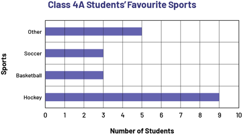 image A diagram with 4 horizontal red bars is titled: "Favourite Sports of Grade 4B Students". The horizontal axis is named "Number of students" while the vertical axis is named "Sports". The bar named Hockey reaches the number 5. The bar named Basketball reaches the number 5. The bar named Soccer reaches the number 7. And the bar named Other reaches the number 3.
 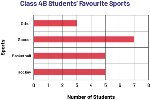 image A diagram with 4 horizontal black bars is titled: "Favourite Sports of Grade 4C Student". The horizontal axis is named "Number of students" while the vertical axis is named "Sports". The bar named Hockey reaches the number 6. The bar named Basketball reaches the number 4. The bar named Soccer reaches the number 8. And the bar named Other reaches the number two.
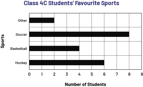
The teacher can then show them the multipe-bar graph below and ask them to describe its characteristics.
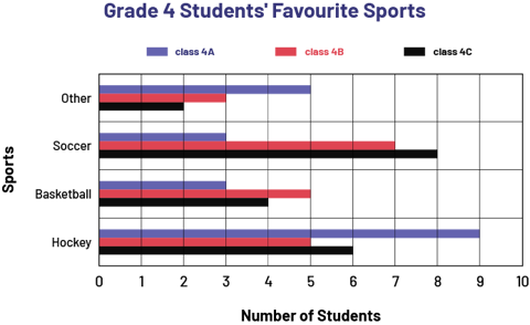 image A diagram with 12 horizontal coloured bars is titled: "Favorite Sports of the Fourth Grade Students". The horizontal axis is named "Number of Students" while the vertical axis is named "Sports". For hockey, the purple bar for reaches the number 9, the red bar reaches the number 5 and the black bar reaches the number 6. For basketball, the purple bar reaches the number 3, the red bar reaches the number 5 and the black bar reaches the number 4. For soccer, the purple bar reaches the number 3, the red bar reaches the number 7 and the black bar reaches the number 8. For other sports, the purple bar reaches the number 5, the red bar reaches the number 3 and the black bar reaches the number two.
The teacher then presents students with three more frequency tables, and asks them to create a multiple bar graph that represents these data.
Characteristics of a Multiple Bar Graph
- It has a title (for example, Grade 4 Students' Favourite Sports).
- It has a graduated axis according to an appropriate scale.
- It has another axis that indicates categories (for example, field hockey, basketball, soccer, other).
- The two axes each have a label (for example, Number of Students, Sports).
- For each category, there are two or more adjacent bars of different colours, each representing a group of data (for example, the blue bars represent students in class 4A as opposed to the red and black bars which represent students in class 4B and 4C, respectively).
- The bars have the same width and their length corresponds, depending on the scale chosen, to the size of the characteristic they represent (for example, if the scale is in intervals of 1, a bar of length 3 represents a population of 3).
- Bars in one category are separated from bars in another category by equal spaces.
Source: adapted and translated from Guide d’enseignement efficace des mathématiques, de la 4e à la 6e année, Traitement des données et probabilité, p. 75-76.