D1.6 Analyse different sets of data presented in various ways, including in stacked-bar graphs and in misleading graphs, by asking and answering questions about the data, challenging preconceived notions, and drawing conclusions, then make convincing arguments and informed decisions.
Skill: Examining and Analyzing Data Represented in Various Graphs
The ability to interpret results is related to the ability to reason in that it requires a certain amount of thinking and analysis. Teachers need to help students develop this skill by providing a variety of activities that focus on interpreting results and by asking questions that encourage students to look closely at those results. In doing so, they will also be contributing to the development of students' data literacy skills.
Gal (2002) suggests that the interpretation of the results should be done from two points of view, that of the investigator and that of the reader. From the investigator's perspective, students examine data that they have collected and that they have summarized in graphs or tables. They then interpret them to answer the question of interest they asked at the start of the inquiry. From the reader's point of view, students examine data that comes from outside, that is, has been collected by others. In this context, the teacher can take the opportunity to present data related to other subjects; for example, science and technology, social studies, physical education and health.
When presenting a table or graph to students, teachers should ensure that students are given sufficient time to reflect on it so that they can examine the data and form a general idea. This reflection can be done individually or in small groups. Teachers should then ask students open questions to help them translate their observations and ideas into their own words and to develop ideas from those of other students in the class. For example, teachers might ask:
- What do you notice about this graph?
- What is interesting about this graph?
- What can you say about this data?
- What can you say about this graph?
These open-ended questions elicit a variety of responses, allowing students to communicate their observations, descriptions, and conclusions in a general way. Teachers can then ask students more specific questions to help them develop the ability to make sense of the data. In data processing, this skill involves three levels of comprehension: reading the data, reading between the data, and reading beyond the data.
|
Level of Comprehension |
Description of the Level |
|
Reading the data |
Identify the data as represented in the table or graph. |
|
Reading between the data |
Compare and combine data to establish relationships between them. |
|
Reading Beyond the Data |
Infer or predict implicit or explicit information from a graph or table and make conclusions. |
Teachers sometimes tend to focus on the first level of comprehension. According to Friel and collaborators (2001), but they should be careful to always ask questions related to all three levels, regardless of the representation or organization of the data. This will help students develop independance in interpreting graphs and tables and in using statistical measures.
What follows is a more detailed explanation of each of the three levels of comprehension, along with examples of relevant questions that teachers might ask during an activity interpreting the results.
Reading the Data
At the first level of comprehension, students are able to identify:
- the components of the representation; for example, the title of the table or graph, the scale or key, the designation of the axes, the choice of categories;
- the value of certain data represented.
Examples of Relevant Questions:
- What is this graph about? (The title)
- How many … in the category? How do we know?
- How many categories are there?
- What is the scale on the horizontal axis?
- What does the vertical axis represent in this graph?
- What does the largest area represent?
Reading Between the Data
This level of comprehension requires viewing data less as "[…] an amalgam of personal data each with its own characteristics" and more as "[…] a collective data set with new properties" (Konold & Higgins, 2003). This level of comprehension is more difficult to achieve because students must analyze individual data by combining them or comparing data sets.
At the second level of comprehension, students are able to:
- compare data using expressions such as more than, less than, as much as, the most, the least, a little more than, three times less than, there is a small difference between;
- compare the heigths of bars in a bar graph;
- make connections between different ways of describing a relationship between data;
- combine some data according to certain categories and compare the frequencies of each category;
- describe some advantages and disadvantages of two different representations of the same data;
- determine the value of certain statistical measures (mode, median, mean) of a set of data.
Examples of Relevant Questions:
- What is the most popular category for students in grades 4, 5 and 6?
- Is the number of students with ... greater than the total number of students with ...?
- Of the metals produced in Canada in 2004, did more than half of the production come from Ontario?
- How many more of … are there compared to…?
- Is there one category that outperforms all others in terms of frequency?
- Why were these data presented in two graphs rather than one?
Reading Beyond the Data
At this third level of comprehension, students use several critical and statistical thinking skills. They are able to:
- recognize what the graph or table does not "tell" directly;
- specify the trend of a data set;
- make inferences and predictions;
- draw conclusions and justify them;
- assess the credibility and logic of predictions and conclusions;
- assess the representativeness of the range, mode, median and mean;
- review the steps in the inquiry process.
Relevant questions
- Do you think that… is the most common in all cities? Why?
- If the survey is redone using other response choices, will the results be similar? Why?
- How could the data be organized to uncover additional information? (For example, by pooling the data from elementary and middle school students, one can analyze student preference in a more general way.)
- What other questions can be answered using the graph?
Source: translated from Guide d’enseignement efficace des mathématiques, de la 4e à la 6e année, Traitement des données et probabilité, p. 89-97.
Skill: From a Graph, Drawing Conclusions, Formulating Arguments and Making Decisions
After examining and analyzing the data (three levels of comprehension, in other words, reading the data, reading between the data, and reading beyond the data) in a graph, students are led and challenged to draw conclusions, formulate arguments, and make decisions.
Interpretation of the results allows you to draw relevant conclusions to answer questions of interest and make informed decisions.
Source: translated from Guide d’enseignement efficace des mathématiques, de la 4e à la 6e année, Traitement des données et probabilité, p. 89.
Decision-making is very important in the inquiry process because without decision-making, the process becomes meaningless. Why would anyone set up an inquiry and then collect, organize, and analyze data if they have no intention of drawing conclusions? In many cases, decision-making is limited to providing an answer to the original question. In other cases, it is about using the answer to decide whether to act in a particular way. Therefore, teachers should engage students in answering the question of interest using all three levels of comprehension, so that they can make decisions based on:
- the relationships established between the data;
- the meaning they have derived from the data;
- the conclusions they drew from it.
Source: translated from Guide d’enseignement efficace des mathématiques, de la 4e à la 6e année, Traitement des données et probabilité, p. 101.
Knowledge: Misleading Graph
A graph is a schematic representation of a set of data. There are different types of graphs, such as pictographs, bar graphs, multiple-bar graphs and stacked-bar graphs.
Note: A graph can reflect a bias if it is not well constructed.
Example
image The title of both bar graphs is: Average price for a single-family home. In the first diagram, the title of the x-axis is "Years". On the first bar it says 2015, on the second bar it says 2016. The two bars have almost the same height. The title of the y-axis is "Price (in dollars)". The axis is graduated by 50,000, i.e. from 0 to 300,000. In the second diagram, the title of the x-axis is "Years". On the first bar it says 2015, on the second bar it says 2016. The 2015 bar is much smaller than the 2016 bar. The title of the y-axis is "Price (in dollars)". The axis is graduated by 5,000, from 250,000 to 280,000.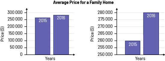
The price of a house increased by $20 000 in 1 year. The first graph clearly shows the small increase in the price of a house in 1 year (between 2015 and 2016), since the gap between the bars is minimal. The second graph is misleading, suggesting that the increase in the price of a house tripled in 1 year (between 2015 and 2016), since the gap between the bars is larger due to the choice of scale for the vertical axis.
Source: translated from En avant, les maths!, 7e année, CM, Données, p. 2.