D1.3 Select from among a variety of graphs, including histograms and broken-line graphs, the type of graph best suited to represent various sets of data; display the data in the graphs with proper sources, titles, and labels, and appropriate scales; and justify their choice of graphs.
Skill: Choosing the Appropriate Graph to Represent Various Sets of Data
Visualization involves representing data in graphs and tables, helping in the effective communication of information for the purpose of interpretation.
Source: translated from Guide d’enseignement efficace des mathématiques, de la 4e à la 6e année, Traitement des données et probabilité, p. 62.
How to Organize the Data
A variety of tables and graphs are commonly used in data management to represent sets of data clearly and to facilitate analysis. Each has its advantages as well as its limitations. It is important to note, however, that the creation of a table generally precedes the creation of a graph.
Students in Grade 6 represent data using a variety of graphs, including multiple-bar graphs, stacked-bar graphs, histograms, and broken-line graphs. These are graphic representations.
Source: translated from Guide d’enseignement efficace des mathématiques, de la 4e à la 6e année, Traitement des données et probabilité, p. 66.
Skill: Representing Data Sets
Representation of data in tables and graphs is used to communicate information for interpretation.
Students must determine the best way to group the data collected in order to facilitate their analysis, and then choose an appropriate representation and construct it in such a way as to ensure the message is conveyed with clarity.
Once the data has been collected and recorded, students must group it within a limited number of categories. There is no rule that dictates how to group the data. The choice of grouping depends largely on the type of data collected.
Source: translated from Guide d’enseignement efficace des mathématiques, de la maternelle à la 3e année, Traitement des données et probabilité, p. 80-81.
Once data have been grouped into categories in a frequency table or similar, it is often very useful to represent them using a graph because of its visual impact. In effect, a graph:
- presents information in an organized manner;
- is generally easier to read and interpret than data represented using text or a table;
- allows you to see all the data at a glance and to get a first impression (for example, whether or not the data is evenly or unevenly distributed between the categories);
- facilitates the analysis of the data and interpretation of the results.
Source: translated from Guide d’enseignement efficace des mathématiques, de la maternelle à la 3e année, Traitement des données et probabilité, p. 86.
For example, students can represent a set of statistical data much more succinctly and effectively with a table or graph than with an oral description. However, students must learn to use the various conventional representations of data (for example, relative-frequency table, broken-line graph, histogram) correctly to ensure that the message being conveyed is the correct one and is understood by others. Students can then use these representations to justify a reasoning or support an argument during a mathematical conversation with the class.
Source: translated from Guide d’enseignement efficace des mathématiques, de la maternelle à la 3e année, Traitement des données et probabilité, p. 30.
The source, titles, labels, and scales provide important information about data in a graph or table:
- The source indicates where the data was collected.
- The title introduces the data contained in the graph.
- Labels provide additional information, such as the intervals that have been used in a histogram.
- Scales identify the possible values of a variable along an axis of a graph.
Source: The Ontario Curriculum. Mathematics, Grades 1-8 Ontario Ministry of Education, 2020.
Skill: Justifying the Choice of Graph
In order to properly target the best representation for the data collected, students need to understand the characteristics and purposes of the different types of graphs. While data can be visualized within different types of representations, it is important to select the one that provides the best clarity and accuracy of the data in context. Students are able to justify their choice of graph with their in-depth knowledge of the characteristics and purposes of each graph.
- Pictographs, line plots, bar graphs, multiple-bar graphs, and stacked-bar graphs are used to present qualitative and discrete quantitative data.
- Histograms present continuous data using intervals. The bars in a histogram have no spaces between them because of the continuous nature of the data. This is in contrast to bar graphs, which have spaces between the bars to show that the categories are discrete.
- Broken-line graphs are used to show change over time and are useful for identifying trends. Students apply their understanding of scales and estimation to create broken-line graphs.
Source: The Ontario Curriculum. Mathematics, Grades 1-8 Ontario Ministry of Education, 2020.
Students in grade 6 are representing sets of data for the first time in histograms and broken-line graphs; however, it is important to recall the types of graphs seen in previous grades so that students can choose the appropriate graph based on the data and thus justify their choice.
Knowledge: Types of Graphs
Line Plot
The line plot is useful for representing a large amount of numerical data. Every data item is represented by an X and the Xs corresponding to the same quantity are arranged one above the other to form columns. Since the height of every column corresponds to the size of the frequency it represents, data analysis is easy.
Example
Teachers ask their students to check how many years their parents have lived in their current home. The results are represented by the following line plot.
image The number line is titled: "Number of years parents of grade 4 have been living in current home.” The line named "Number of Years" is scaled from one to 23. The number one shows the presence of one X. Number two has no X’s. Number 3 has 4 X’s. Number 4 has 6 X’s. Number 5 shows 5 X's. Numbers 6 and 7 show no X’s. Number 8 has two X's. Numbers 9, ten and 11 have no X’s. Number 12 has one X. Number 13 has 7 X's. Number 14 has 4 X's. Number 15 has 5 X's. Numbers 16, 17, 18 and 19 have no X. Number 20 has 2 X's. The numbers 21 and 22 have no X. Number 23 has one X.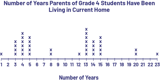
It is easy to see from the distribution of Xs that there were two waves of moves, 3-5 years ago and 13-15 years ago, which could be the result of new housing construction or new jobs in the city.
Characteristics of a Line Plot:
- It has a title.
- It has a graduated horizontal axis with a label.
- Each piece of data is represented by an X. The Xs that represent the same numerical data are aligned and separated from each other by a constant space.
Source: translated from Guide d’enseignement efficace des mathématiques, de la 4e à la 6e année, Traitement des données et probabilité, p. 83-84.
Bar Graph (Vertical or Horizontal)
The bar graph is used to represent the frequencies of a set of data. It is composed of rectangular bars whose length corresponds to the frequency of the outcome. It allows the reader to see, at a glance, the distribution of the data in each category.
Note: To facilitate the construction of bar graphs, it is recommended that students use graph paper.
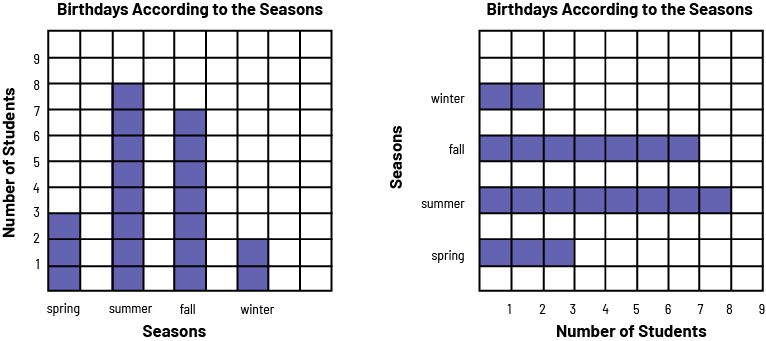 image graph1: A purple 4 bar chart is titled "Birthdays According to the Seasons". The horizontal axis is named "Seasons," and the vertical axis is named "Number of Students". In spring, the bar goes up to 3. In summer, the bar goes up to 8. In the fall, the bar goes up to 7. And in the winter, the bar goes up to two. graph2: A diagram with 4 horizontal purple bars is titled "Birthdays According to the Seasons". The horizontal axis is named "Number of Students", and the vertical axis is named "Seasons". In the spring, the bar indicates three students. In the summer, the bar indicates 8 students. In the fall, the bar indicates 7 students. And in the winter, the bar indicates two students.
Characteristics of a Bar Graph:
- It has a title (for example, Birthdays by season).
- It has an axis (vertical or horizontal) graduated on an appropriate scale.
- It has another axis that represents categories (for example, spring, summer, fall, winter).
- The two axes each have a label (for example, Number of students, Seasons).
- The bars have the same width and their length corresponds, depending on the scale chosen, to the size of the frequency they represent (for example, if the scale is by intervals of 1, a bar of length 3 represents a frequency of 3).
- The bars are separated by equal spaces.
Source: translated from Guide d’enseignement efficace des mathématiques, de la 4e à la 6e année, Traitement des données et probabilité, p. 71-72.
Multiple-Bar Graph
The multiple-bar graph represents more than one set of data simultaneously to facilitate comparison between them. It has the same characteristics as a bar graph, but each category has two or more bars of data. A key indicates what aspects are represented.
A multiple-bar graph can be constructed in either a horizontal or vertical orientation. The orientation chosen could depend on personal preference or on the purpose of the representation.
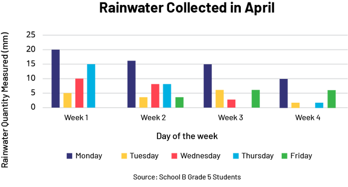 The title of the vertical multiple bar diagram is: Rainwater collected in April. The title of the x-axis is: Day of the week. The axis is graduated in four weeks, i.e. week 1, week 2, week 3 and week 4. The title of the y-axis is: Rainwater quantity measured (in millimeters). The axis is graduated by 5, from 0 to 25. There is a legend: blue is Monday, yellow is Tuesday, red is Wednesday, light blue is Thursday and green is Friday. Below the legend it says "Source: School B Grade 5 Students".
Source: The Ontario Curriculum. Mathematics, Grades 1-8 Ontario Ministry of Education, 2020.
The data can be organized in a way that makes it easier to compare categories of data with each other. For example, to compare the number and type of pets of students in Grades 1 to 6, data for Grades 1 to 3 and Grades 4 to 6 could be combined and represented in a double bar.
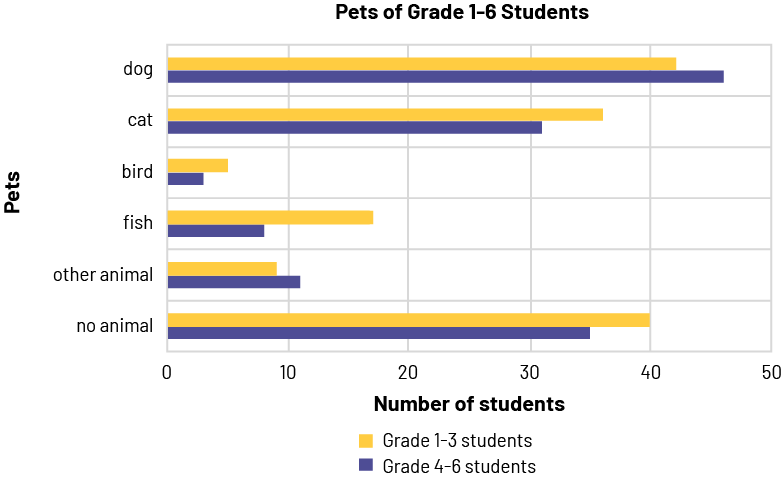 A double horizontal bar graph is titled "Pets of Grade 1 to 6 Students ." The yellow bars correspond to students in grades one through three, while the purple bars correspond to students in grades four through six. The horizontal axis is named "Number of Students" and is graduated from zero to 50. The vertical axis is named "Pets". For the dog, the horizontal yellow bar stops between 40 and 45 while the purple bar goes slightly over 45. For the cat, the yellow bar is slightly over 35 while the purple bar is slightly over 30. For the bird, the yellow bar reaches five while the purple bar stops before five. For fish, the yellow bar stops between 15 and 20 while the purple bar stops between five and ten. For "other animal", the yellow bar stops a little before ten and the purple bar goes slightly over ten. And for "no animal", the yellow bar reaches 40 while the purple bar reaches 35.
Stacked-Bar Graph
Stacked-bar graphs display the data values proportionally. Stacked-bar graphs can be used to display percent, or relative frequency. Each bar in the graph represents a whole, and each of the segments in a bar represents a different category. Different colours are used within each bar to easily distinguish between categories.
Stacked bars are useful when there is a second categorical variable in a data set, for example, a set that includes preferred kinds of granola bars and age.
Sources, titles, labels, and scales provide important details about the data in a graph:
- The source indicates where the data was collected.
- The title introduces the data contained in the graph.
- Labels on the axes of a graph describe what is being measured (the variable). A key on a stacked-bar graph indicates what each portion of the bar represents.
- Scales are indicated on the axis of bar graphs , showing frequencies , and the key of pictographs.
- The scale for relative frequencies is indicated using fractions, decimals, or percents.
Example
image The title of the stacked bar diagram is: Rainwater collected in April. The title of the x-axis is: Day of the week. The axis is scaled into four weeks: week 1, week 2, week 3 and week 4. The title of the y-axis is: Rainwater Quantity Measured (in millimeters). The axis is graduated by 5, from 0 to 60. There is a legend: red is Monday, yellow is Tuesday, pink is Wednesday, green is Thursday and blue is Friday. Below the legend it says "Source: School B Grade 5 Students".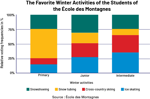
Knowledge: Broken-Line Graph
The broken-line graph is used to illustrate a trend in data overtime. Continuous data is a form of quantitative data that can be measured, but not counted, such as time, height and mass. Junior Division students typically use the broken-line graph to illustrate change over a period of time, such as a change in temperature or the growth of a plant. For example, we measured the water level of the Blanche River every month of the year and obtained the following results.
| Month | J | F | M | A | M | J | J | A | S | O | N | D |
| Level (m) | 1.3 | 1.5 | 2.0 | 3.0 | 2.5 | 2.1 | 1.3 | 0.5 | 0.6 | 0.7 | 1.0 | 1.0 |
This data can be represented by points on a graph as follows.
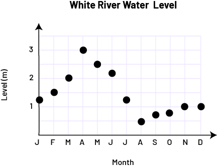 image The broken line diagram is titled "White River Water Level". The horizontal axis is named "Month" while the vertical axis, graduated from zero to three, is named "Level in meters". At the letter J, the point is slightly above one. At the letter F, the point is at one and a half. At the letter M, the point is at two. With the letter A, the dot is at three. With the letter M, the dot is two and a half. At the letter J, the point is above two. At the next letter J, the dot is between one and one and a half. At the letter A, the point is at one and a half. At the letter S, the dot is below one. At the letter O, the dot is slightly closer to one. At the letter N and the letter D, the dot is at one.
The data corresponding to the water level is continuous, since it can take any value between two integers. Similarly, time is a continuous variable, since we can consider any moment within the month. We can therefore join the data points by line segments and obtain a broken-line graph.
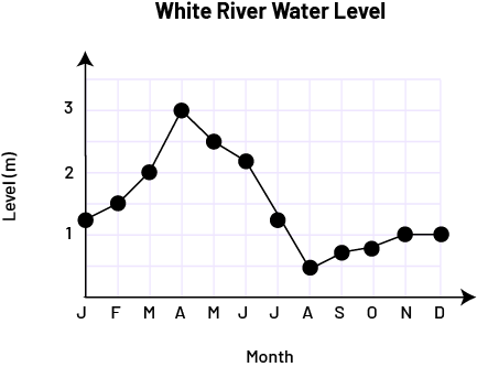 image The broken line diagram with connected dots is titled "White River Water Level". The horizontal axis is named "Month" while the vertical axis, graduated from zero to three, is named "Level in meters". At the letter J, the point is slightly above one. At the letter F, the point is at one and a half. At the letter M, the point is at two. With the letter A, the dot is at three. With the letter M, the dot is two and a half. At the letter J, the point is above two. At the next letter J, the dot is between one and one and a half. At the letter A, the point is at one and a half. At the letter S, the dot is below one. At the letter O, the dot is slightly closer to number one. At the letter N and the letter D, the dot is at one.
The line segment between two successive data points indicates that the water level of the river changes continuously between the two samples. The line segments that form the broken line are approximations of the curve that would be obtained if the water level were taken every week, day, hour, minute, or second. Before creating a broken-line graph, students should know how to interpret the points on an existing broken-line graph, that is, understand what each point represents. To do this, teachers can use data from a survey known to the students or present them with new data, making sure that they understand the situation well. For example, students can be presented with the results of a survey in which the height of a plant was measured every week for five consecutive weeks.
Growth of a Plant
| Week | 0 | 1 | 2 | 3 | 4 | 5 |
| Height (cm) | 5 | 8 | 12 | 17 | 20 | 21 |
The teacher then presents them with a graph in which the data is represented by points, and asks questions to ensure that the students understand what each point represents.
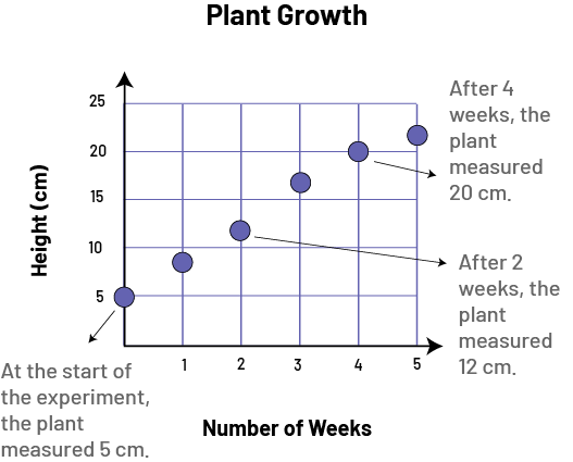 image A broken line diagram is titled “Plant Growth". The horizontal axis, graduated from zero to five, is named "Number of weeks", while the vertical axis, graduated from zero to 25, is named "Height in centimeters". Additional information accompanies every other dot. At zero on the horizontal axis, the dot is at five on the vertical axis, with the following information: “At the start of the experiment, the plant measured five centimeters". At one on the horizontal axis, the dot is slightly below ten. At two on the horizontal axis, the dot is slightly above ten, with the following information: "After two weeks, the plant measured 12 centimeters". At three on the horizontal axis, the dot is slightly above 15. At 4 on the horizontal axis, the dot is at 20, with the following information: "After 4 weeks, the plant measured 20 centimeters". At 5 on the horizontal axis, the dot is between 20 and 25.
Then the teacher connects consecutive points with line segments to indicate growth during the first week, the second week, and so on.
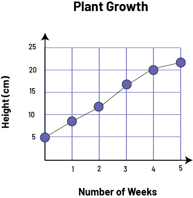 image A broken line diagram with connected dots is titled "Plant Growth". The horizontal axis, graduated from zero to five, is named "Number of weeks", while the vertical axis, graduated from zero to 25, is named "Height in centimeters". At zero on the horizontal axis, the dot is at five on the vertical axis. At one on the horizontal axis, the dot is slightly below ten. At two on the horizontal axis, the dot is slightly above ten. At three on the horizontal axis, the dot is slightly above 15. At 4 on the horizontal axis, the dot is at 20. At 5 on the horizontal axis, the dot is between 20 and 25.
The teacher then ask students to represent data using points in on a graph with the scales and titles provided. For example, the teacher could ask them to add data for the growth of a second plant.
Growth of an Anthurium Plant
| Week | 0 | 1 | 2 | 3 | 4 | 5 |
| Height (cm) | 0 | 3 | 7 | 12 | 18 | 24 |
This gives students the graph below, to which they can then add the line segments.
 image A double broken line diagram is titled "Plant Growth". The horizontal axis, graduated from zero to five, is named "Number of weeks", while the vertical axis, graduated from zero to 25, is named "Height in centimeters". The first sequence of dots is purple and the dots are connected. The second sequence is red and the dots are not connected. At zero on the horizontal axis, the purple dot is at five on the vertical axis, while the red dot is at zero. At one on the horizontal axis, the purple dot is slightly below ten while the red dot is between zero and one. At two on the horizontal axis, the purple dot is slightly above ten while the red dot is slightly above five. At three on the horizontal axis, the purple dot is slightly above 15 while the red dot is between ten and 15. At 4 on the horizontal axis, the purple dot is at 20 while the red dot is between 15 and twenty. And at five on the horizontal axis, the purple dot is between 20 and 25 while the red dot is at 25.
Once students are able to interpret and create a broken-line graph when a scale is provided, they can advance to work that involves deciding on a scale that best fits a data set.
Characteristics of a Broken-Line Graph:
- It has a title (for example, White River Water Level).
- The axes each have an appropriate scale (for example, 0, 1, 2, 3 and J, F, M …).
- The axes each have a label (for example, Month, Level [m]).
- The data is represented by points.
- Consecutive points are connected by line segments because the data is continuous.
Source: translated from Guide d’enseignement efficace des mathématiques, de la 4e à la 6e année, Traitement des données et probabilité, p. 79-82.
Knowledge: Histogram
A histogram displays continuous quantitative data (for example, height, age, mass) using intervals. For each interval, a bar is drawn whose width on the x-axis represents the range of its interval and whose height is proportional to the frequency of the interval. There are no gaps between the bars because of the continuous nature of the data. The histogram is generally used for managing large sets of data. The graph formed by connecting the midpoints of the column vertices of a histogram is called the frequency polygon.
Example
The graph below with five coloured bars is titled "Average Middle School Student Height". The horizontal axis is named "Height (cm)" while the vertical axis, graduated from zero to 20, is named "Number of Students”. The first bar is yellow and rises to 20. The second bar is red and rises to 15. The third bar is blue and goes up to ten. The fourth bar is light purple and rises to between 6 and 15. And the fifth bar is dark purple and rises slightly above 15.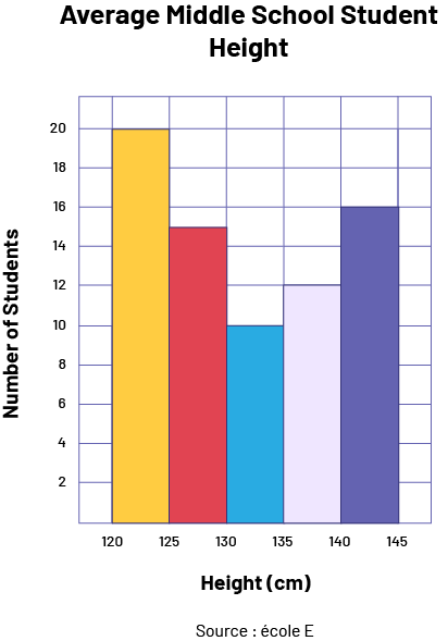
A histogram gives a picture of the distribution or shape of the data.
A normal distribution gives a symmetrical histogram that looks like a bell. In this case, the mode, the mean and the median are the same.
If data is skewed to the left (goes up from left to right), then the mean is likely to be less than the median. If the data is skewed to the right (goes down from left to right), then the mean is likely to be greater than the median.
Source: The Ontario Curriculum. Mathematics, Grades 1-8 Ontario Ministry of Education, 2020.
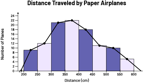 image A hybrid diagram illustrates data using 8 bars and connected dots that sit atop each bar. The chart is titled: "Distances traveled by paper airplanes". The horizontal axis, graduated from zero to 800, is named "Distance in centimeters". The vertical axis, graduated from zero to 25, is named "Number of planes". The first bar, from 200 to 250, is dark purple and rises slightly below the number ten. The second bar, from 250 to 300, is light purple and rises between ten and 15. The third bar, between 300 and 350, is dark purple and rises to 20. The fourth bar, between 350 and 400 is light purple and rises slightly above 20. The fifth bar, from 400 to 450 is dark purple and rises slightly below the number 20. The sixth bar, from 450 to 500, is light purple and rises slightly above ten. The seventh bar, from 500 to 550 is dark purple and rises to ten. And the eighth bar, from 550 to 600, is light purple and rises to five.
Source: translated from En avant, les maths!, 6e année, CM, Données, p. 2.