D1.4 Create an infographic about a data set, representing the data in appropriate ways, including in tables, histograms, and broken-line graphs, and incorporating any other relevant information that helps to tell a story about the data.
Activity 1: Understand What an Infographic Is
Here is an infographic created by a Grade 6 student who attends Rising Sun School. This infographic represents weather data for the month of October.
image The infographic is titled "October Weather" and is divided into 4 illustrations. The first illustration shows three naive yellow suns on a white background. The first one smiles broadly with a thumb up. The second is smiling moderately and pointing ahead. And the third is smiling broadly, wearing sunglasses and pointing up. The second illustration is titled "Temperatures". It shows two thermometers: the first, named "Minimum", shows a low blue mercury and a temperature of 12 degrees Celsius. The second, named Maximum", shows a high red mercury and a temperature of 31 degrees Celsius. The third illustration is a five coloured bar graph with a zigzag line that emphasizes the variations. The chart is entitled "October Temperatures". The horizontal axis, graduated from 11 to 35, is named "Temperature in Celsius" while the vertical axis, graduated from zero to 8, indicates the frequency. The first bar, from 11 to 15 degrees, is transparent and goes up to 6 on the vertical axis. The second bar, from 16 to 20 degrees, is yellow and goes up to 8. The third bar, from 21 to 25 degrees, is blue and goes up to 6. The fourth bar, from 26 to 30 degrees, is red and goes up to 8. And the last bar, from 31 to 35 degrees, is purple and goes up to 3. The fourth illustration is a broken line diagram with connected dots, titled "Daily temperatures, at noon, during one week in October". The horizontal axis is named "Days" while the vertical axis, graduated from zero to 26, is named "Temperature in Celsius". On day one, the dot is located at 18. On day two, the dot is at 20. On day three, the dot is at 23. On day four, the dot is at 23. On day five, the dot is at 19. On day six, the dot is at 21. And on day 7, the dot is at 17.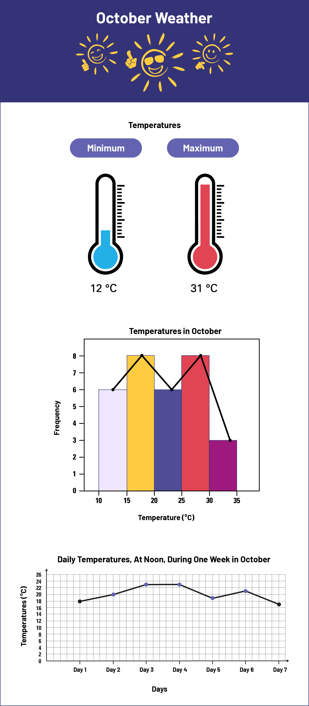
Ask students the following questions:
- What are the features of this infographic?
- What do you think the purpose of this infographic is? What message is the student trying to convey?
- What data representations did the student choose and why did they choose them?
Source: translated from En avant, les maths!, 6e année, ML, Données, p. 14.
Activity 2: Create an Infographic
A committee is working to encourage reading among Ontario students. Here are two tables that summarize the data collected.
Table A
| Year | Number of Students Surveyed | Students Who like to Read | Percentages of Students Who Say they like to Read |
|---|---|---|---|
| 2016 | 146 412 | 56 842 | 39 % |
| 2017 | 145 628 | 61 541 | 42 % |
| 2018 | 145 898 | 62 476 | 43 % |
| 2019 | 146 002 | 61 852 | 42 % |
| 2020 | 146 098 | 58 953 | 40 % |
| 2021 | 146 053 | 63 878 | 44 % |
| 2022 | 146 198 | 69 830 | 48 % |
Note: Percentages have been rounded to the nearest unit.
Table B
Age of Students Who like to Read in 2022
| Age Groups | Frequency |
|---|---|
| 6 to 8 years | 27 461 |
| 9 to 11 years | 22 956 |
| 12 to 14 years | 10 831 |
| 15 to 17 years | 8 532 |
Ask students to create the most appropriate graphs to represent the data given in the frequency tables above. Then ask them to create an infographic to represent the data collected by the committee while including the graphs they created.