D1.3 Select from among a variety of graphs, including circle graphs, the type of graph best suited to represent various sets of data; display the data in the graphs with proper sources, titles, and labels, and appropriate scales; and justify their choice of graphs.
Activity 1: Choosing The Most Appropriate Graph to Represent Data
The following is a relative frequency table summarizing the results of the June 2022 provincial election. This secondary data was collected from the CBC website.
Ontario Election Results (June 2022)
| Political Party | Frequency | Relative Frequency (%) |
|---|---|---|
|
Conservative Party |
1 910 481 |
40.8 |
|
New Democratic Party |
1 110 563 |
23.7 |
|
Liberal Party |
1 114 600 |
23.8 |
|
Green Party |
278 975 |
6.0 |
|
Other political parties |
263 408 |
5.6 |
|
Total |
4 678 027 |
99.9 |
Source: Ontario Election 2022 Results | ICI Radio-Canada.ca.
Note: Rounding relative frequencies in percent to the nearest tenth causes a loss of precision, hence the total is 99.9% and not 100%. It is important to have a discussion with students about the effect of rounding on relative frequencies.
Ask students the following question:
What type of graph would best represent the data in it? Explain your reasoning.
Examples of answers
Student A
I think it is best to use a circle graph to represent the data. This graph will visually represent the portion of each category within the whole (the total votes). The size of each sector will give a better picture of what the data represents and make it easier to interpret at a glance.
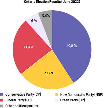 Image A pie chart is entitled "Ontario Election Results in June 2022". It is divided into five parts. The Conservative Party occupies 40.8 percent of the chart. The New Democratic Party occupies 23.7 percent. The Liberal Party occupies 23.8 percent. The Green Party occupies six percent. And Other political parties occupy 5.6 percent.
After constructing the pie chart, we can say that the Conservative Party received almost half of the vote (40.8%). Only 0.1% separates the number of votes received by the Liberal and New Democratic Parties. Yet there is a difference of 4037 votes. In analyzing the data, we see that the circle graph best represents the data in the relative frequency table.
Student B
I think it is best to use a bar graph, since we are representing qualitative data (political parties) and comparing the frequency between the various categories.
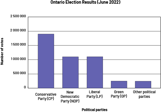 Image A purple bar graph is titled "Ontario Election Results in June 2022". The horizontal axis is called "Political Parties" while the vertical axis, graduated from zero to 2 500 000 is called "Number of Votes". In the Conservative Party, the bar rises slightly below two million. For the New Democratic Party and the Liberal Party, the bars rise slightly above one million. And for the Green Party and the Other Political Parties, the bars fall between zero and 500 000.
After constructing the bar graph, we can see that almost 2 million Ontarians voted for the Conservative Party, while about 1 million voted for each of the New Democratic Party and the Liberal Party. Less than 1 million Ontarians voted for the Green Party, as well as for the other political parties. By analyzing the graph, we can also say that about 5 million Ontarians voted in the June 2022 election, less than half of the registered voters. It would be interesting to compare the data with the last Ontario election, to see if each of the political parties has won more or less votes since the 2018 election. To do this, we could construct a multiple-bar graph.
Activity 2: Easy-to-Construct Circle Graphs
There are several ways to easily construct a circle graph without the need for software. You can quickly construct circle graphs by having the students in the class name their favourite baseball team. Then have them line up in a row to group the students who named the same team. Then have the groups form a circle. Tape one end of the four strings to the floor at a point in the center of the circle. Stretch each string out to a point in the circle between two groups of students who have chosen different teams. You've made a beautiful circle graph without measuring or calculating percentages.
Example
Human circle graph: students form a circle and the stretched ropes separate the different groups.
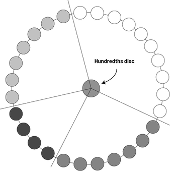 Image The circle is made up of ten white disks, seven dark gray disks, four black disks and seven light gray disks. The hundredths disk, in the center, unfolds four strings that separate the sets of disks by colour.
Copy the hundredths disc (FR 3: Hundredths Disc), cut it out and put it in the center of the circle the students are forming: the strings define each sector of the diagram.
 Image The disk of hundredths is divided into ten equal parts, and is graduated by hundredths all around. The radius at degree zero is dotted.
There is another simple way to construct a circle graph, which is similar to the human graph. First, have students construct a bar graph to represent the data to be interpreted. Then, cut out the bars and join them end to end using tape. Finally, join the two ends to the previously joined segments and draw the circle. You can then approximate the percentages using the hundredths disk, as you did earlier.
Source: Van de J. Walle and L. Lovin (2008). L'enseignement des mathématiques - L'élève au centre de son apprentissage, tome 3. Éditions du Renouveau pédagogique inc. ISBN: 978-2-7613-2342-0, p. 351 and 397.
Activity 3: Represent Data Using a Circle Graph
Present students with the following scenario:
A survey of 25 000 Canadian youth aged 12 to 17 was conducted to determine their physical activity habits. The following table illustrates the results:
| Physical Activity Among Youth Aged 12 to 17 Years | Frequency | Relative Frequency (Decimal Number) | Relative Frequency (Percent) |
|---|---|---|---|
| Active (Engages in physical activity more than 4 times a week) | 4750 | 0.19 | 19 % |
| Moderately active (Participates in physical activity about 3 times a week) | 9000 | 0.36 | 36 % |
| Somewhat active (Engages in physical activity about 2 times a week) | 1500 | 0.06 | 6 % |
| Very low activity (Participates in physical activity about once a week) | 6500 | 0.26 | 26 % |
| Inactive (Occasional or no physical activity) | 3250 | 0.13 | 13 % |
| Total | 25 000 | 1.0 | 100 % |
Represent the results of the relative frequency table as a circle graph. Before you begin, first order the categories from largest to smallest based on what you anticipate to be the size of each section of the circle.
Strategy
Before creating the circle graph, the categories are ordered from largest to smallest based on the estimated size of each section of the circle. The largest section of the circle will likely be occupied by the "Moderately Active" category because it has the highest relative frequency in the graph at 36%. The categories that should follow are:
- 2nd section of the graph: Very low activity (26%)
- 3rd section of the graph: Active (19%)
- 4th section of the graph: Inactive (13%)
- 5th section of the graph: Somewhat active (6%)
To create a circle graph, we need to measure the angle to the nearest degree of each sector.
| Physical Activity Among Youth Aged 12 to 17 Years | Frequency | Relative Frequency (Decimal Number) | Relative Frequency (Percent) | Angle Measurement (to the Nearest Degree) |
|---|---|---|---|---|
| Active (Engages in physical activity more than 4 times a week) | 4750 | 0.19 | 19 % | \({\begin{align} 19\% \times 360 \\ 0,19 \times 360 = 68° \end{align}}\) |
| Moderately active (Participates in physical activity about 3 times a week) | 9000 | 0.36 | 36 % | \({\begin{align} 36\% \times 360 \\ 0,36 \times 360 = 130° \end{align}}\) |
| Somewhat active (Engages in physical activity about 2 times a week) | 1500 | 0.06 | 6 % | \({\begin{align} 6\% \times 360 \\ 0,06 \times 360 = 22° \end{align}}\) |
| Very low activity (Participates in physical activity about once a week) | 6500 | 0.26 | 26 % | \({\begin{align} 26\% \times 360 \\ 0,26 \times 360 = 93° \end{align}}\) |
| Inactive (Occasional or no physical activity) | 3250 | 0.13 | 13 % | \({\begin{align} 13\% \times 360 \\ 0,13 \times 360 = 47° \end{align}}\) |
| Total | 25 000 | 1.0 | 100 % | 360° |
Note: In the frequency table, the column Angle measurement is only necessary when the circle graph is constructed by hand. Draw a circle on a sheet using a compass and use a protractor to separate the circle into sectors according to the calculated angle measurements. To find the angle measurement representing each sector, multiply the percentage relative frequency by 360, since a circle is 360o.
Only the columns Physical Activities of 12- to 17-year-olds and Frequency or Percentage Frequency are needed when the pie chart is constructed using a spreadsheet. Insert the data into the spreadsheet, making sure not to add the Total row.
The results can now be represented in the form of a circle graph. The circle graph should include the following elements:
- title: Physical activity participation among youth ages 12 to 17;
- circle divided into five adjacent sectors;
- designation of sectors using percentages: 36%, 26%, 19%, 13%, 6%;
- designation of sectors according to the categories: Active, Moderately Active, Somewhat Active, Very Low Activity and Inactive.
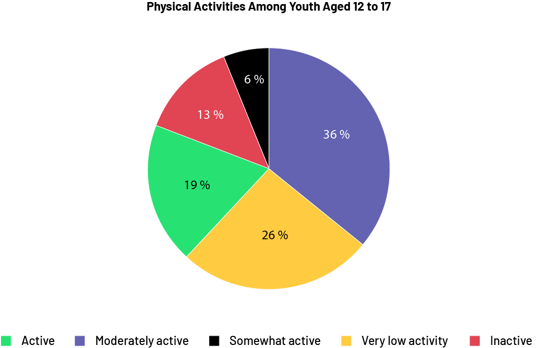 Image The pie chart is entitled "Physical Activity among Youth Aged 12 to 17. It is divided into five coloured sections. "Active" takes up 19 percent of the space. Moderately active is 36 percent. A little active is at six percent. Very little active is at 26 percent. And inactive is at 13 percent.
Source: translated from En avant, les maths!, 7e année, CM, Données, p. 5-8.