D1.5 Use mathematical language, including the terms “strong”, “weak”, “none”, “positive”, and “negative”, to describe the relationship between two variables for various data sets with and without outliers.
Skill: Describing the Relationship Between Two Variables Belonging to Different Data Sets, With or Without Outliers
When analyzing a scatter plot, students observe the arrangement of the data points in order to describe the relationships (or lack thereof) between the two variables being studied.
When data points cluster to form a line or a curve, there is a strong relationship between the variables.
When data points are scattered, there is no relationship.
The scatter plot of a weak relationship between two variables shows points that are more spread out than those showing a strong relationship.
The scatter plot of a positive relationship shows points going upwards from the origin and to the right. The scatter plot of a negative relationship shows points going down from left to right.
If a data set has outliers, something may have gone wrong in the data collection (or measurement). This requires further investigation. It may represent a valid, unexpected piece of the population needing further clarification. If the investigation uncovers an error, the researcher should fix it. If the data turns out to be from an individual that is not part of the population, then it should be removed. If none of these are uncovered, then re-sampling may be needed.
Source: The Ontario Curriculum. Mathematics, Grade 1-8 Ministry of Education, 2020
The scatter plot, also called the scatter diagram, is used to analyze relationships between variables. Students will plot the points on a graph and describe the relationship between two variables using terms such as "strong," "weak," "none," "positive," and "negative".
In science, the scatter plot is widely used to present the measurement of two or more related variables. The scatter plot is particularly useful when the values of the variables on the y-axis depend on the values of the variable on the x-axis.
In a scatter plot, the points are placed without being connected. The resulting trend indicates the type and strength of the relationship between two or more variables.
The following is an example of a scatter plot which could be used to look for a relationship between income and car ownership. Here, the percentage of people who own a car increases with income, showing a positive relationship between these two variables.
 image The scatter diagram is titled "Owning a Car in Everything Town According to Household Revenue". The horizontal axis is scaled from 10,000 to 110,000 and is called "Revenue in Dollars". The vertical axis is scaled from 50 to 100 and is called "Percentage". The dots tend to form an ascending diagonal.
| Income ($) | Percentage (%) |
|---|---|
| 20 000 | 60 |
| 30 000 | 55 |
| 40 000 | 75 |
| 50 000 | 85 |
| 60 000 | 82 |
| 70 000 | 97 |
| 80 000 | 87 |
| 90 000 | 90 |
| 100 000 | 95 |
The trend of the points in the scatterplot shows the relationship between the variables. Scatterplots can show different trends and relationships, for example:
- a linear or non-linear relationship: When the points form a straight line in the graph, the relationship between the variables is linear, as in graph A. When the points do not form a line or form a line that is not straight as in graph B, the relationship is non-linear.
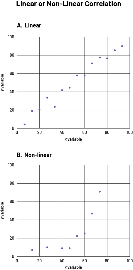 image Two scatter diagrams are placed one below the other. The common title is "Linear or non-linear correlation". The axes are named "Variable X" and "Variable Y" and are scaled from zero to 100. Graph "A" is linear and the dots form an ascending diagonal. The "B" graph is non-linear and the dots initially line up horizontally before showing an upward trend on the vertical axis.
- a positive or negative relationship: If the points are clustered near a line that runs from the lower left to the upper right corner of the graph, the relationship between the two variables is said to be positive (graph A). If the points are clustered near a line that runs from the upper left to the lower right corner of the graph, the relationship between the variables is said to be negative (graph B).
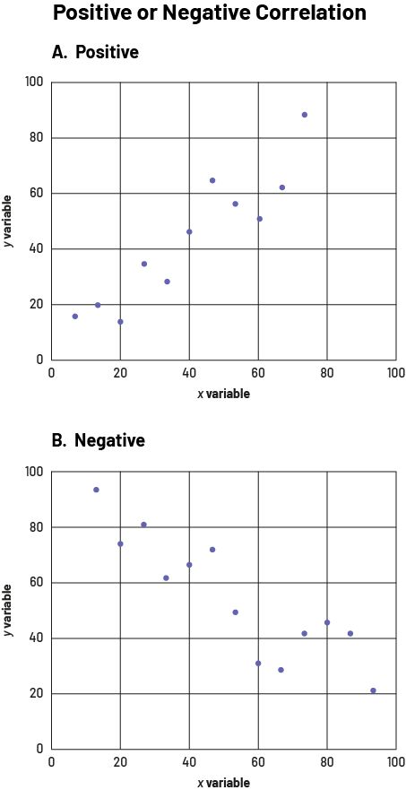 image Two scatter diagrams are placed one below the other. The common title is "Positive or Negative Correlation". The axes are named "Variable X" and "Variable Y" and are scaled from zero to 100. Graph "A" has a positive relationship; the dots are grouped to form an ascending diagonal. Graph "B" has a negative relationship; the dots are grouped to form a descending diagonal.
- concentration or dispersion of data: Points can be very close together (graph A) or widely dispersed in space (graph B).
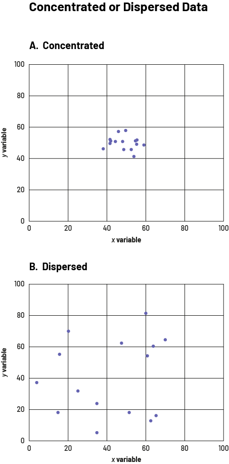 image Two scatter diagrams are placed one below the other. The common title is "Concentrated Data or Dispersed Data". The axes are named "Variable X" and "Variable Y" and are scaled from zero to 100. Graph "A" shows concentrated data. All the dots are grouped in the same box except for one, which is still very close to the others. Graph "B" shows dispersed data; the dots are far apart.
- the presence of extreme values (outliers): In addition to showing the relationship between two variables, a scatterplot can also show extreme values in the data set. Extreme values are those that are far from the other data in the data set, such as the two red points in the graph below.
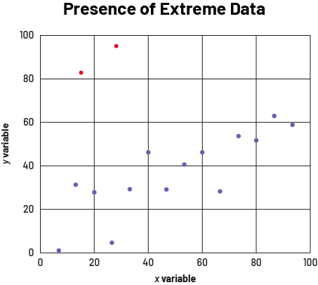 image The scatter diagram is titled "Presence of Extreme Data". The axes are named "Variable X" and "Variable Y" and are scaled from zero to 100. The fourteen purple dots are distributed between zero and 100 on the horizontal axis, and between zero and 70 on the vertical axis; while two red dots are between zero and 40 on the horizontal axis, and between 80 and 100 on the vertical axis.