D1.5 Use mathematical language, including the terms “strong”, “weak”, “none”, “positive”, and “negative”, to describe the relationship between two variables for various data sets with and without outliers.
Activity 1: Relationship Between Two Variables
Student Bolo Competition
Students in one class held a bolo competition on a special day.
The goal was to hit the ball as many times as possible for as long as possible without missing a hit.
The table below represents the results of 15 students.
| Duration in Seconds | Number of Keystrokes |
|---|---|
| 14 | 28 |
| 12 | 24 |
| 15 | 75 |
| 48 | 48 |
| 28 | 84 |
| 20 | 40 |
| 44 | 132 |
| 22 | 110 |
| 36 | 180 |
| 50 | 200 |
| 57 | 114 |
| 30 | 120 |
| 6 | 24 |
| 25 | 25 |
| 39 | 156 |
The data is entered into a scatter plot to see if there is a correlation between the number of hits and duration.
 image The scatter diagram is called "Bolo". The horizontal axis, graduated from zero to 60, is called "Duration in seconds", and the vertical axis, graduated from zero to 200, is called "Number of hits". The highest dot on the vertical axis is at 200 hits.
- How would you describe the correlation between the two variables – strong, weak, none existing?
- If there is a strong correlation, describe what happens to the variable on the vertical axis as the variable on the horizontal axis increases.
The points are scattered around a line that runs from the lower left corner to the upper right corner, so there is weak positive relationship between the data.
This indicates that the degree of correlation between the number of hits and duration is not very high.
Source: translated from L'@telier - Ressources pédagogiques en ligne (atelier.on.ca)
Activity 2: Vocabulary Associated with Relationships Between Two Variables
Use appropriate terms (weak or strong positive relationship, weak or strong negative relationship, no relationship, and scatter plot with outliers) to describe the relationship between the two variables in the plots below. Explain your choice.
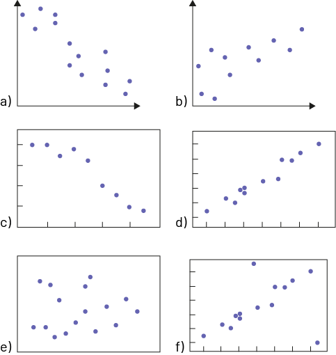
Sample Responses
a) We see that the points are scattered, so there is a weak relationship between the two variables. We also notice that as the variable represented on the horizontal axis increases, the variable represented on the vertical axis decreases, so we therefore know that there is a weak negative relationship.
b) We see that the points are scattered, so there is a weak relationship between the two variables. We also notice that as the variable represented on the horizontal axis increases, the variable represented on the vertical axis also increases, so there is a weak positive relationship.
c) We can see that the points closely resembles a straight line. This means that there is a strong relationship between the two variables. We also notice that as the variable on the horizontal axis increases, the variable on the vertical axis decreases, so there is a strong negative relationship.
d) We can see that the points closely resemble a straight line. This means that there is a strong positive relationship between the two variables. We also notice that as the variable on the horizontal axis increases, the variable on the vertical axis increases as well, so there is a strong positive relationship.
e) We notice that the points are completely scattered, so we can conclude that there is no relationship between the two variables.
f) We notice that there appears to be some data that are completely out of trend with the other data, so we can deduce that this is a graph that contains outliers.
Source: translated from En avant, les maths!, 8e année, CM, Données, p. 3-4.